Hi, I'm Yu. I design products that make complex things feel simple.
I care about systems thinking and asking the right questions. I use quick AI prototypes to test ideas early, and turn messy problems into products people trust.
At PayPayJapan's largest mobile payment app in Tokyo, I make paying and managing money easy for 65M+ users, even when the rules behind it are not. Before that, I worked on growth and engagement at CarousellMarketplace app across Southeast Asia and Taiwan in Taiwan and Singapore.
Outside work, I mentor designers at AAPDEducation platform for product builders in Taiwan and build small tools with code and AI.
Work
PayPay
I lead design for how money gets in and out of the wallet, from top-ups to ATMs to card payments.
Ryan was a key team member during my time at PayPay, where he consistently delivered high-quality designs across multiple projects. He also contributed to Design Ops by improving QA processes and accessibility.
Ryan is my team member at AAPD, where we teach Figma and UI design. He began as a teaching assistant and quickly advanced to an instructor role, demonstrating strong learning ability, attention to detail, and clear communication.
Ryan was a valued team member who independently led several challenging projects with unclear requirements. He brought clarity through thorough research and tackled problems with patience and a methodical approach.
Ryan was a former colleague at Carousell, and I was always impressed by his ability to balance user needs with business goals to deliver practical, thoughtful designs.
When design and development misaligned, he calmly found practical solutions with the team. His suggestions for bug fixes and optimizations boosted both product quality and team efficiency.
Ryan was a key team member during my time at PayPay, where he consistently delivered high-quality designs across multiple projects. He also contributed to Design Ops by improving QA processes and accessibility.
Many PayPay users top up small amounts, around ¥5,000, several times a month. Every top-up costs PayPay a processing fee, and across millions of top-ups a month, these small and frequent ones added up fast. Fewer, larger top-ups would save money for the business and save users from doing the same task again and again. I set out to help people top up more at once, without pushing them.
What I found
I looked at interviews and usage data and found three reasons people top up small amounts:
They don’t feel safe keeping a big balance. Users told us they worry about holding too much money in the app.
Typing the amount is a hassle. Usage data showed people dropping off at the amount input step.
They don’t know how much they spend. Most users have no idea what they spend on PayPay in a month, so they top up just enough for now.
Picking what to test first
The first two reasons needed big changes. Making people feel safe with a larger balance meant policy work with the risk and compliance teams, and a new amount input would take months to build. The team’s goal this quarter was quick A/B tests that could show results fast, so we started with the third reason: people don’t know how much they spent last month. It was quick to ship and easy to measure.
Design
The goal was simple: show people what they spent last month, and make it easy to top up that amount.
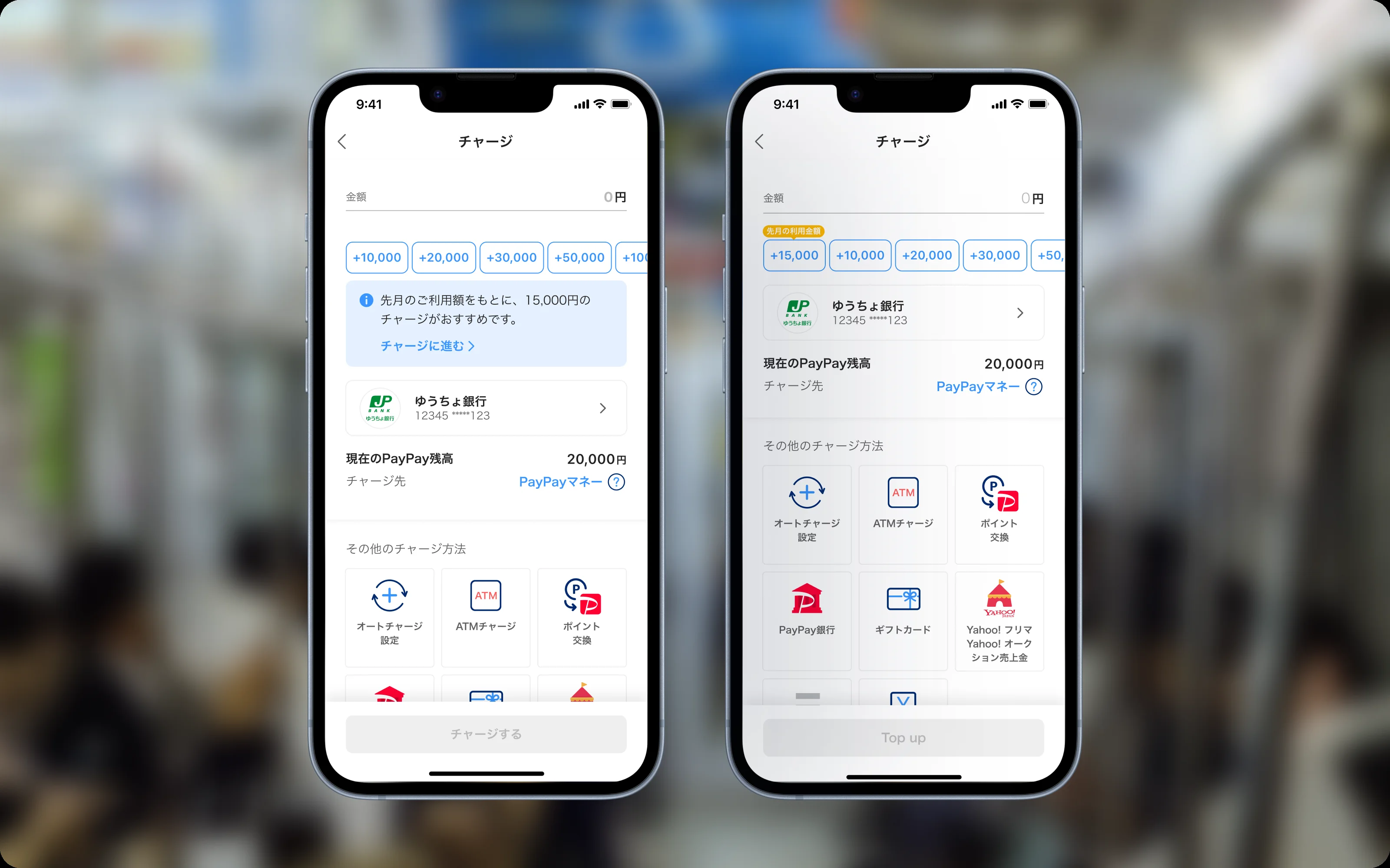
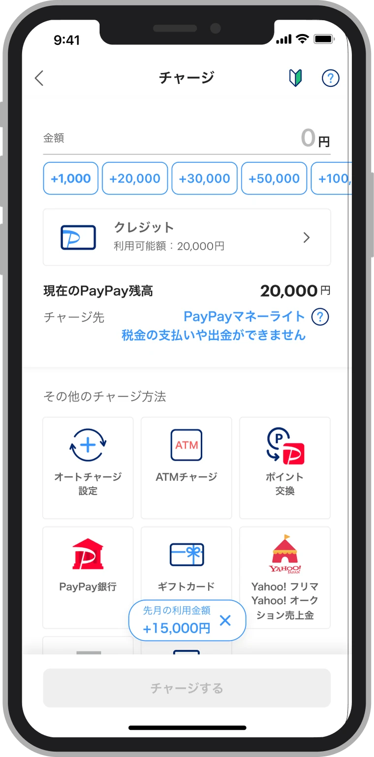
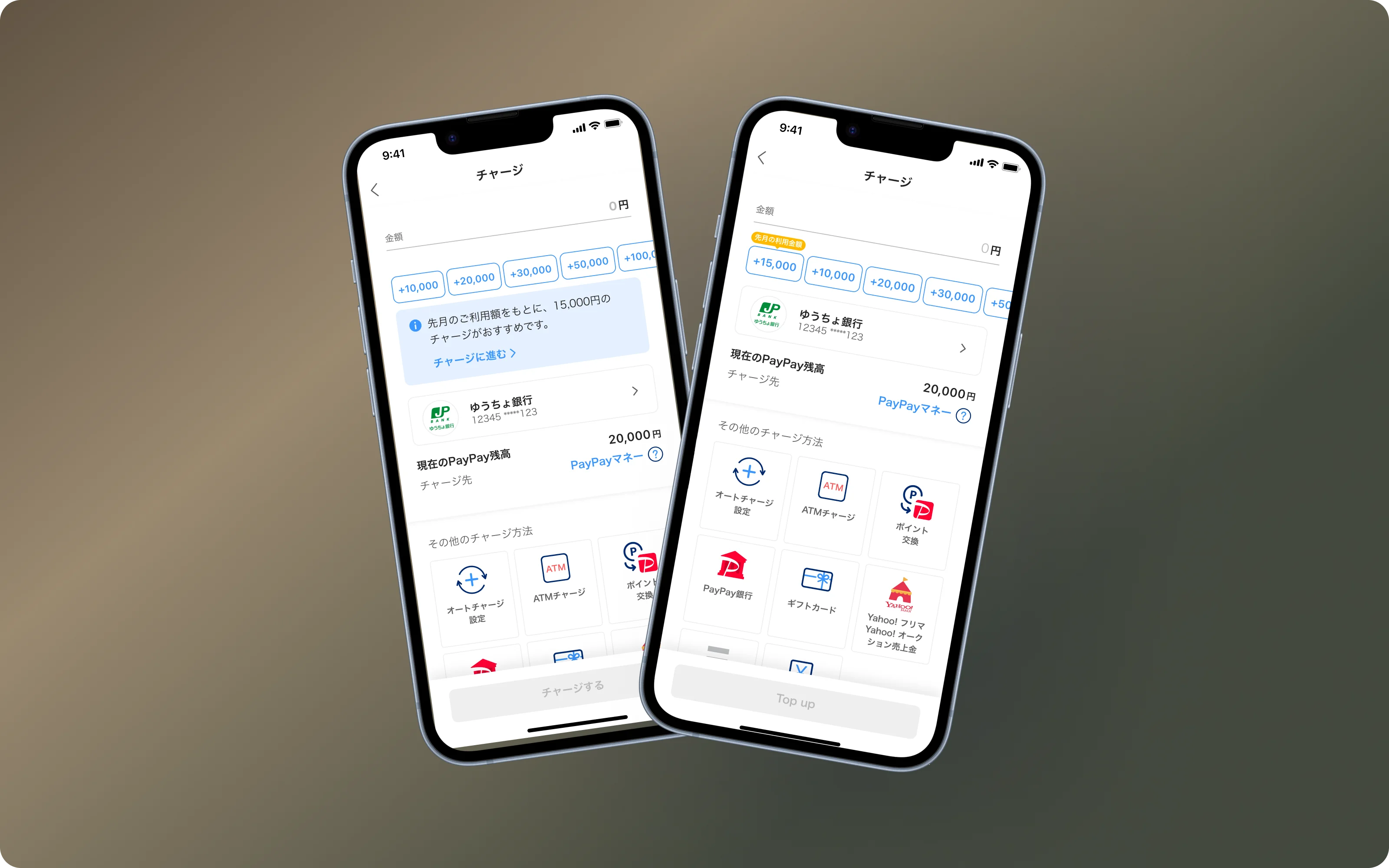
I explored three ways to do it: an info banner, an extra quick-amount button and a floating button.
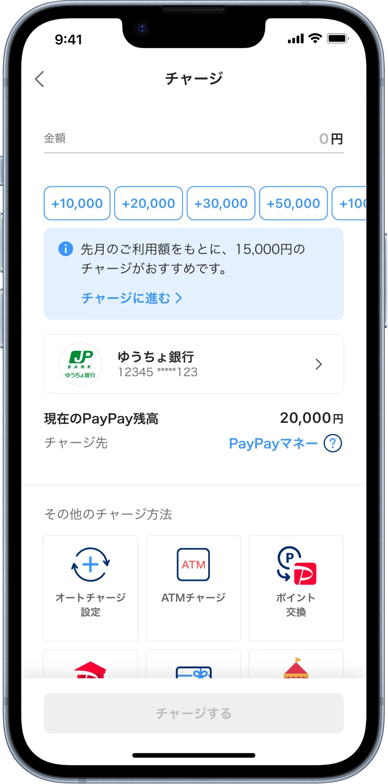
A message above the amount buttons suggests last month's spending.
Working through them, I realized the real question was not which layout looked best. It was whether the suggestion works better as a message on top of the flow, or as part of the flow itself. The floating button could cover content at the bottom of the screen, so I dropped it and tested the two ends:
Variant A: a banner. A message above the amount buttons that suggests last month’s spending.
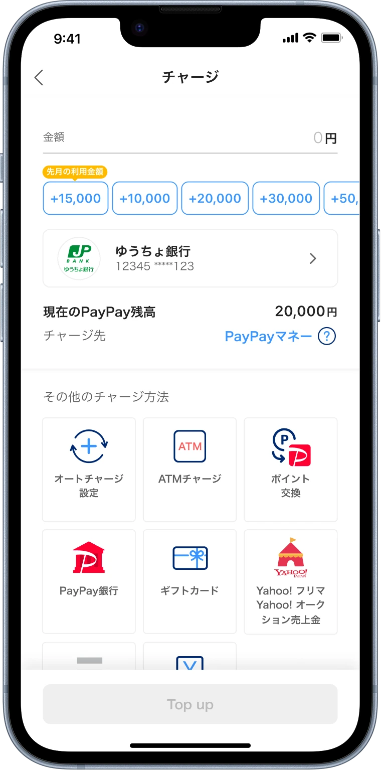
Variant B: a quick-amount button. Last month’s spending as the first amount button.
Both fill in the amount with one tap. The only difference is where the suggestion sits.
Details that mattered
A few small choices decided whether the design felt helpful or just got in the way.
Show it when people top up more. People top up larger amounts at the start of the month, and most top up about every two weeks. So it shows for the first two weeks, then hides until next month.
Count only regular spending. Payments that don’t happen every month, like investments, are left out, so one unusual payment doesn’t push the amount too high.
Round up to a clean number. ¥14,563 becomes ¥15,000. It’s easier to act on, and nudges people to top up a little more.
Small fixes along the way
The first two reasons were too big for this quarter, but I could still make them a little easier. These shipped separately from the A/B test:
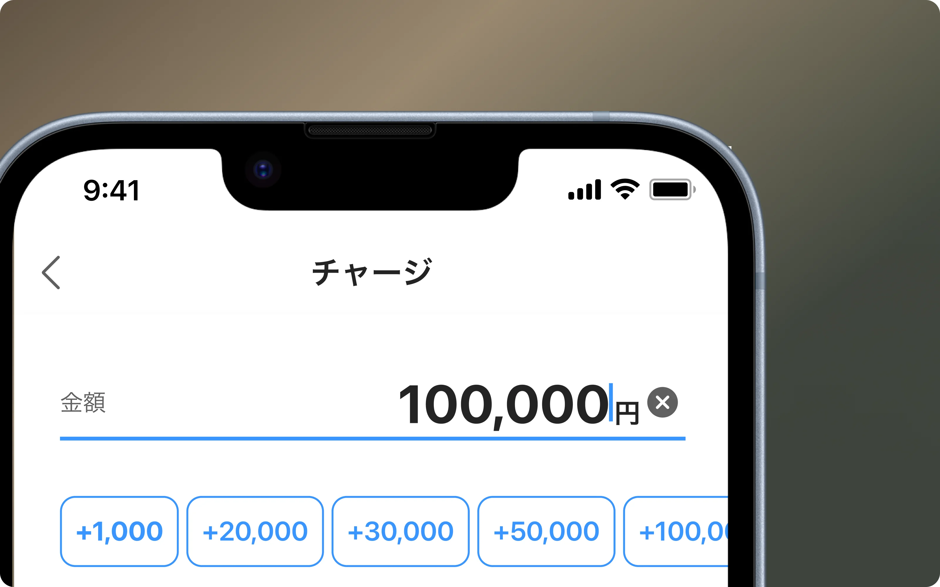
Quick clear. A clear button in the amount field, so people who type the wrong amount can start over in one tap.
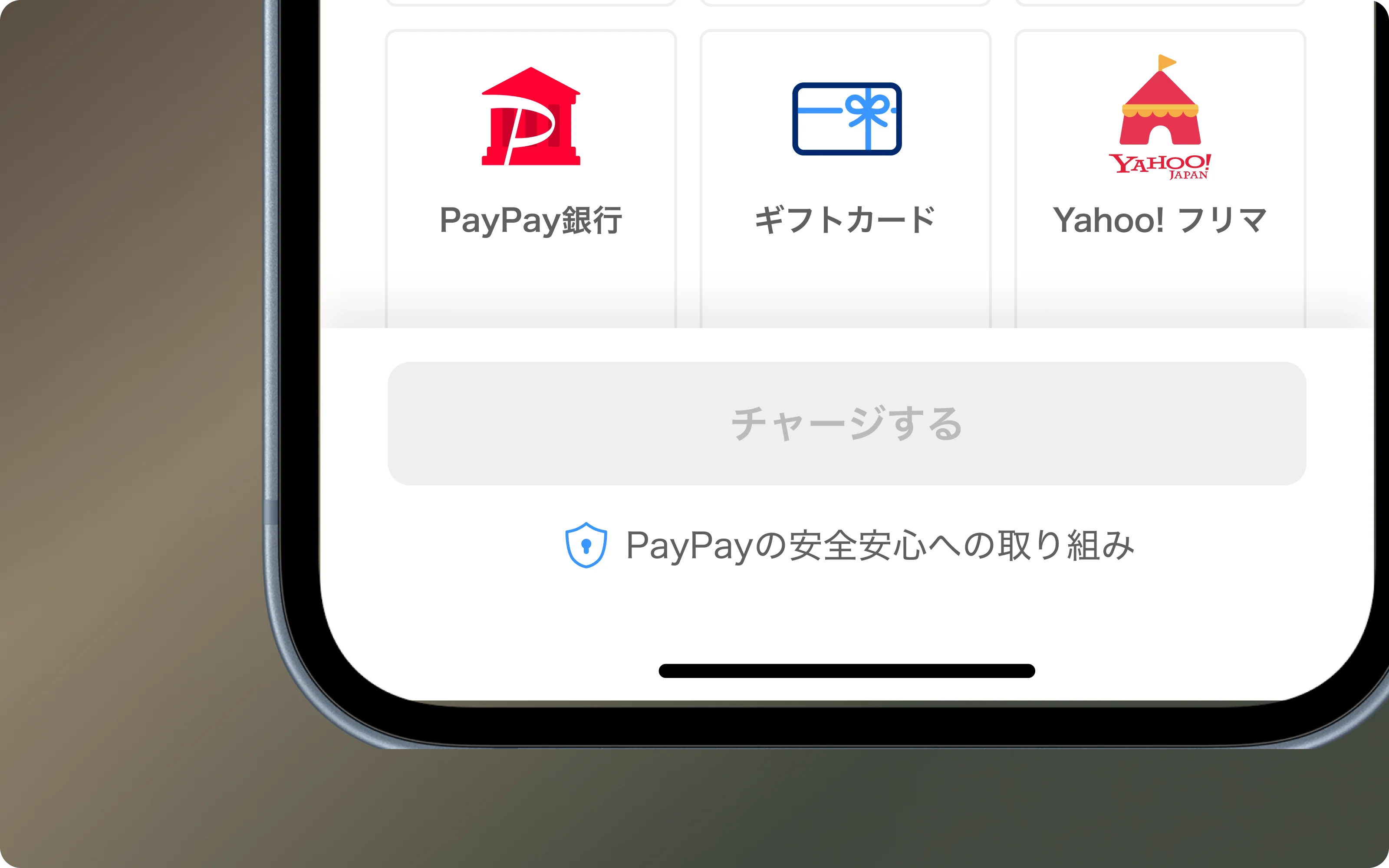
A safety link. A link to PayPay's safety page right under the top-up button, for people who worry about keeping a bigger balance. Several other payment apps do the same.
Results
Each variant went to 1% of users for one month, with everyone else as the control group. Variant B, the quick-amount button, was the clear winner. The banner made no significant difference.
Top-up amount per user
+7%
Top-ups per month, from 4.5 to 3.5
−22%
Total top-up costs
−13%
Before rolling out to everyone, I checked with the risk and compliance teams that bigger balances stayed within limits and fraud monitoring. Security tickets did not go up after launch. I also worked with engineering to calculate spending once a day instead of live, so it works for millions of users.
What I learned
The same information, shown in a different place, gave completely different results. A banner sits on top of what people are doing. A suggestion in the amount buttons is part of it, right where they are already choosing a number.
Next, I want to test showing spending before users open the top-up screen, before they have a number in mind.