Cardless ATM

Company
PayPay
Timeline
2024 Q2 - 2023 Q4
Responsibility
End-to-end design
User testing
Overview
As the designer in charge of the ATM experience, I redesigned it to support cardless deposits and withdrawals. No more carrying a cash card. Just your phone.
The hard part was execution: unifying a fragmented experience across a smartphone app and a physical ATM, each with its own constraints, regulations, and screen specs, while keeping it as simple as using a regular cash card.
0
0
%↑
Services adaption rate
0
0
%↑
Trasaction success rate
Product Demo
With this feature, users can now access all ATM features using just their smartphone, no need to carry a bank card.
Also in testing, the average transaction was completed in 30 seconds, faster than the typical 45-second card-based withdrawal.
Over 50% of payments in Japan are still made in cash, and it remains deeply embedded in daily life. Even PayPay users have cash needs. So we set out to make the experience frictionless, making the app the only thing users need to carry: pay, withdraw, deposit, send, and engage, all in one place.
Field research at the ATM
I started by visiting ATMs in person to test the cardless flow myself. What I was looking for was where the experience broke down: the moments of hesitation, the instructions that didn't quite land, the points where switching between phone and ATM felt disorienting. Experiencing it firsthand made those friction points visceral in a way data alone couldn't.
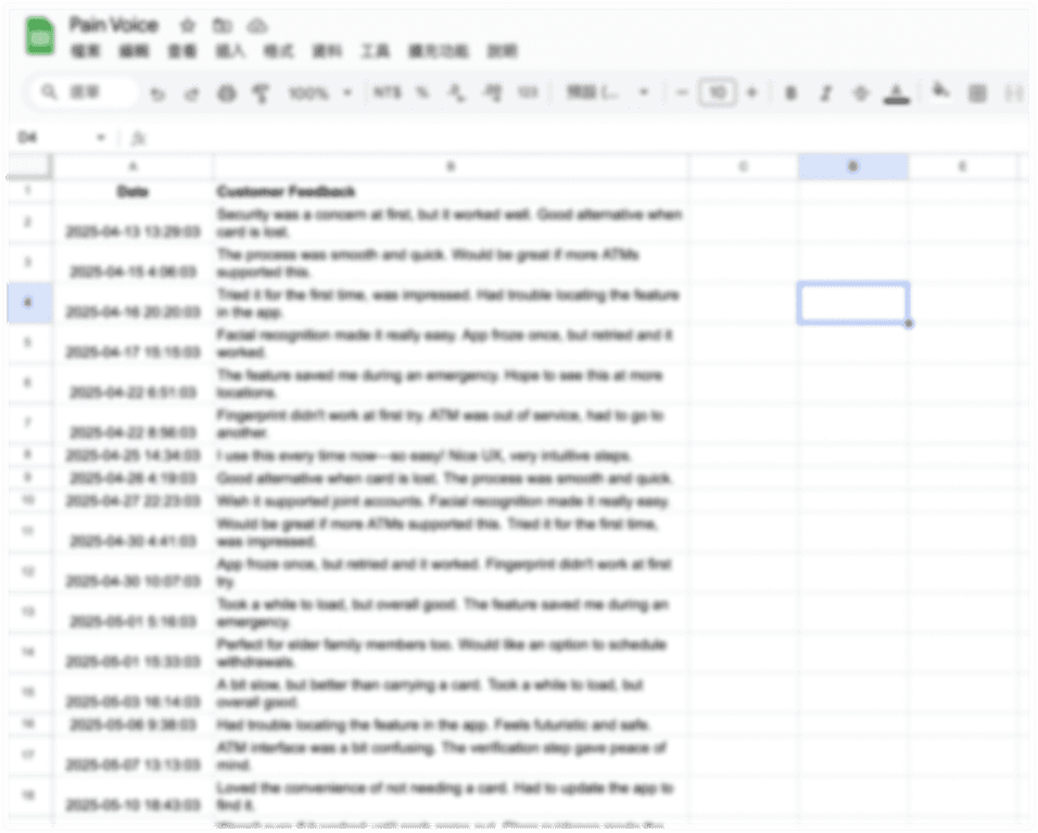
Learning from support data
To back up my findings, I worked with the customer support team to review user inquiries about the ATM experience, grouping them into key failure categories.
Funnel analysis
Then I partnered with a data analyst to run a funnel analysis across the actual flow. Together, these three inputs gave me a clear picture: the problems weren't random. They clustered around a few predictable moments, which showed me exactly where to focus the design work.
The research pointed to three distinct moments where the experience broke down. Three different moments, but the same underlying pattern: users lost confidence because the experience didn't give them enough information at the right time.
#1 Users couldn't get started
The initial setup, required for fraud prevention, offered multiple verification methods that each behaved slightly differently, with no clear guidance on which to choose. 40% of users failed at this step before ever reaching an ATM.
#2 Users got lost between two screens
After scanning the QR code at the ATM, the app displayed a number to enter back on the ATM but never told users to switch back. Without that prompt, 13% dropped off right there, phone in hand, waiting for something that wasn't coming.
#3 Users left not knowing if it worked
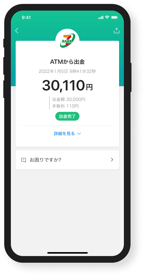
Due to technical constraints, the cardless flow couldn't display the transaction amount or updated balance at completion. That uncertainty drove 7% of all CS inquiries, with users essentially asking: "Did my money actually move?"
Ready to design
Design principles
With the pain points mapped, I set 3 design principles to anchor every decision that followed.
As simple as a cash card. The cardless flow introduces inherent complexity: setup steps, device switching, new mental models. My job was to absorb that complexity in the design, so users never had to feel it.
Additive, not disruptive. Millions of users already relied on the existing ATM experience. New features had to fit in naturally, without forcing relearning or getting in the way of users who weren't opting in.
Honest about constraints. Technical and regulatory limits were real and non-negotiable. Rather than fight them, I treated them as design parameters: things to work around thoughtfully, not pretend didn't exist.
Competitive analysis
I walked through the cardless flows of other apps and most solved the basics the same way: scan a QR code, get numbers, enter them on the ATM. The difference was in the guidance. Almost none told users when to switch between phone and ATM, the same gap I saw in our own flow. The opportunity wasn't a new flow, it was better guidance through the device handoff.

Ideation
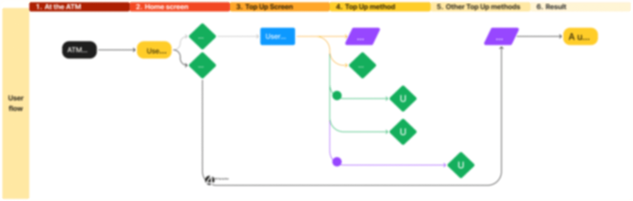
I translated these insights into wireframes, mapping the interactions across the app and the ATM screen in parallel.


When I presented the first draft to the team, most of the flow held up, but the entry screen, where users choose between services, sparked the most debate. It was the first real decision point in the flow, and how we handled it would set the tone for everything after. That became the focus of the next round.

User testing
Based on the team's feedback, I built three prototypes for the entry point, each testing a different idea about how to help users quickly understand their options.

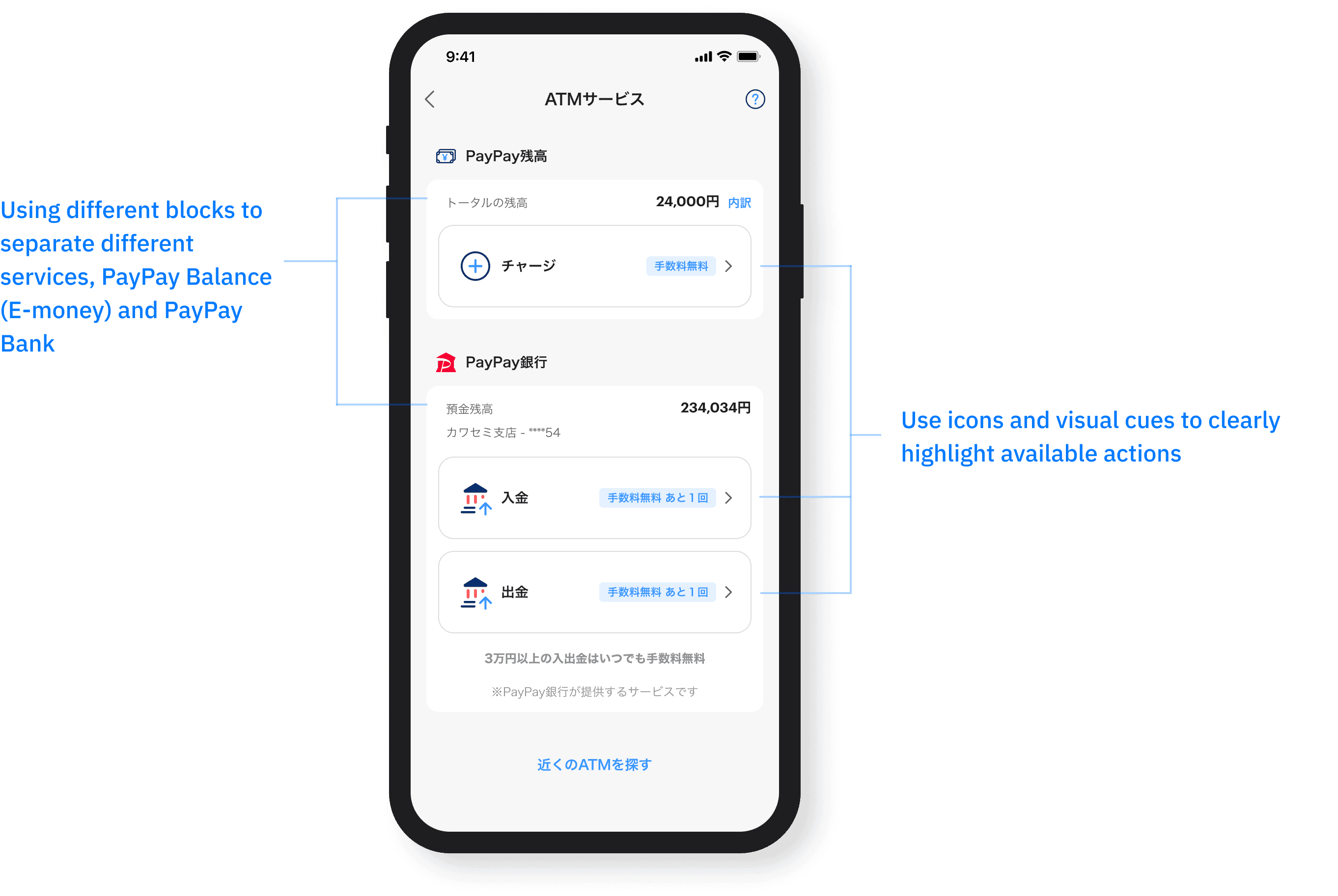
Concept 1
Added icons to each button, making the options more visually distinct at a glance

Concept 2
Switched to a horizontal layout, betting that a linear arrangement would be easier to scan

Concept 3
Introduced an illustration to reinforce the call to action and give the screen more visual weight
I tested all three with eight participants, asking about first impressions, where their attention landed, and whether they could complete the task without guidance.
The results were clear: icons helped users tell the options apart faster, the illustration added visual noise without adding clarity, and users gravitated toward the vertical layout, which fit better with the rest of the app's structure.
I moved forward with Concept 1. Icons gave users a visual shortcut without reading every word, which matters when someone is standing at an ATM with a queue behind them.
With the concept validated, I moved into final design: refining the flow, cleaning up the copy, and checking each screen against our constraints.
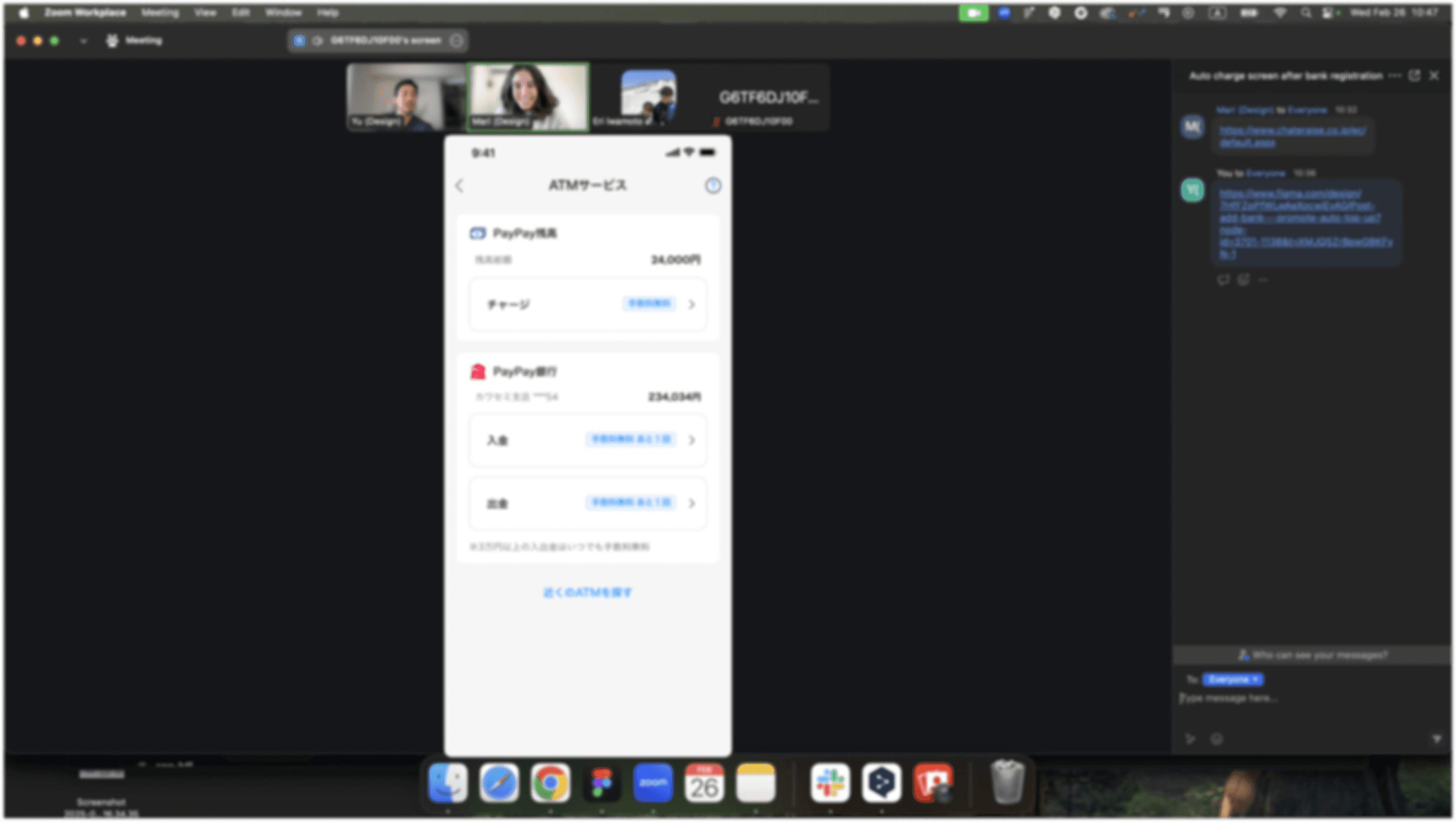
Setup before using

Research above showed that 40% of users failed at this step before ever using the feature. So I broke the setup into clear steps with visible progress, letting users know where they are and what to do next.
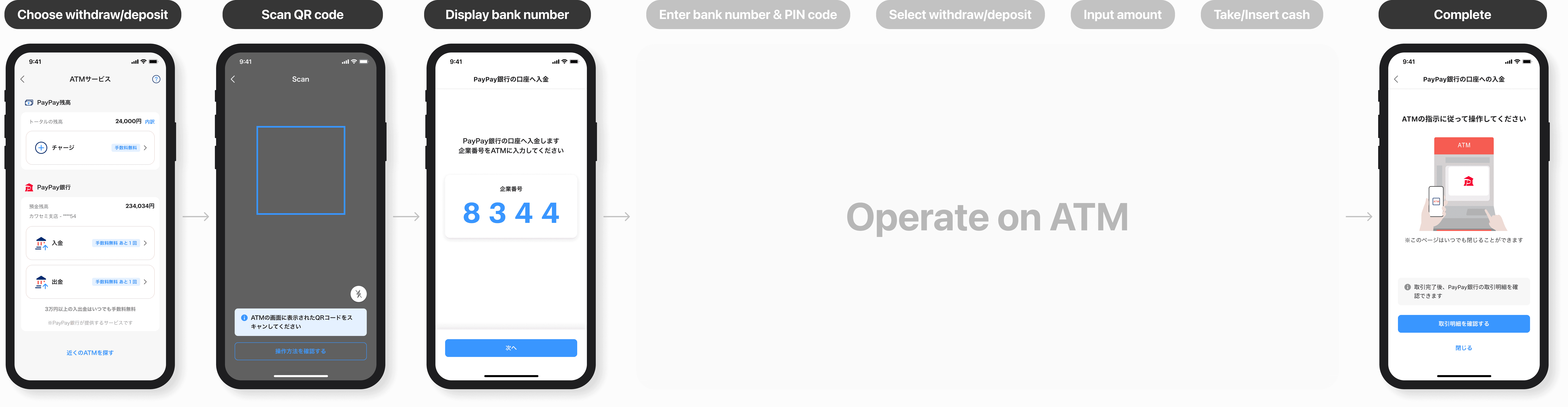
Choose withdraw/deposit
Scan QR code

Display Bank number

Complete transaction

And more… ATM screen

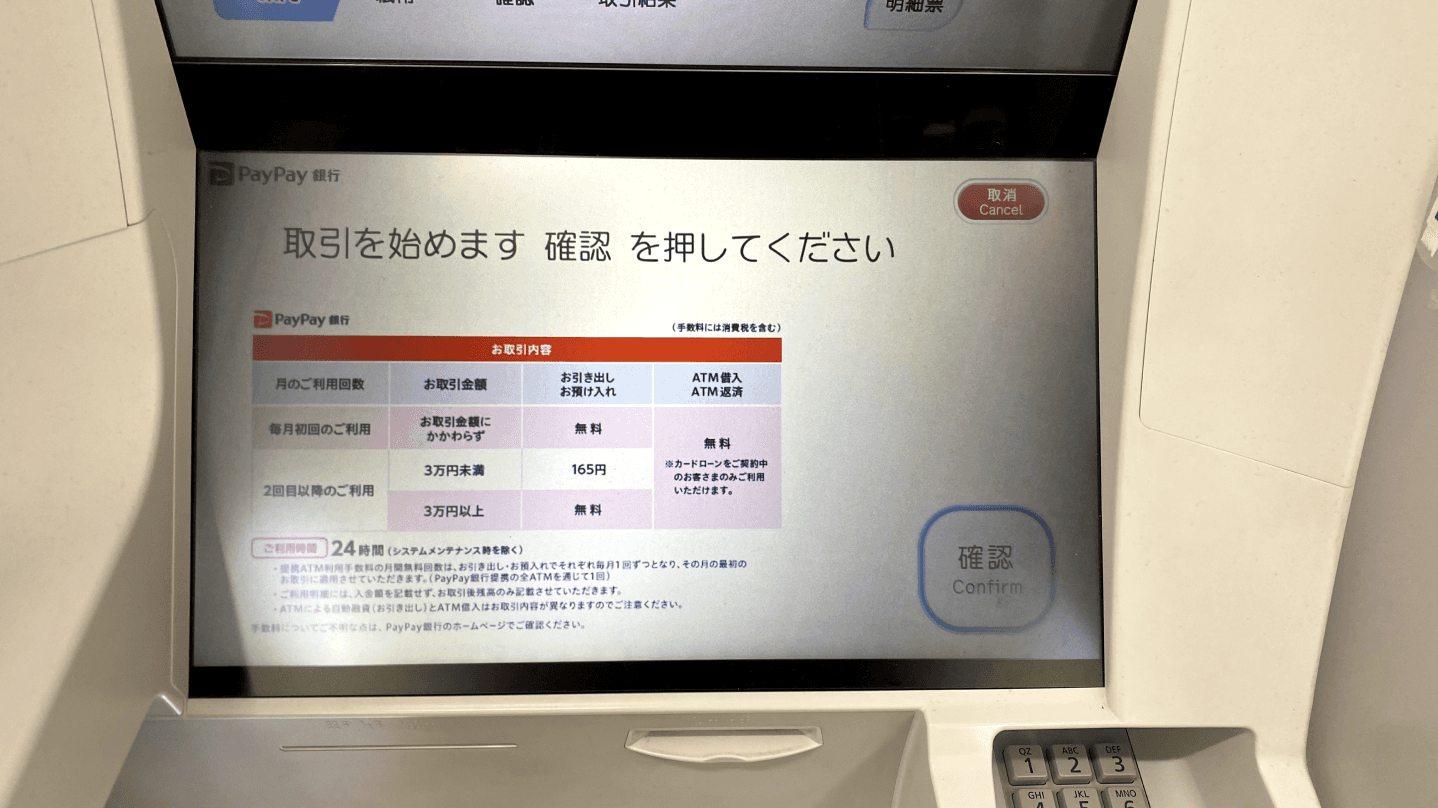
One part of this project was genuinely new territory: the ATM screen itself. Unlike the app, it came with strict rules set by the vendor and shaped by regulations: a limited color palette, fixed font sizes, and fixed layout zones. There was no design system to lean on, no mobile conventions to borrow from. Every decision took rounds of back-and-forth with the vendor, checking what was possible against what regulations allowed.
It was my first time designing for a screen that wasn't a phone or a computer. It forced me to strip the design to its essentials: without familiar UI patterns to rely on, information hierarchy becomes everything. A user glancing at the ATM mid-transaction should immediately see what they need, their balance, the fee, the limit, and nothing else.
We launched to 10–20% of users in beta. The data looked promising, until it didn't.
We discovered beta users weren't following the expected flow.
Instead of selecting a service in the app first, they started at the ATM and used the app's general scan feature to pick up from there. The problem: the app had no way of knowing which service they'd selected on the ATM side, causing errors we couldn't even explain clearly when things went wrong.
I'll be honest: this caught me off guard. We had mapped the flow carefully and tested it with real users. But what we tested was the flow as designed, not the flow as people actually behaved. Standing at an ATM, it turns out, a lot of people just start with what's in front of them.

I worked closely with engineers to find a solution that didn't require users to change their behavior. We landed on a condition check: if a user hasn't linked a PayPay Bank account, the app infers they're going for an e-money top-up and routes them there automatically. No extra steps, no error message. The system meets users where they actually are, not where we assumed they'd be.
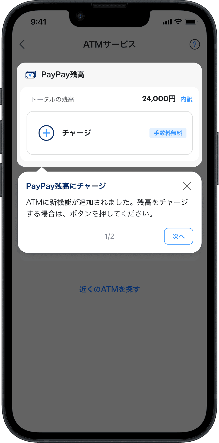
In addition to the condition check, I added a tutorial to help users navigate the new feature.
After beta, the feature rolled out to all users. The results:
12%↑
Services adaption rate
16%↑
Trasaction success rate
Along the way, I also noted a few ideas for future improvements:

Add haptic feedback to confirm that the number input succeeded.
Retrieve the transaction data from the ATM via API after completion, showing the success status and amount in the app to give users clear closure.
Three things I'd carry into the next project:
Ask the uncomfortable question early. The behavior mismatch we found in beta wasn't unforeseeable; it was a question nobody asked until it became a live problem. Now I push harder upfront: "What happens if users don't follow the designed flow?" is a boring question until it becomes a launch-blocking one.
Multi-device means multi-context. The ATM and the app aren't just different screens; they're different environments, different mental states, different levels of time pressure. I learned to map those context shifts explicitly, not to assume that a decision that felt right on mobile would hold up when someone is standing at an ATM with a queue behind them.
No amount of controlled testing fully replicates real-world behavior. The most important research in this project happened after we shipped.
Constraints sharpen the design. Working within the ATM vendor's fixed rules taught me that when you can't add anything, every element that stays has to earn its place.

Next
Brand New Notification Center
Improved user engagement led to a 11% increase in order completion
