Hi, I'm Yu. I design products that make complex things feel simple.
I care about systems thinking and asking the right questions. I use quick AI prototypes to test ideas early, and turn messy problems into products people trust.
At PayPayJapan's largest mobile payment app in Tokyo, I make paying and managing money easy for 65M+ users, even when the rules behind it are not. Before that, I worked on growth and engagement at CarousellMarketplace app across Southeast Asia and Taiwan in Taiwan and Singapore.
Outside work, I mentor designers at AAPDEducation platform for product builders in Taiwan and build small tools with code and AI.
Work
PayPay
I lead design for how money gets in and out of the wallet, from top-ups to ATMs to card payments.
Ryan was a key team member during my time at PayPay, where he consistently delivered high-quality designs across multiple projects. He also contributed to Design Ops by improving QA processes and accessibility.
Ryan is my team member at AAPD, where we teach Figma and UI design. He began as a teaching assistant and quickly advanced to an instructor role, demonstrating strong learning ability, attention to detail, and clear communication.
Ryan was a valued team member who independently led several challenging projects with unclear requirements. He brought clarity through thorough research and tackled problems with patience and a methodical approach.
Ryan was a former colleague at Carousell, and I was always impressed by his ability to balance user needs with business goals to deliver practical, thoughtful designs.
When design and development misaligned, he calmly found practical solutions with the team. His suggestions for bug fixes and optimizations boosted both product quality and team efficiency.
Ryan was a key team member during my time at PayPay, where he consistently delivered high-quality designs across multiple projects. He also contributed to Design Ops by improving QA processes and accessibility.
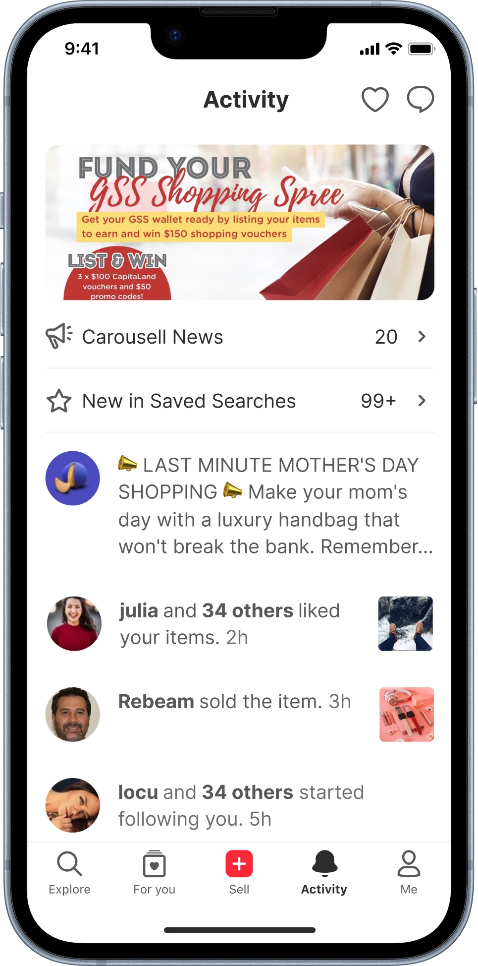
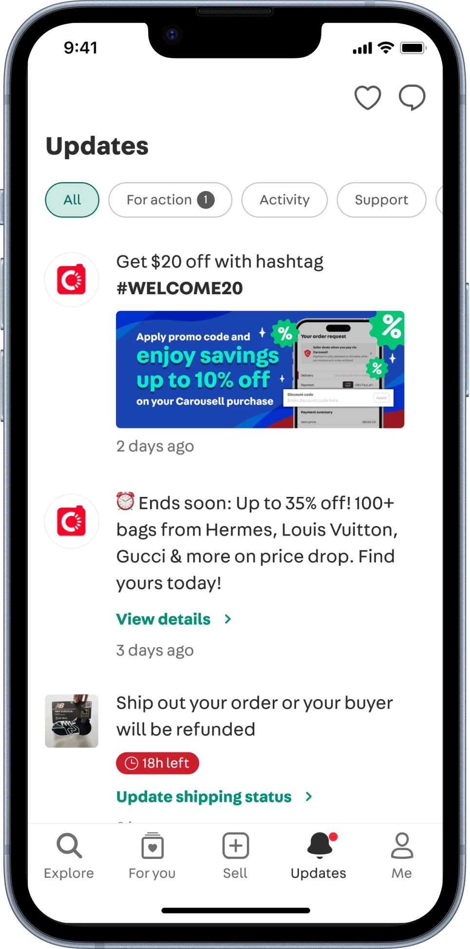
The Activity tab was one of the most used screens at Carousell. 80% of daily active users opened it to check on their account and orders. But important order updates were buried under marketing banners and promotions, and people did not know what to do next. I redesigned it to help people act on what matters and finish more orders.
The audit
I looked at six months of data on each section’s share of taps and reviewed the information architecture. Three problems stood out:
Marketing took the space, not the taps. Banners, company news and promotions got few taps but filled much of the screen.
No clear hierarchy. Every section looked equally important, so nothing guided the eye.
Important updates were hard to find. The account and listing updates people actually used were pushed down the page.
1234
1Marketing banner2.4%
2Carousell News & saved searches12.5%
3Marketing messages2.8%
4Account & listing activity82%
Others0.3%
Learning from other products
I looked at how other products handle notifications. Three patterns kept coming up: categories, a visual hierarchy, and read or unread markers.
A turning point
I turned those patterns into concepts, but the concepts kept multiplying, and team discussions went back and forth without a clear direction. Competitors showed what other products do, not what our users need. So I stopped making concepts and proposed interviews instead.
User interviews
I talked to 5 people across our four main groups: buyers, sellers, people who do both, and pro sellers. Each session had two parts: card sorting, then concept testing.
Card sorting. Each person sorted real notifications into groups that made sense to them, thinking out loud as they went. Two ways of grouping came up again and again: by topic (buying, selling, promotions) and by urgency.
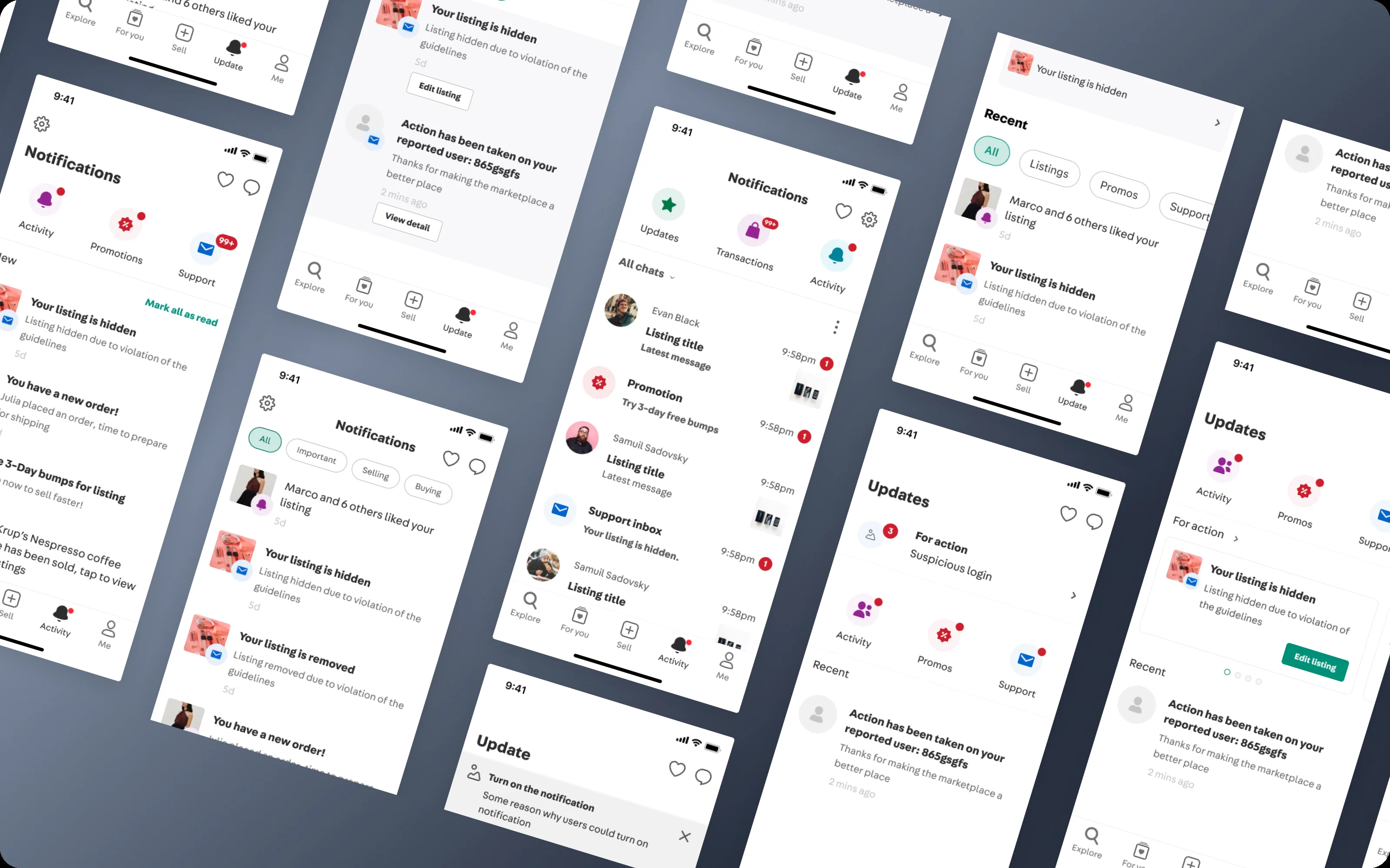
Concept testing. Then they tried three concepts. A put notifications behind category icons, B kept one list with filters on top, and C mixed category icons with a single list. Concept B matched how people grouped notifications best and felt the smoothest to use.
From the research, I set a few principles based on how people think about notifications: how they group them, how they see each type, and which ones they tend to ignore. These principles shaped the design.
Final design
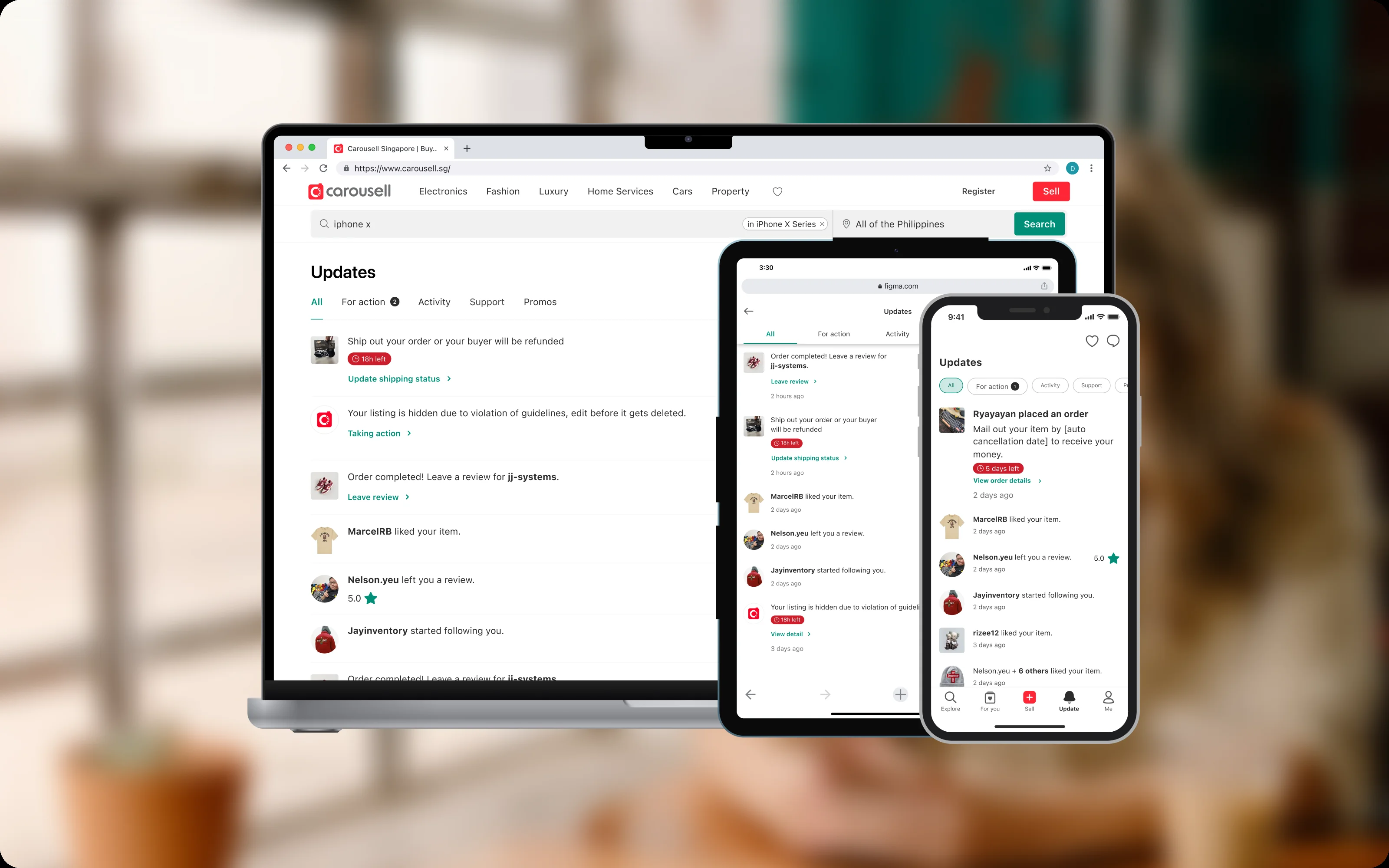
The old Activity tab led with marketing. The new Updates tab leads with what needs attention, with filters for actions, activity, support and promos. Drag the line to compare.
After
Before
More details
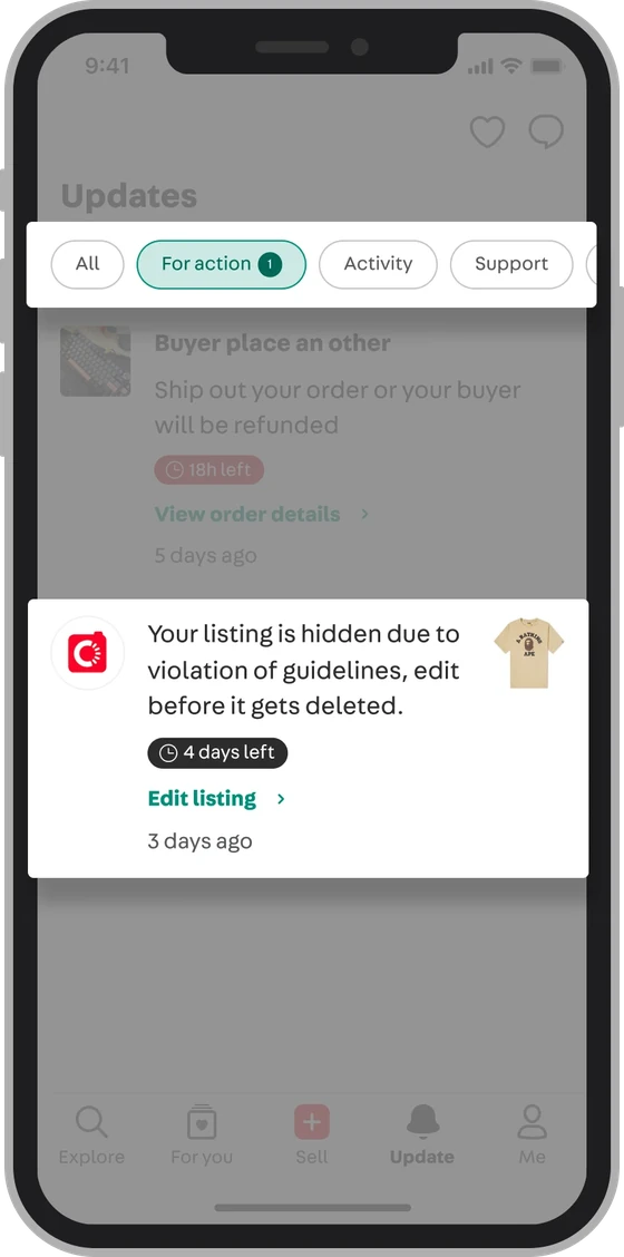
Urgent items on top. Notifications are grouped by topic and urgency. Urgent ones get a countdown and a clear button.
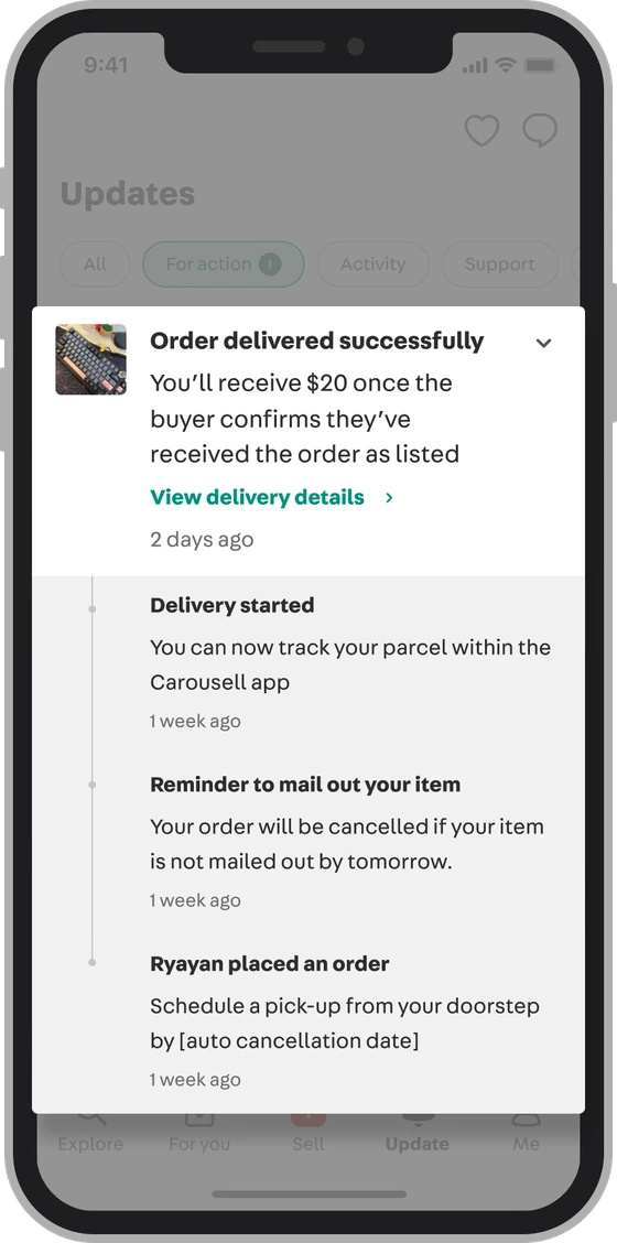
One timeline per order. Updates from the same order stack into one item that opens up, so nothing gets lost and the list stays short.
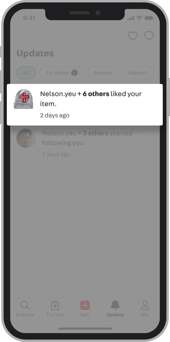
Small things bundled. Low-stakes updates of the same type, like item likes, are combined into one.
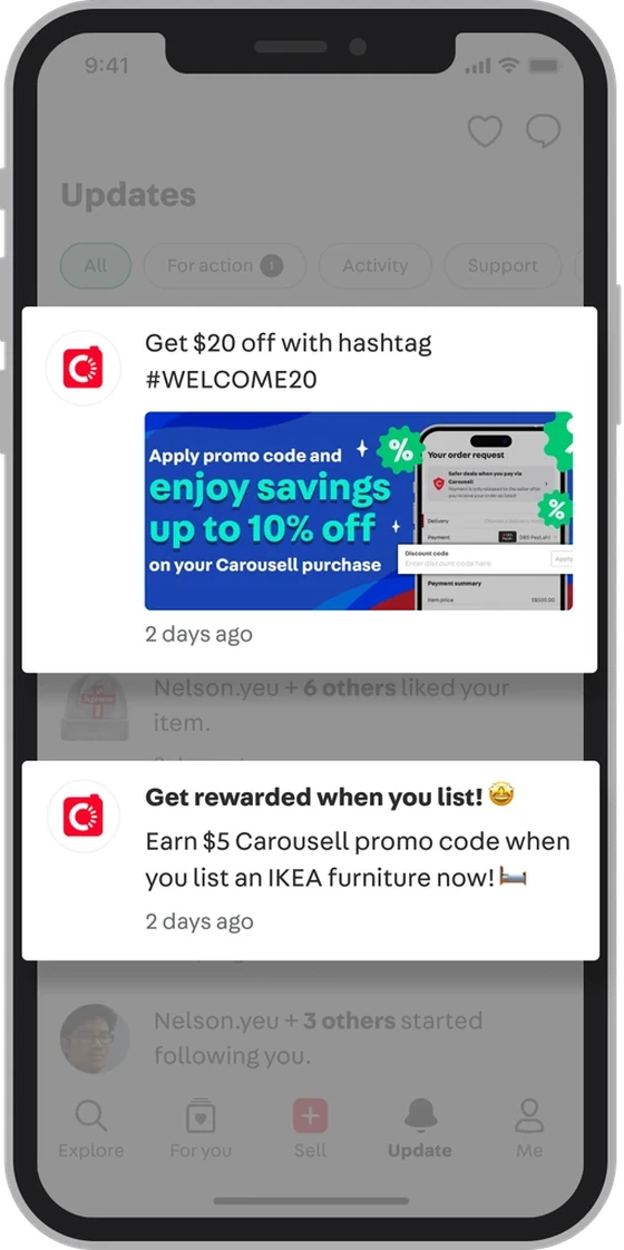
Marketing as notifications. Banners became notification-style items. They are easier to scan, and campaigns still get seen.
Bringing marketing along
Changing marketing placements on a high-traffic page was the riskiest part. Those spots belonged to the marketing team. Instead of trading opinions, I showed six months of tap data on the old banners. To make sure the new format wasn’t a downgrade, the notification-style placement takes images, text or video, so campaigns keep their range. Marketing agreed, and a joint workshop settled how campaign notifications would work.
Responsive web design
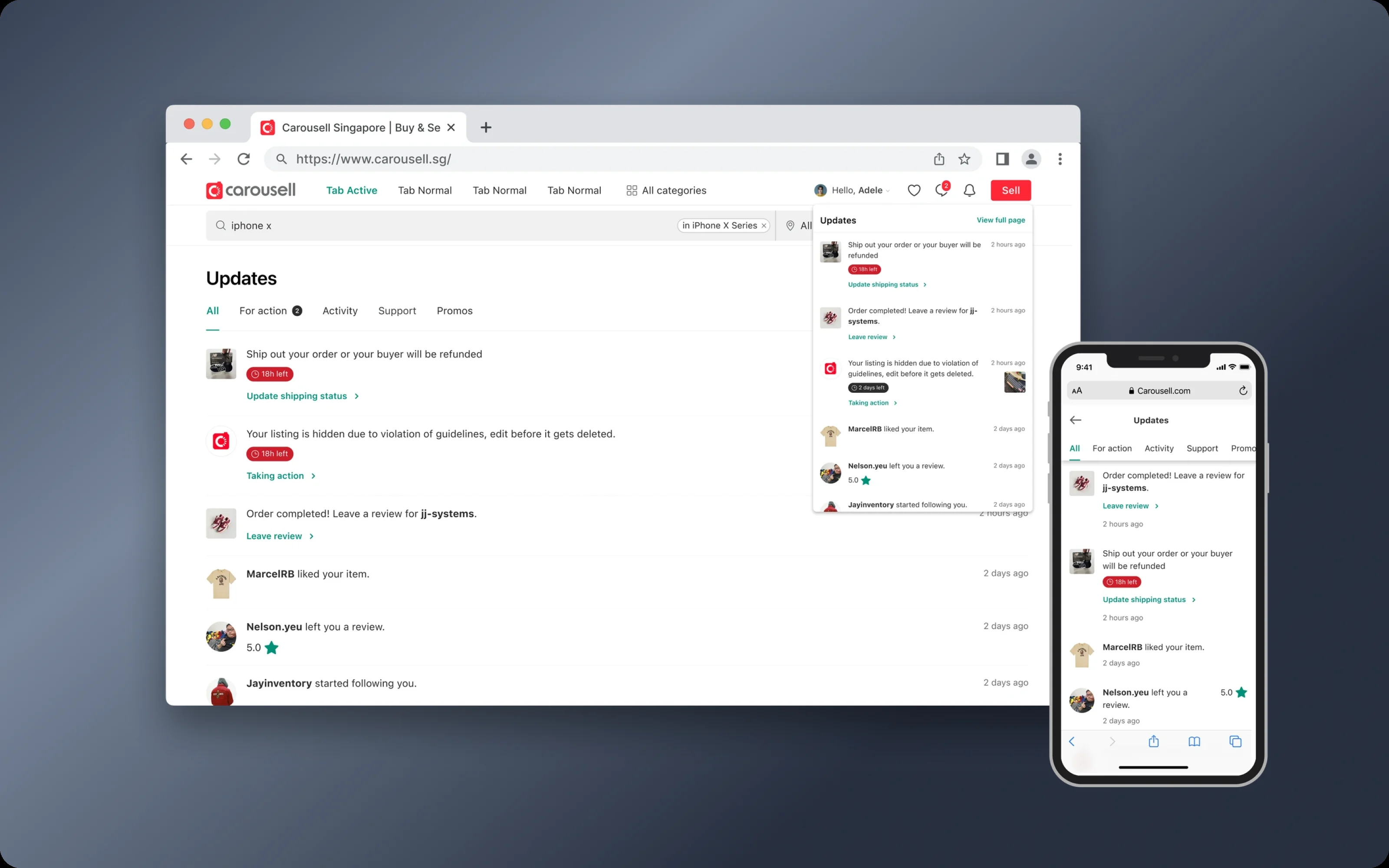
The web had no Activity tab before. I designed a responsive version, so people see the same updates on any screen.
Getting everyone on board
The change touched many teams, so I presented the design at the tech town hall, to the whole tech org including C-level leaders, and took their questions.
Results
CTR on order updates
+20%
Order completion
+11%
Reflection
Evidence before exploration. I spent too long on concepts from competitor research before understanding our own users. Competitors give ideas, not proof. Five interviews settled weeks of debate in a few days.
One screen also serves many people. A layout that helps a casual buyer can slow down a seller with dozens of orders. Naming those tensions early, and checking past research, kept us from rebuilding ideas that had already been tried.