Hi, I'm Yu. I design products that make complex things feel simple.
I care about systems thinking and asking the right questions. I use quick AI prototypes to test ideas early, and turn messy problems into products people trust.
At PayPayJapan's largest mobile payment app in Tokyo, I make paying and managing money easy for 65M+ users, even when the rules behind it are not. Before that, I worked on growth and engagement at CarousellMarketplace app across Southeast Asia and Taiwan in Taiwan and Singapore.
Outside work, I mentor designers at AAPDEducation platform for product builders in Taiwan and build small tools with code and AI.
Work
PayPay
I lead design for how money gets in and out of the wallet, from top-ups to ATMs to card payments.
Ryan was a key team member during my time at PayPay, where he consistently delivered high-quality designs across multiple projects. He also contributed to Design Ops by improving QA processes and accessibility.
Ryan is my team member at AAPD, where we teach Figma and UI design. He began as a teaching assistant and quickly advanced to an instructor role, demonstrating strong learning ability, attention to detail, and clear communication.
Ryan was a valued team member who independently led several challenging projects with unclear requirements. He brought clarity through thorough research and tackled problems with patience and a methodical approach.
Ryan was a former colleague at Carousell, and I was always impressed by his ability to balance user needs with business goals to deliver practical, thoughtful designs.
When design and development misaligned, he calmly found practical solutions with the team. His suggestions for bug fixes and optimizations boosted both product quality and team efficiency.
Ryan was a key team member during my time at PayPay, where he consistently delivered high-quality designs across multiple projects. He also contributed to Design Ops by improving QA processes and accessibility.
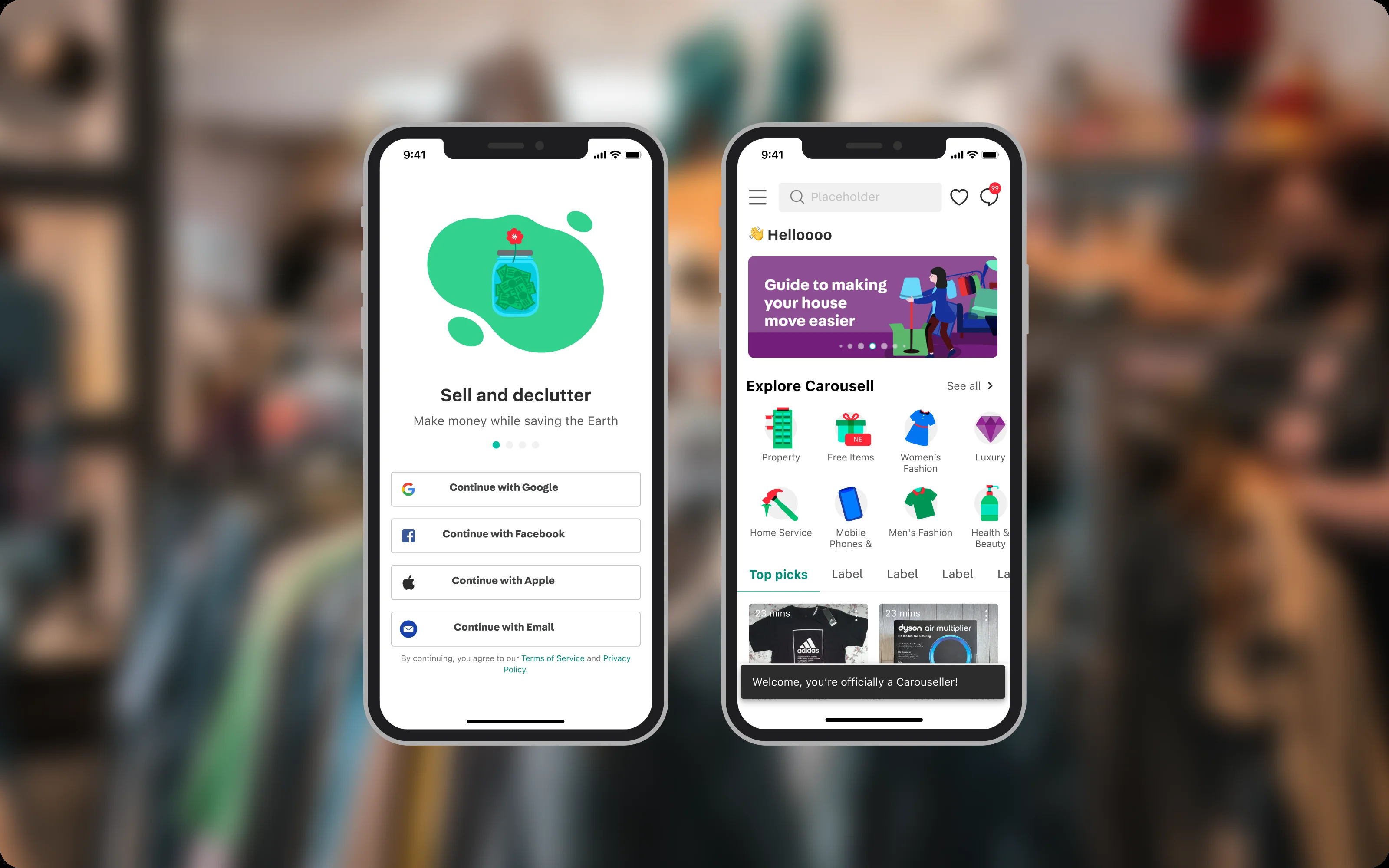
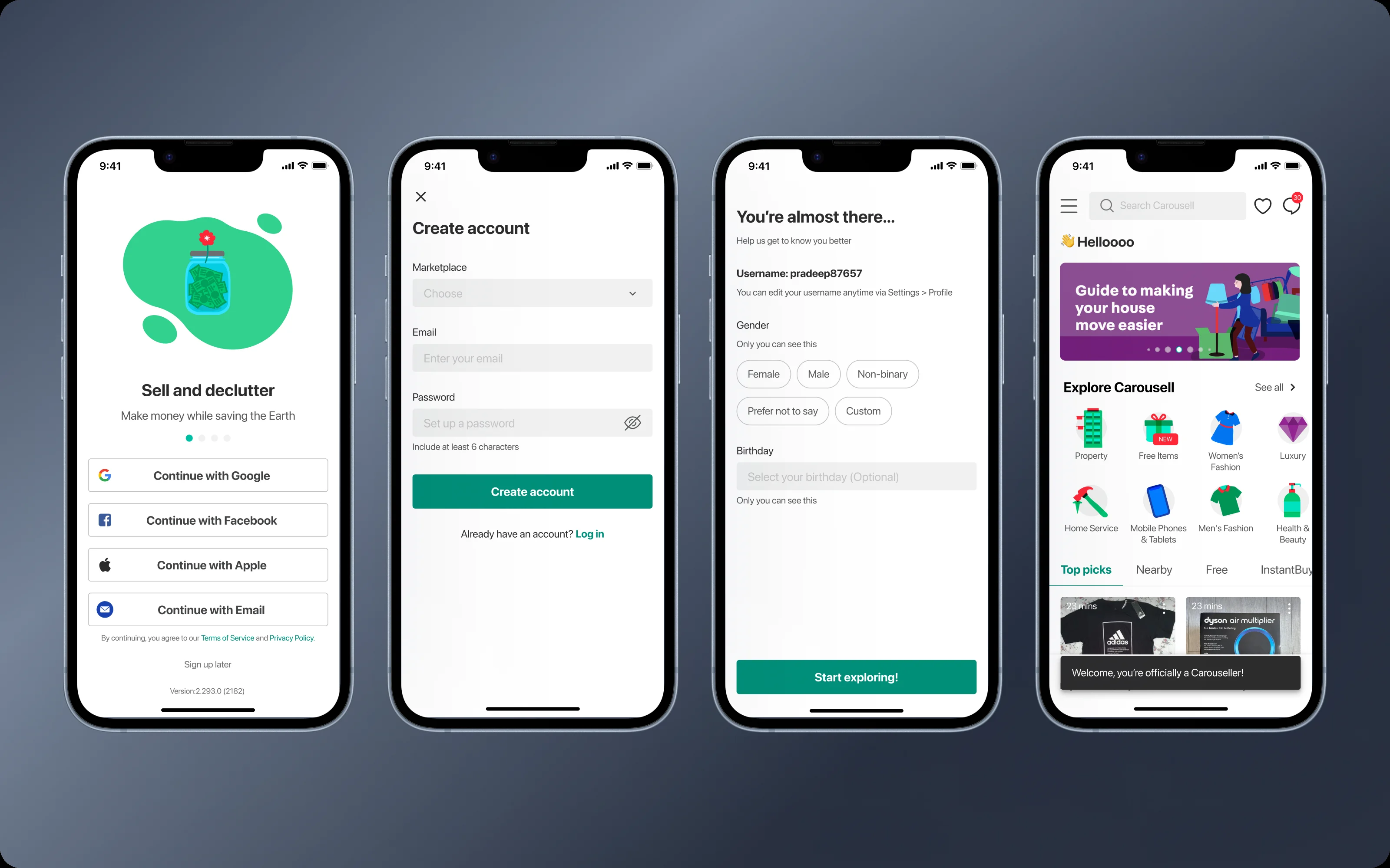
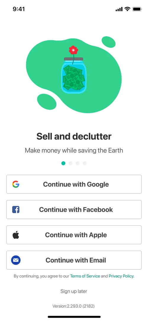
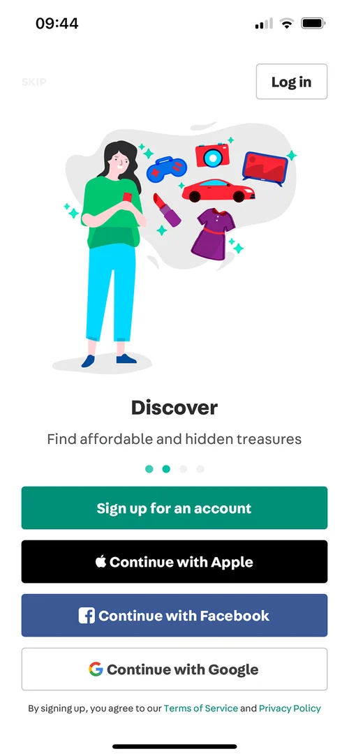
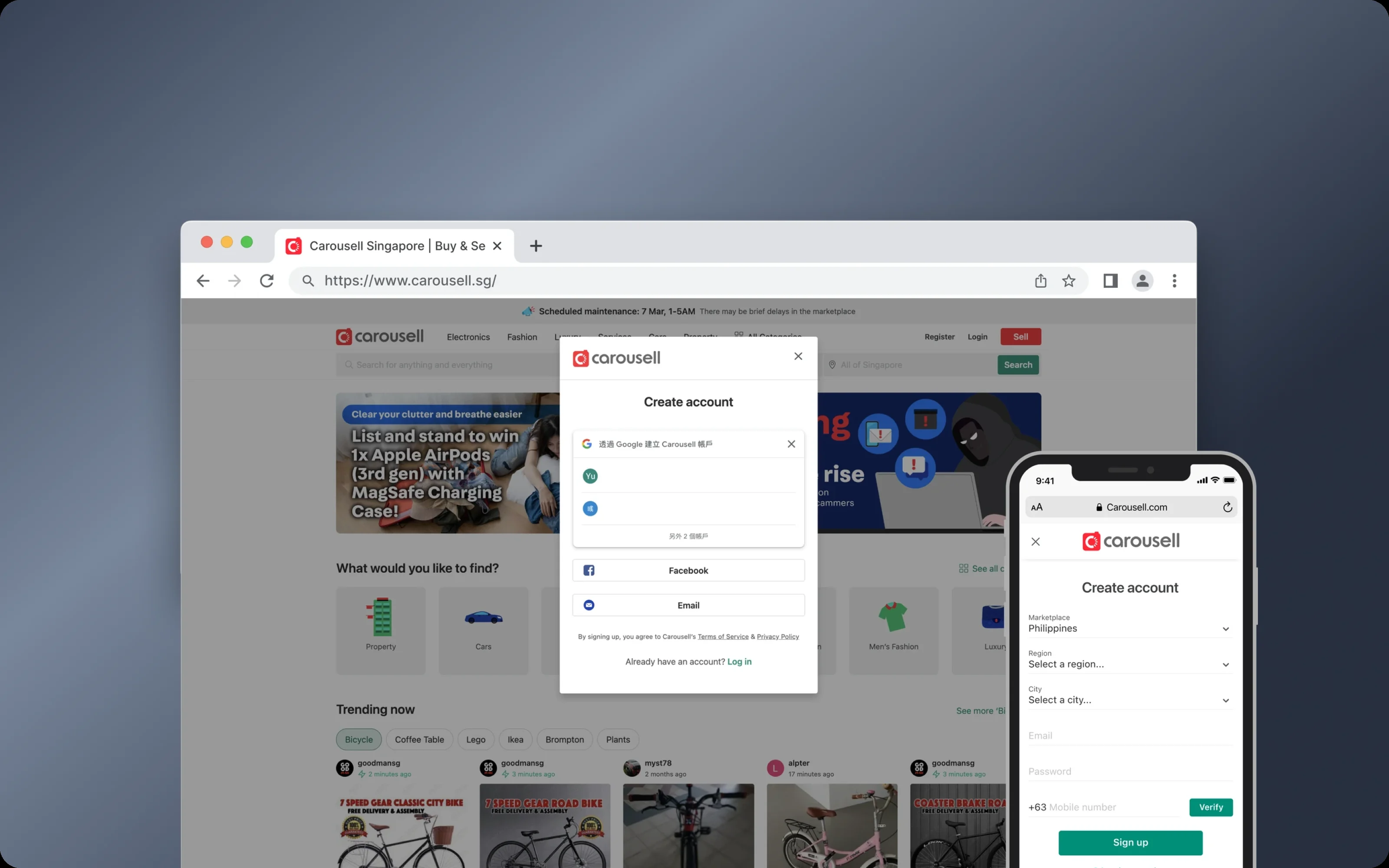
Carousell is a marketplace for buying and selling across Southeast Asia, Taiwan and Hong Kong. By 2022, only 60% of new users finished signing up. Four in ten left before they even started. I led the redesign of the sign-up flow to remove friction and give people a reason to stay.
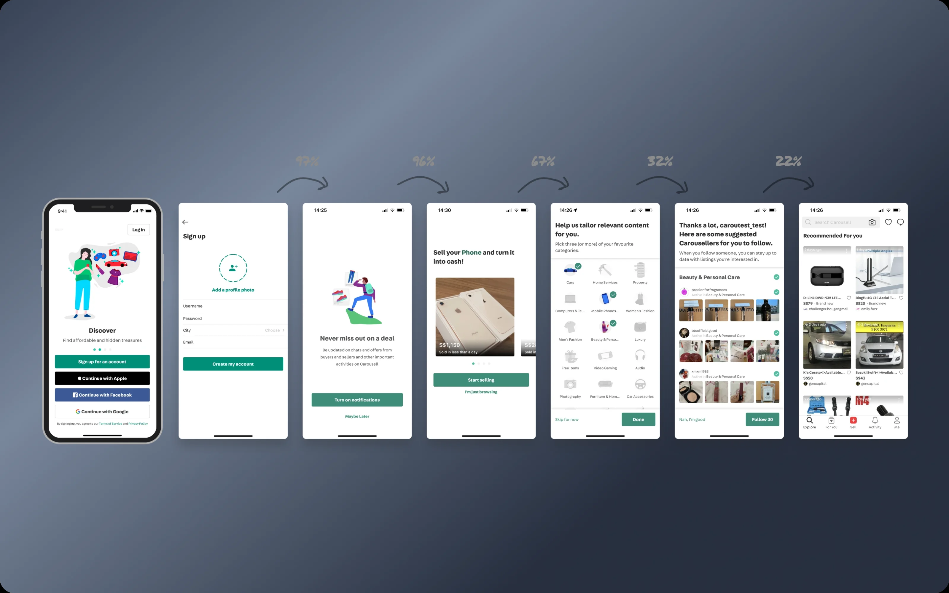
Where people dropped off
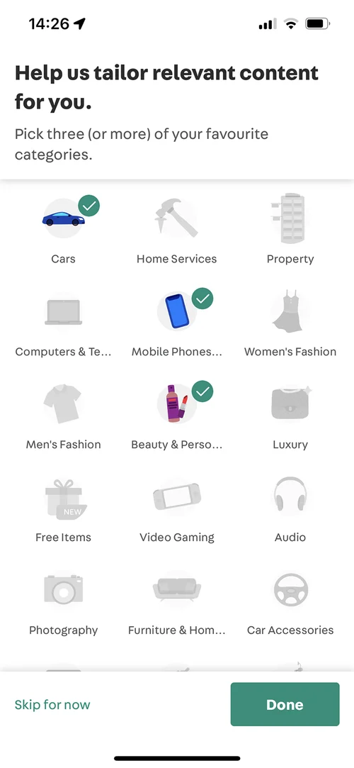
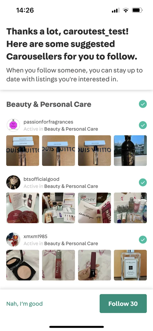
Six months of funnel data showed that the biggest drop was not account creation. It was the personalization steps after it: picking interests, following sellers and setting up a feed. We were asking people to make choices about a product they had not used yet.
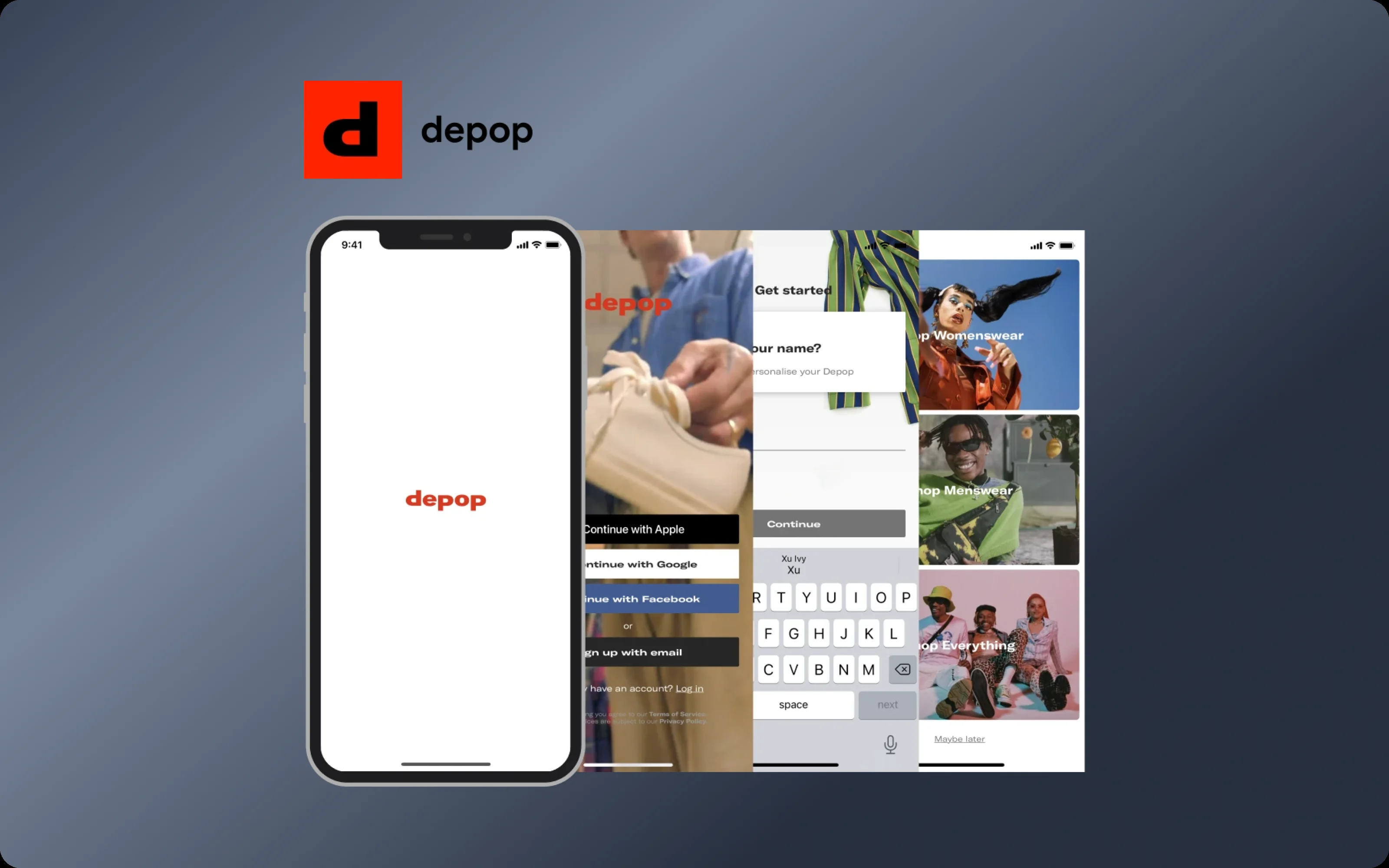
I interviewed 8 users across three groups: newcomers, casual users and active sellers. The same thing came up again and again. The app pushed a seller identity before people had decided how to use it. One person said, “I’m getting a feeling I need to sell something.”
Too much, too soon. People had to make choices before seeing what Carousell offered. The steps were not wrong, they were in the wrong place.
The wrong first impression. Seller-focused choices made buyers feel left out. One flow tried to serve buyers, casual sellers and merchants, and fit none of them.
Unclear screens. Old UI patterns and vague instructions made people hesitate.
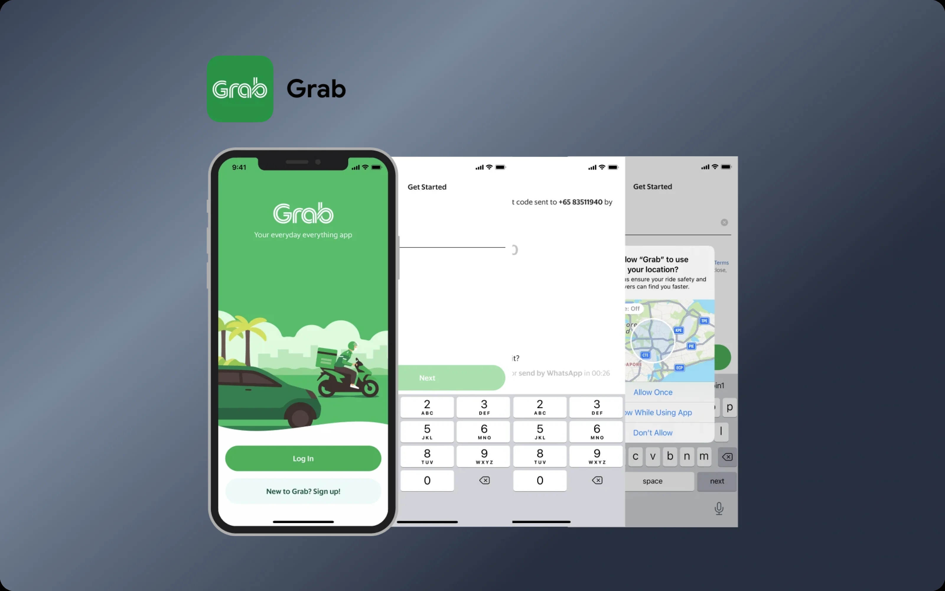
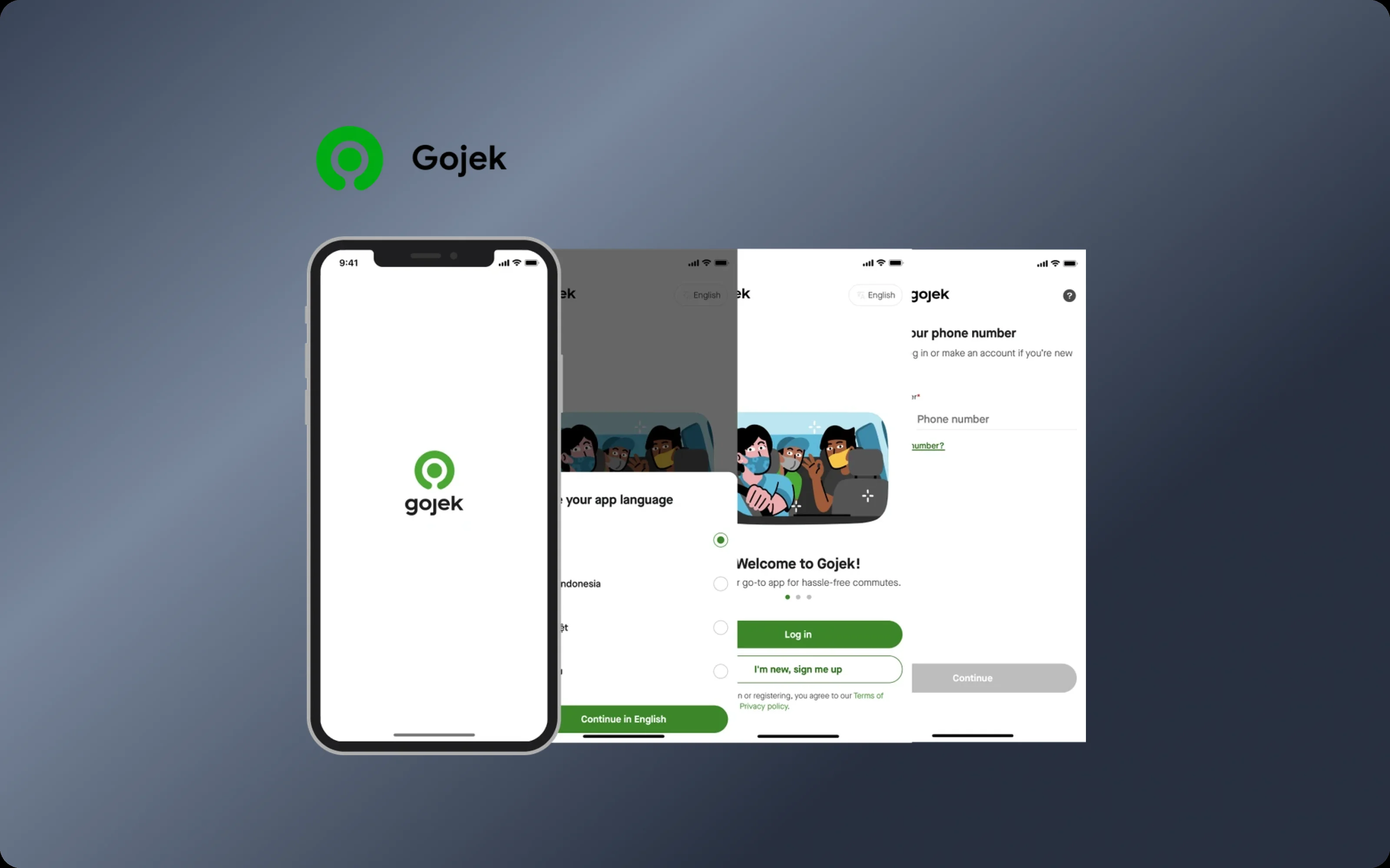
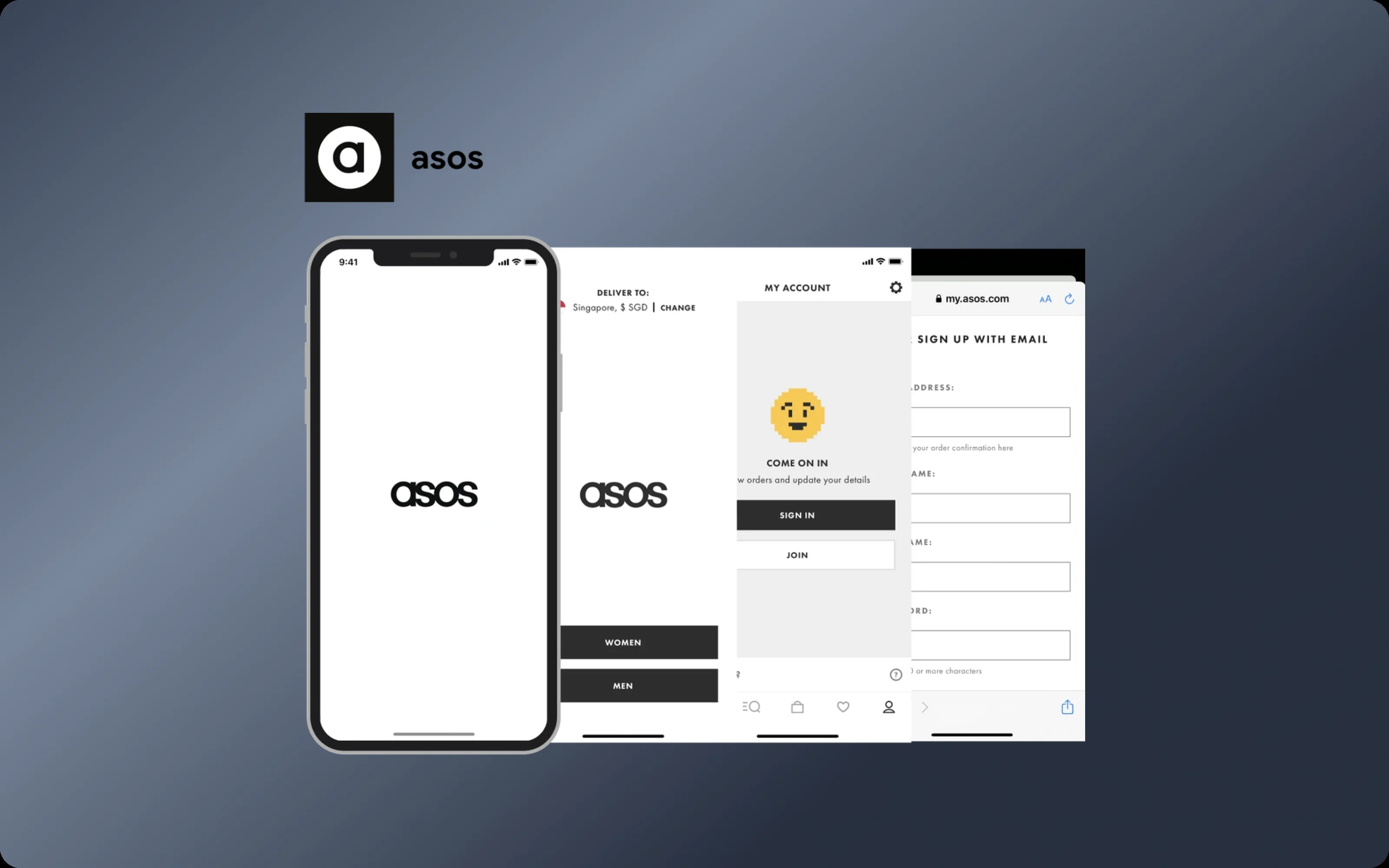
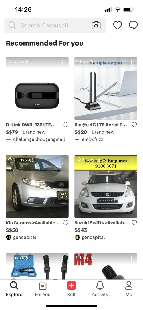
The best marketplace apps I looked at did the opposite: get people to their first useful moment fast, and ask about preferences later.
The best answer had to wait
To decide what to fix, I ran a workshop with our PM and researcher. We landed on one question: how might we tailor sign-up to what each person came to do?
The strongest idea was a personalized start. People pick buyer, casual seller or merchant, and each gets its own flow. It fixed the wrong first impression directly. But it needed a lot of backend work, and the timeline was already at risk.
So I made a call with the PM: a clearly better sign-up now, instead of a perfect one later. We split the project. Phase 1 took the changes with the most impact for the least effort, and the personalized start moved to phase 2.
What shipped
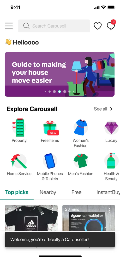
Personalization after sign-up. Picking interests, following sellers and setting up a feed moved to after sign-up, once people have seen the product.
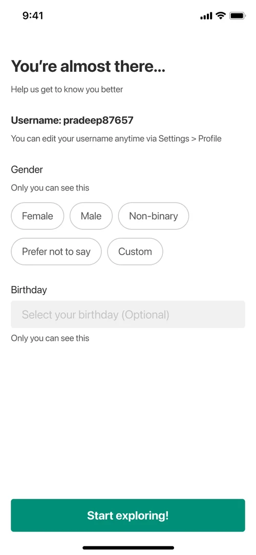
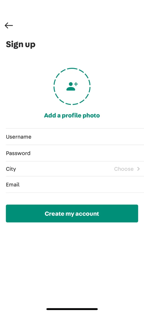
Lighter personalization. Only gender and age. Recommendations adjust on their own instead of asking people to set them up.
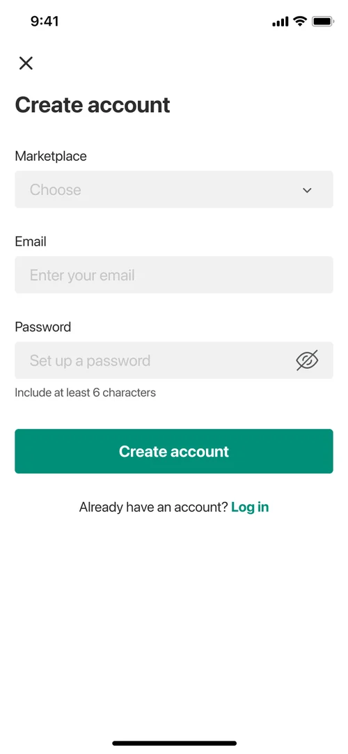
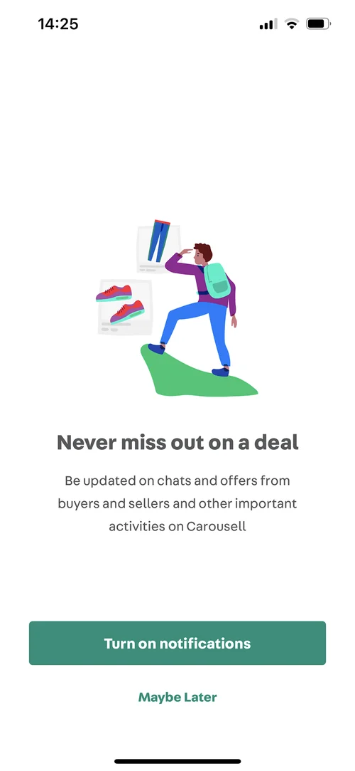
The new design system. Old components replaced, instructions rewritten, and a clearer hierarchy on every screen.
After 5 steps
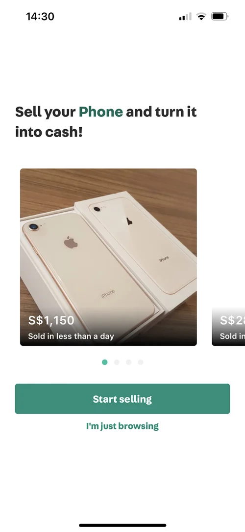
Before 7 steps
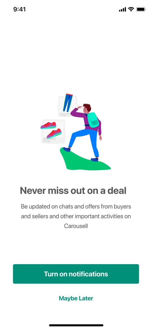
For web, I rebuilt native parts like date pickers, dropdowns and permission prompts with web patterns, so both versions feel the same.
Results
Phase 1 shipped on schedule.
Sign-up completion
+22%
New users
+13%
What I’d do differently
The deadline that forced us to split the work also showed what mattered most. Phase 1 got most of the impact without the personalized start.
But phase 2 never shipped. A phase 2 with no scope and no date is just a good intention. Next time, I’d plan it before phase 1 ships.
I’d also measure something else. Finishing sign-up isn’t the real goal; using the product is. I’d define the first-week action that predicts whether someone stays, and design sign-up to lead there.