Hi, I'm Yu. I design products that make complex things feel simple.
I care about systems thinking and asking the right questions. I use quick AI prototypes to test ideas early, and turn messy problems into products people trust.
At PayPayJapan's largest mobile payment app in Tokyo, I make paying and managing money easy for 65M+ users, even when the rules behind it are not. Before that, I worked on growth and engagement at CarousellMarketplace app across Southeast Asia and Taiwan in Taiwan and Singapore.
Outside work, I mentor designers at AAPDEducation platform for product builders in Taiwan and build small tools with code and AI.
Work
PayPay
I lead design for how money gets in and out of the wallet, from top-ups to ATMs to card payments.
Ryan was a key team member during my time at PayPay, where he consistently delivered high-quality designs across multiple projects. He also contributed to Design Ops by improving QA processes and accessibility.
Ryan is my team member at AAPD, where we teach Figma and UI design. He began as a teaching assistant and quickly advanced to an instructor role, demonstrating strong learning ability, attention to detail, and clear communication.
Ryan was a valued team member who independently led several challenging projects with unclear requirements. He brought clarity through thorough research and tackled problems with patience and a methodical approach.
Ryan was a former colleague at Carousell, and I was always impressed by his ability to balance user needs with business goals to deliver practical, thoughtful designs.
When design and development misaligned, he calmly found practical solutions with the team. His suggestions for bug fixes and optimizations boosted both product quality and team efficiency.
Ryan was a key team member during my time at PayPay, where he consistently delivered high-quality designs across multiple projects. He also contributed to Design Ops by improving QA processes and accessibility.
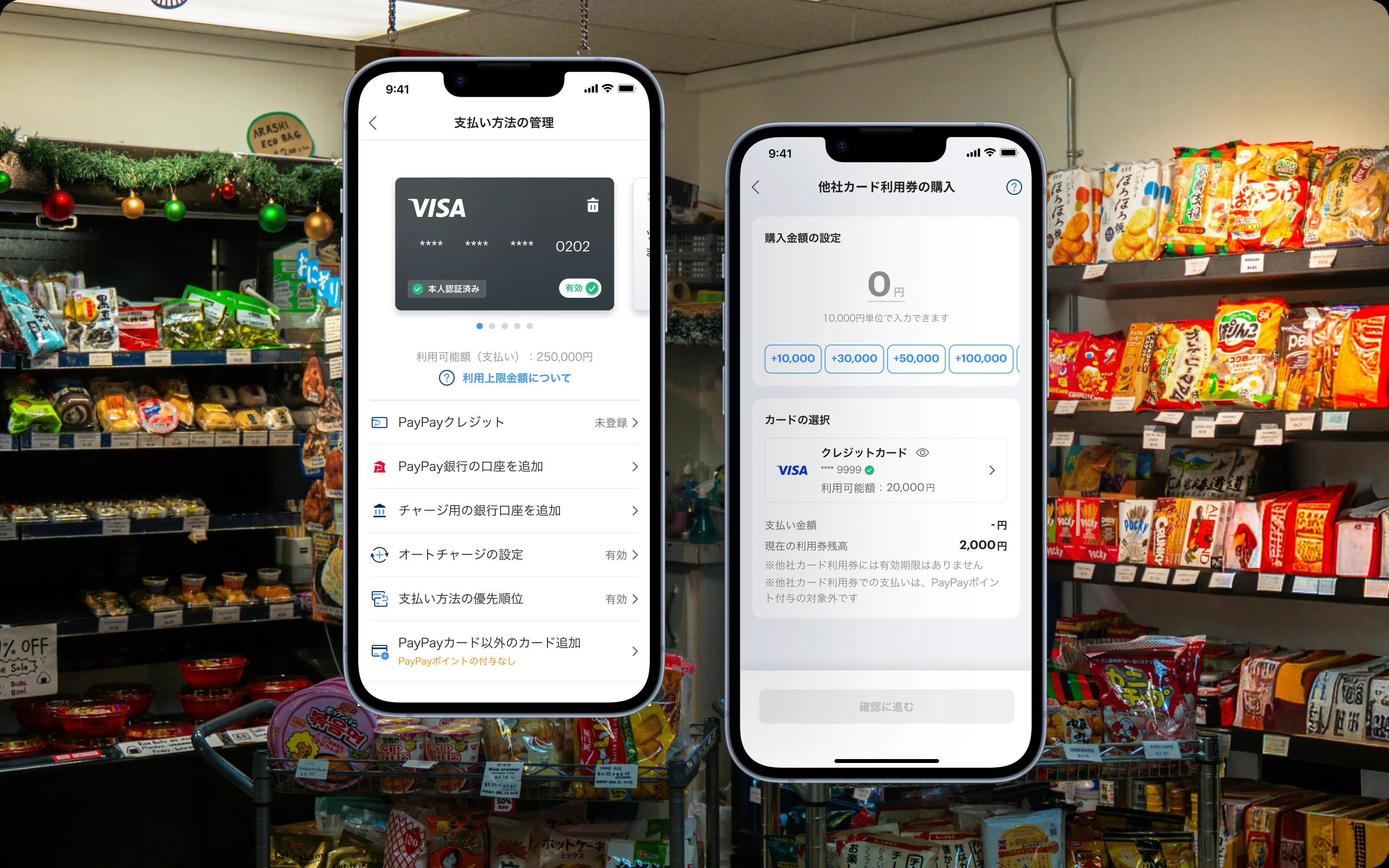
PayPay let people link an outside credit card and pay through the app. Every one of those payments came with a card network fee, and with 65M+ users that fee added up fast. Leadership set a date to turn it off. My job was to figure out how, without losing the people who used it.
Why people linked a card
I started by talking to users who paid with a linked card. Most weren’t loyal to PayPay. They used it because it’s accepted almost everywhere in Japan, while their card earned them miles and rewards. Removing card payments meant removing their reason to open the app. So the real question became: how do people keep their rewards without the card network?
When the obvious answer got blocked
The obvious fix was a top-up: charge the card, then pay from the balance. But legal flagged it. In Japan, a new stored balance counts as e-money, which needed a license we couldn’t get in time.
Vouchers don’t have that problem, because they can’t be transferred. So I proposed Credit Card Vouchers: buy a voucher with your card, keep your rewards, and pay as usual. No new license, no lost users, and engineering could reuse PayPay’s existing voucher system. It was approved quickly.
A softer cutoff
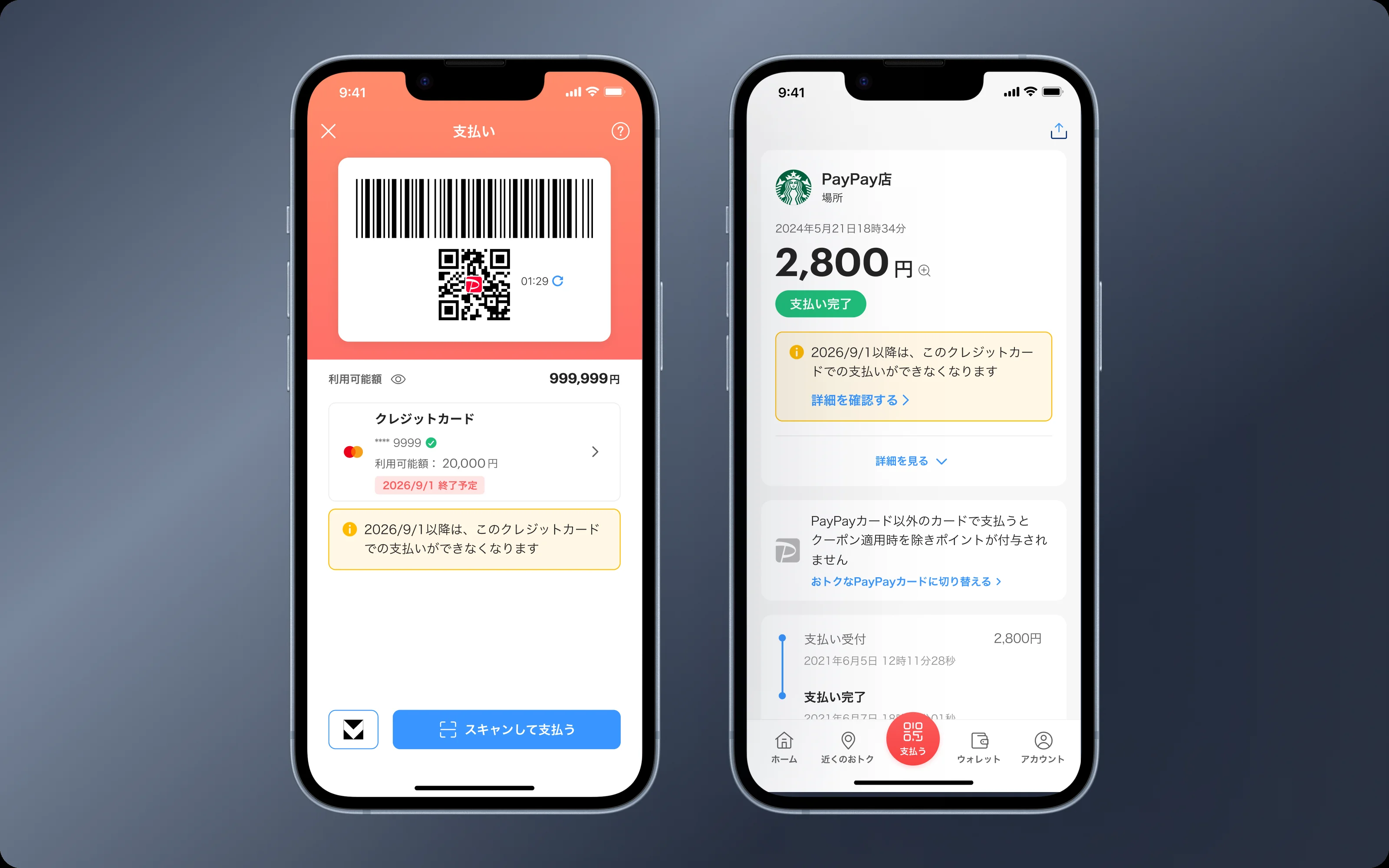
Engineering wanted to switch it off on a set date. But support data showed that surprise errors at checkout make people retry, lose trust, and feel embarrassed at the register. So I proposed a gentler path: a notice before the date, then a guided first voucher purchase. Engineering agreed.
Design
These users had paid by card for months, some for years. The design had to teach a new habit without pushing them to another payment app.
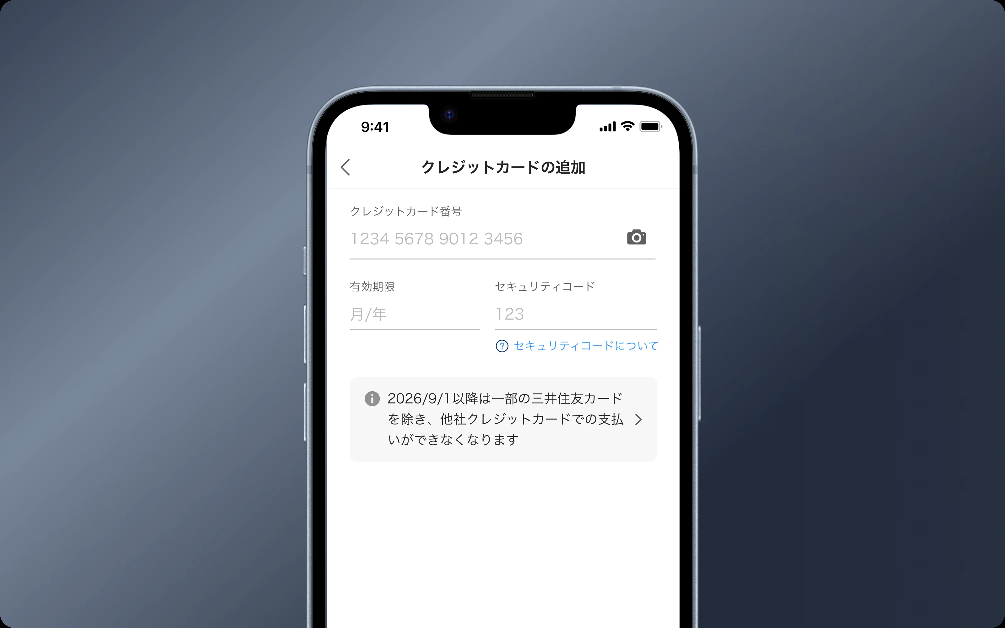
I used CTR data to place the notice where people actually look: the payment flow and the receipt screen. I also caught a gap. People adding a card for the first time would skip both, so the notice went there too.
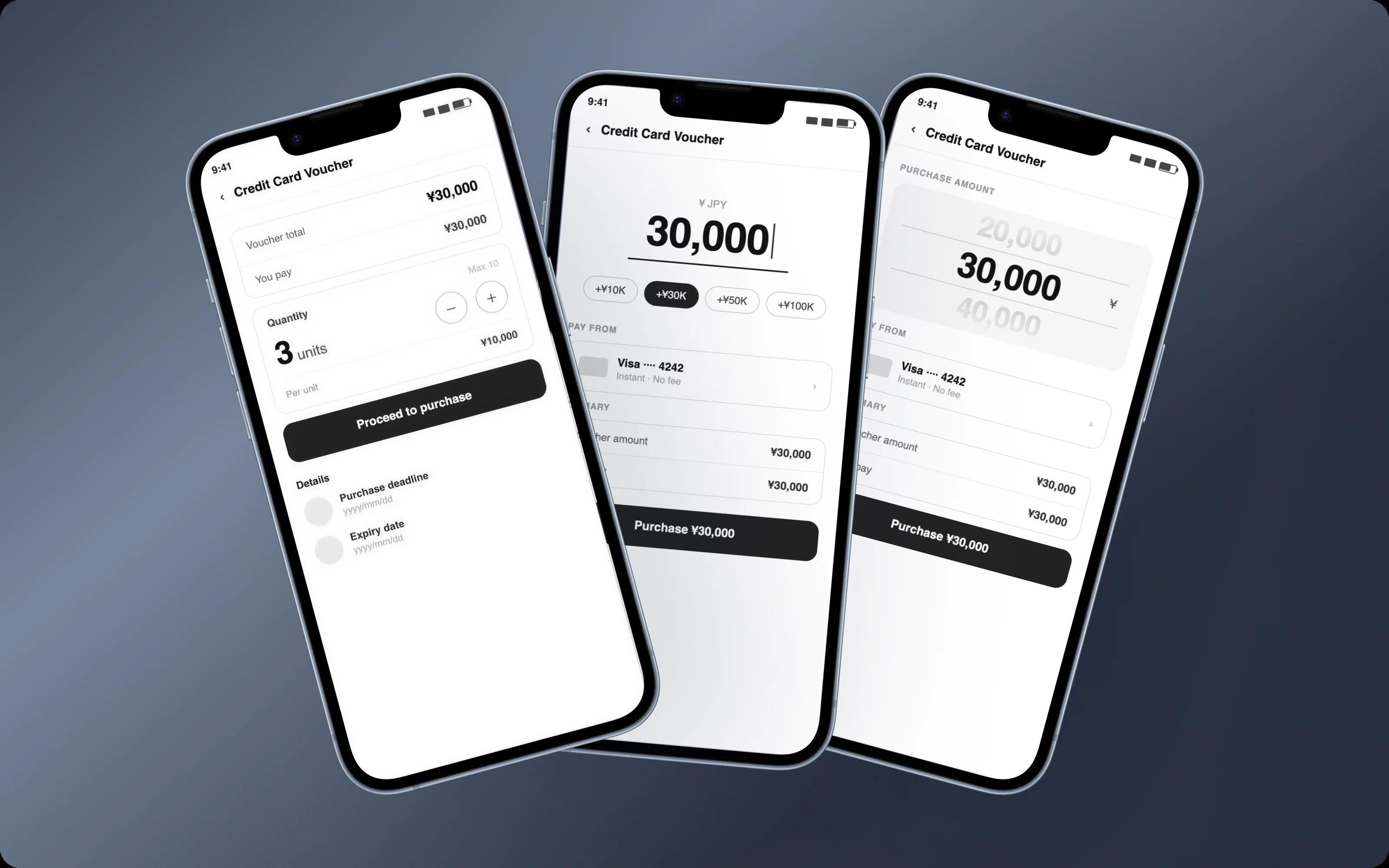
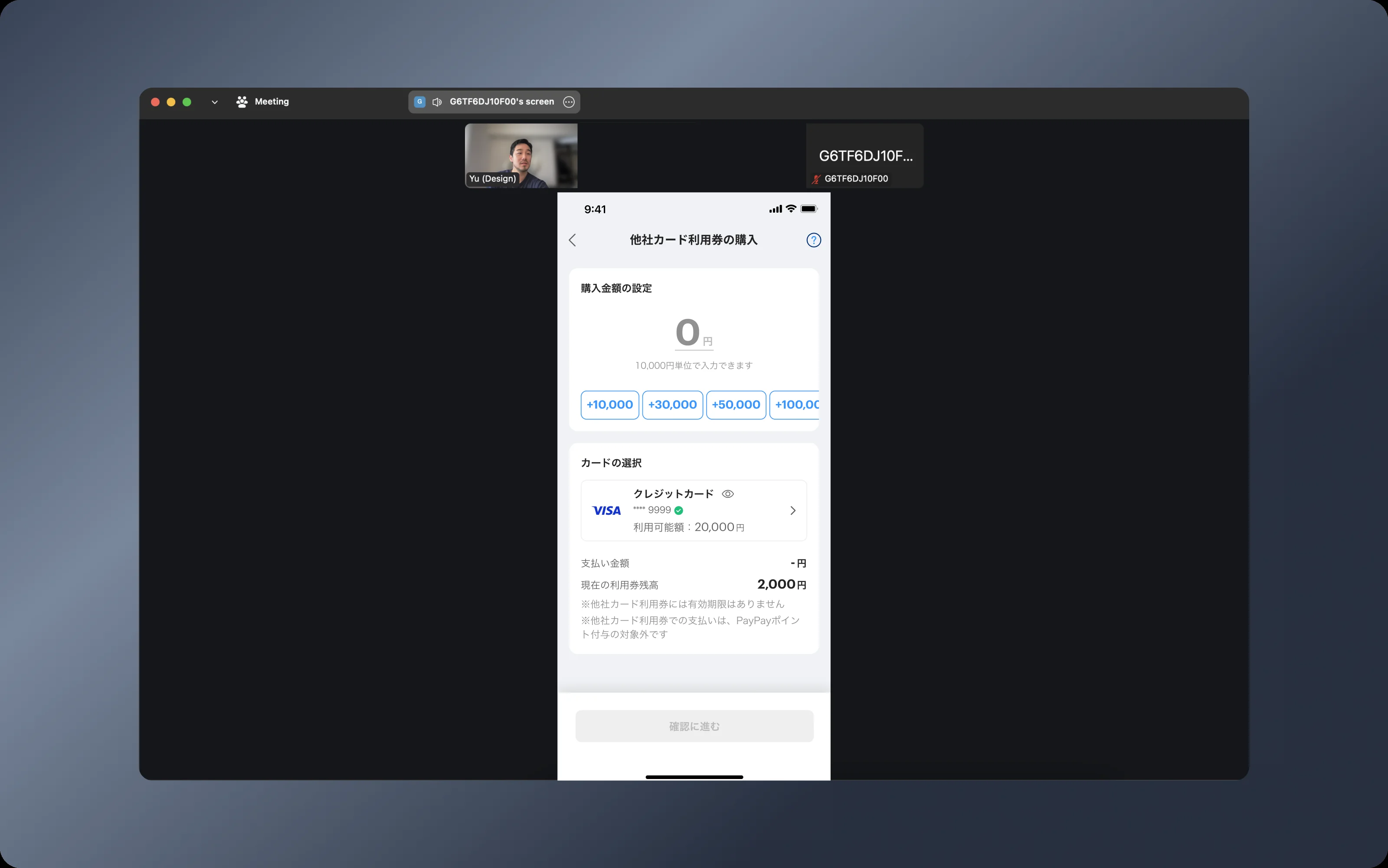
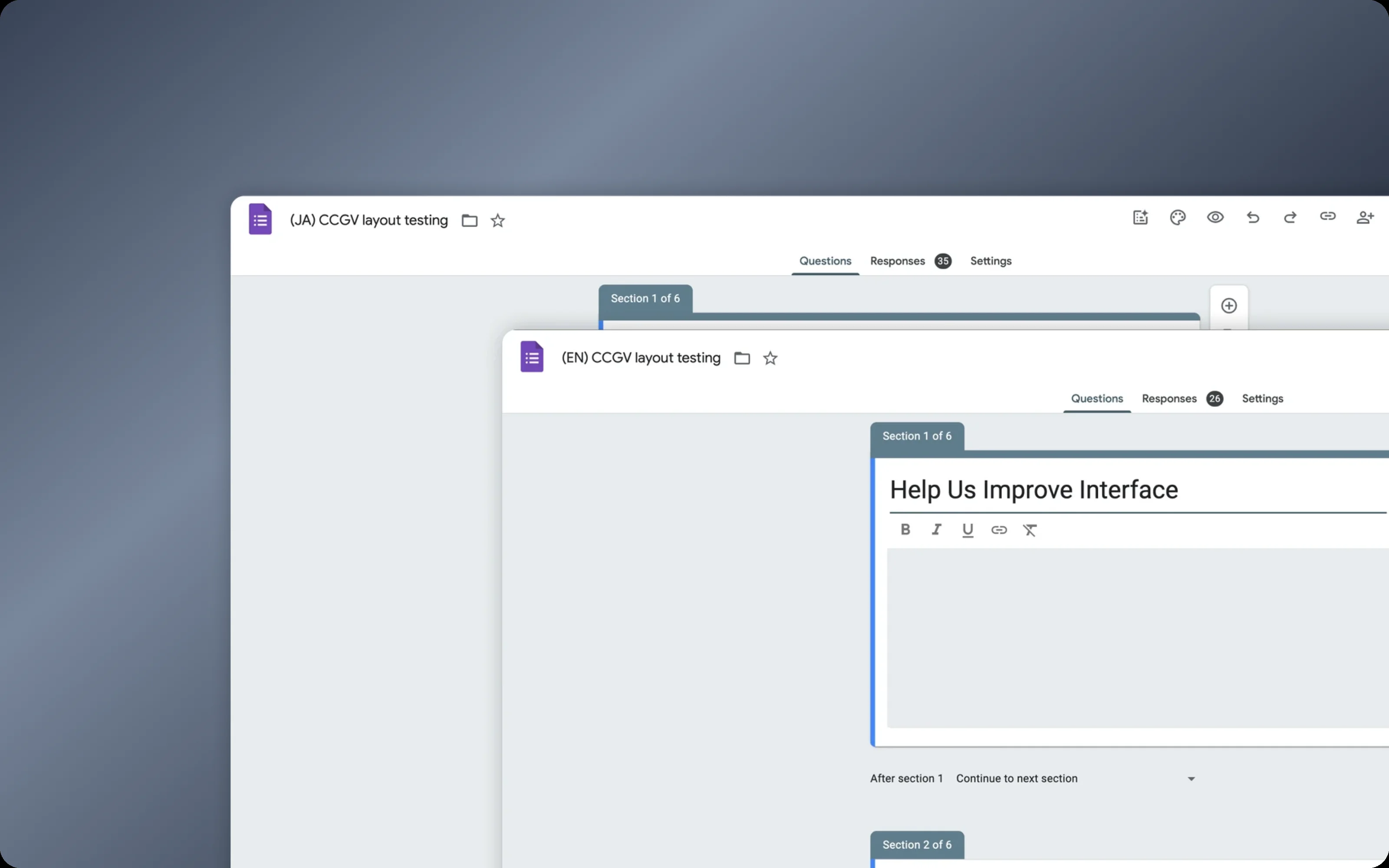
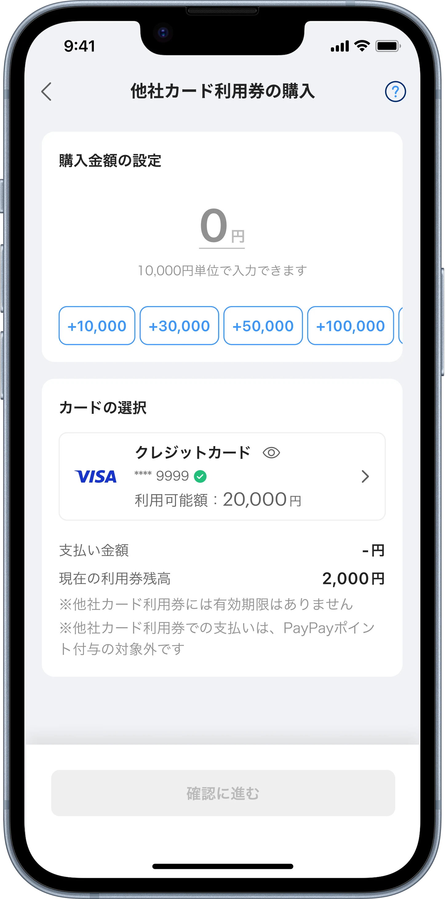
The hardest question was the purchase screen. Should it feel like buying a product with fixed amounts, or like a top-up where you type a number? I explored three directions: the existing gift voucher pattern, a top-up style input, and a scroll-based amount picker. Instead of deciding by opinion, I ran a bilingual survey and tested the three prototypes with 8 users. The top-up pattern won. People already knew how it worked, and that mattered more than being technically accurate. As one tester put it, “I don’t like having fixed amounts. I want to decide how much I put in myself.”
1234
1Amount inputType any amount, like a top-up. It's the pattern people already knew.
2¥10,000 stepsThe legal rule is shown up front, not as an error later.
3Quick amountsCommon amounts in one tap.
4Card and limitSee your card's available amount before you buy.
Details that mattered
Context first. Japanese users want to know why before they act, so a short page explains what is changing before asking them to do anything.
Fix, don’t block. Legal required amounts in ¥10,000 steps. Instead of an error, a floating button fixes the amount in one tap.
Straight back to paying. After buying, one button goes to payment with the voucher already applied. The whole recovery takes about 10 seconds.
Every state covered. I worked with engineering to design the success, pending and error states, so nothing unplanned showed up after launch.
Fix, don't block
Straight back to paying
When the CEO joined the review
In a design review, our CEO asked to use the purchase page to promote PayPay’s own credit card. I understood the goal, but an ad there would add friction right where drop-off risk was highest. I mapped the full journey and showed a better moment: the sunset notice, when users are already deciding what to do about their card. On the purchase page, the PayPay Card option became more visible in the payment method list instead. The CEO approved it.
Results
The feature is live for all card users. So far, about 30% of them have moved to vouchers, and I’m still tracking the data. The main signals are the voucher purchase success rate and the payment success rate. Support inquiries are the early warning: a jump there points to friction before it shows up anywhere else. What we learn will shape the next round of changes.
Also in this project
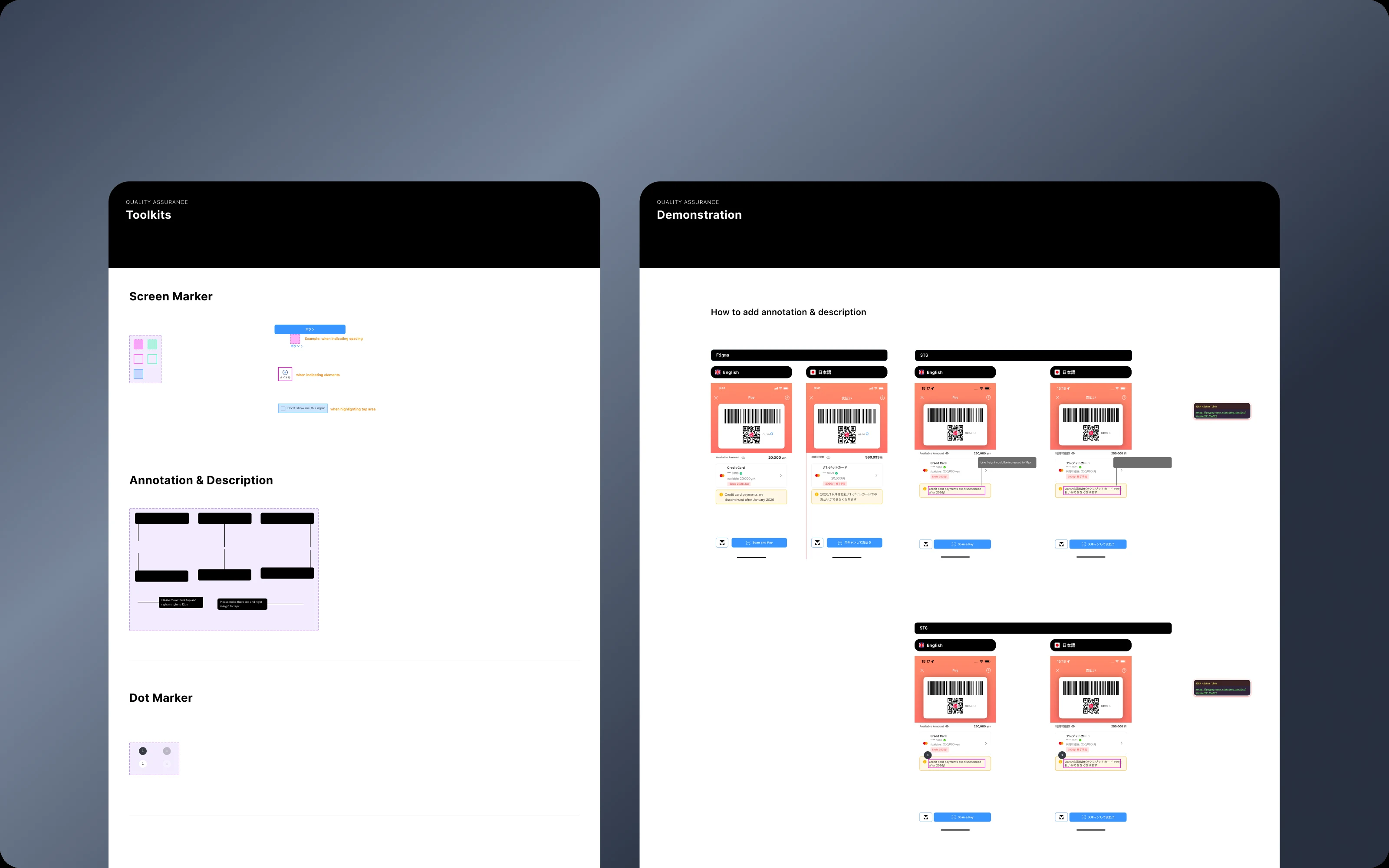
I set up a design QA process and a handoff kit to go with it: markers for spacing, elements and tap areas, numbered notes, and a link to each ticket. Other designers picked it up, and it became the team standard.
What I learned
In a project full of legal rules, late surprises are expensive, and design absorbs most of the cost. Now I bring legal and business in much earlier. Quick research still pays off too: a survey and 8 tests moved a big decision from opinion to evidence, and gave me a clear reason to point to in every review after.