


🤔
We know there's a significant percentage of sign-up failures. And we want to understand more about where and why they fail...
🤔
We know there's a significant percentage of sign-up failures. And we want to understand more about where and why they fail...
We analyze the data for the current sign-up flow over 6 months and calculate the conversion rate for each steps. During this analysis, we observe a significant drop-off on specific steps, suggesting that users are more likely to abandon the sign-up process at these steps.
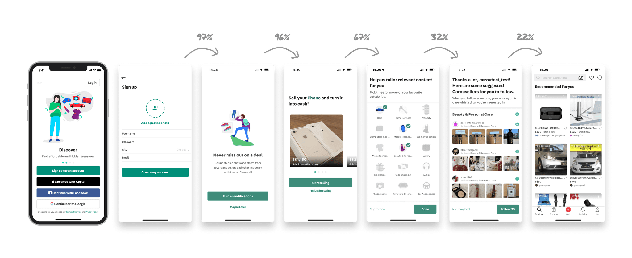


Next, in order to understand the reasons, we conducted user interviews with total 8 users, which included who have never used our product, casual and professional users.
During these interviews, we revisited the current flow with the them to gain insights from their experiences and identify any pain points that may exist on each step.


Some feedback from the users
Some feedbacks from the users
Some feedbacks from the users
It’s a lot to do with selling phones, I’m getting a feeling I need to sell something, feels like a seller oriented app
It’s a lot to do with selling phones, I’m getting a feeling I need to sell something, feels like a seller oriented app
Annoying, I have to keep skip skip, because I want to find product i need not something irevelant.
Annoying, I have to keep skip skip, because I want to find product i need not something irevelant.
I want to search for something, it’s been a long while since i click on `I want to browse
I want to search for something, it’s been a long while since i click on `I want to browse
「These are the popular choices.This is not adding any value to me, I’d rather browse myself and see」
「These are the popular choices.This is not adding any value to me, I’d rather browse myself and see」
Persona
Persona
After conducting interviews with 8 users, we have created 3 personas: buyers, casual sellers, and merchants.
By doing so, we can gain a better understanding of specific user pain points and develop solutions accordingly.
After conducting interviews with 8 users, we have created 3 personas: buyers, casual sellers, and merchants.
By doing so, we can gain a better understanding of specific user pain points and develop solutions accordingly.
After conducting interviews with 8 users, we have created 3 personas: buyers, casual sellers, and merchants.
By doing so, we can gain a better understanding of specific user pain points and develop solutions accordingly.


Problems
Problems
Following the research phase, we have identified the problems we aim to address in this project.
Following the research phase, we have identified the problems we aim to address in this project.
Following the research phase, we have identified the problems we aim to address in this project.
The current flow requires some unnecessary steps to complete the task.
Some personalized settings may be difficult for users to navigate and understand and create wrong impression.
Certain screens are confusing and lack clarity.
The current flow requires some unnecessary steps to complete the task.
Some personalized settings may be difficult for users to navigate and understand and create wrong impression.
Certain screens are confusing and lack clarity.
Competitive analysis
Competitive analysis
Before diving into the design process, we conducted a competitive analysis. This allowed us to establish benchmarks that we could leverage throughout the design phase.
Before diving into the design process, we conducted a competitive analysis. This allowed us to establish benchmarks that we could leverage throughout the design phase.
Before diving into the design process, we conducted a competitive analysis. This allowed us to establish benchmarks that we could leverage throughout the design phase.
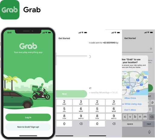


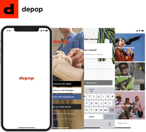


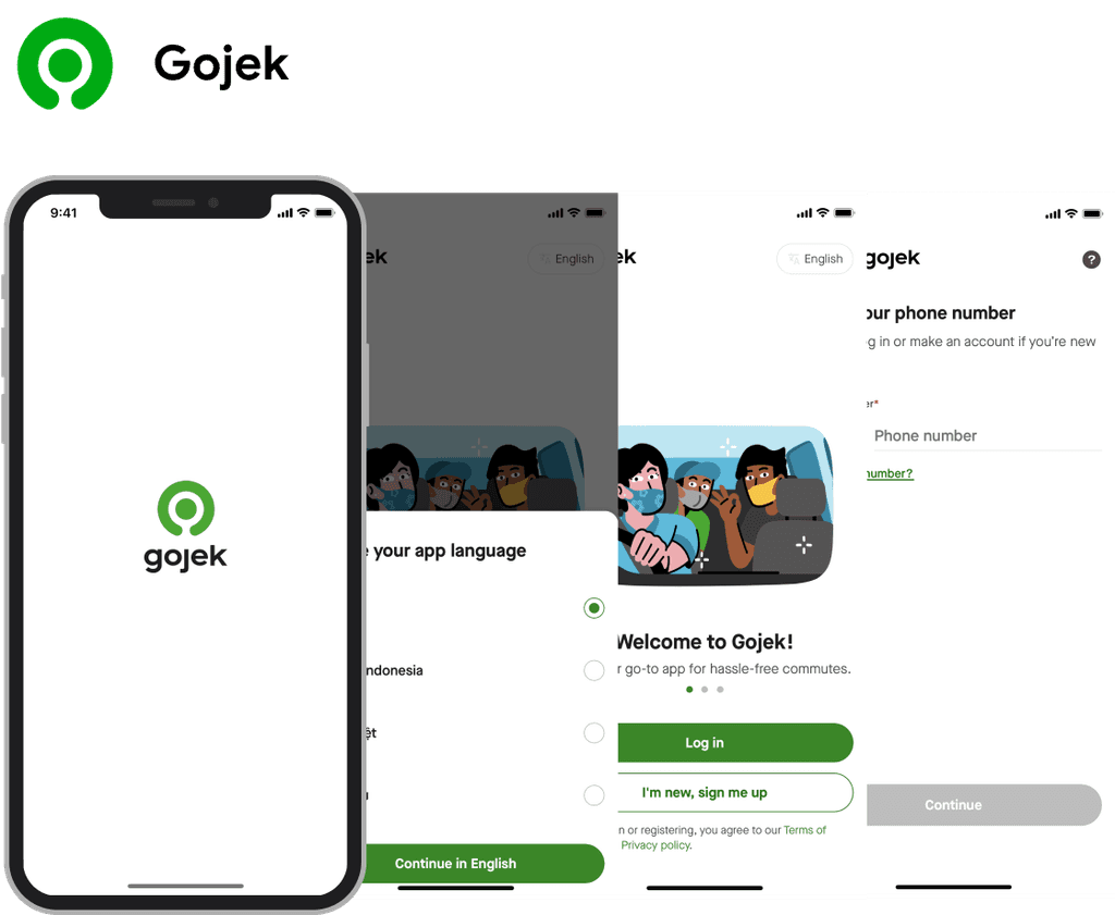


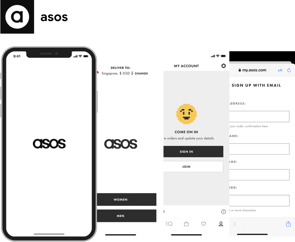


We learned that sign-up flow can be divided into three key steps:
Entering user information (email, password, mobile number, etc.)
Setting personalization preferences
Granting permissions (notifications, location, contact access)
Design
Design
We decided to hold a workshop to ideate the solutions with the team, including Designer, PM, and researcher. The participants will be divided into 3 groups, each working with a unique persona to guide their ideation. This approach helped ensure our ideas aligned with user needs and behaviors.
💡
"How might we design a concise and quick sign-up flow that only asks necessary questions, allowing users to experience the product first."
💡
"How might we design a concise and quick sign-up flow that only asks necessary questions, allowing users to experience the product first."


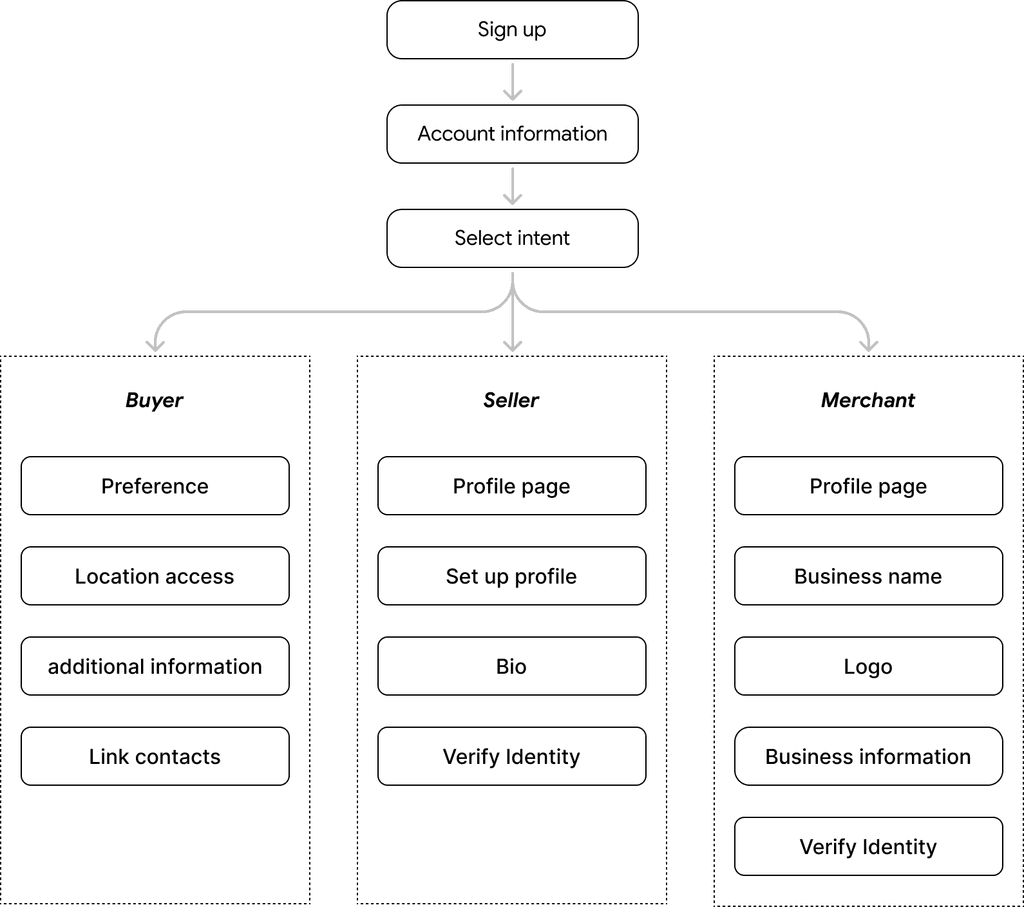
New flow: Personalized entry point
Based on the workshop results, we wanted to add a personalization step where users choose how they want to use the app— as a buyer, an individual seller, or a merchant. This helps tailor the sign-up and onboarding experience to their goals and guide them to the right starting point.


🚨
However, after workshop, We found that we are way behind schedule and other stakeholders are expect us to deliver on time...
🚨
However, after workshop, We found that we are way behind schedule and other stakeholders are expect us to deliver on time...
Therefore, we have made the decision to release this revamping in multiple phases, taking into account constraints with our development resources and project timeline.
Following thorough discussions and revisit the research insights, our focus in the first phase will be to let users to effortlessly create an account and exprience the product first.
To accomplish this, we adjust and refine the design by incorporating benchmarked practices and updating new design patterns. We are removing confusing and irrelevant screens as well, fostering a more intuitive and engaging user experience.
Wireframe flow
Wireframe flow
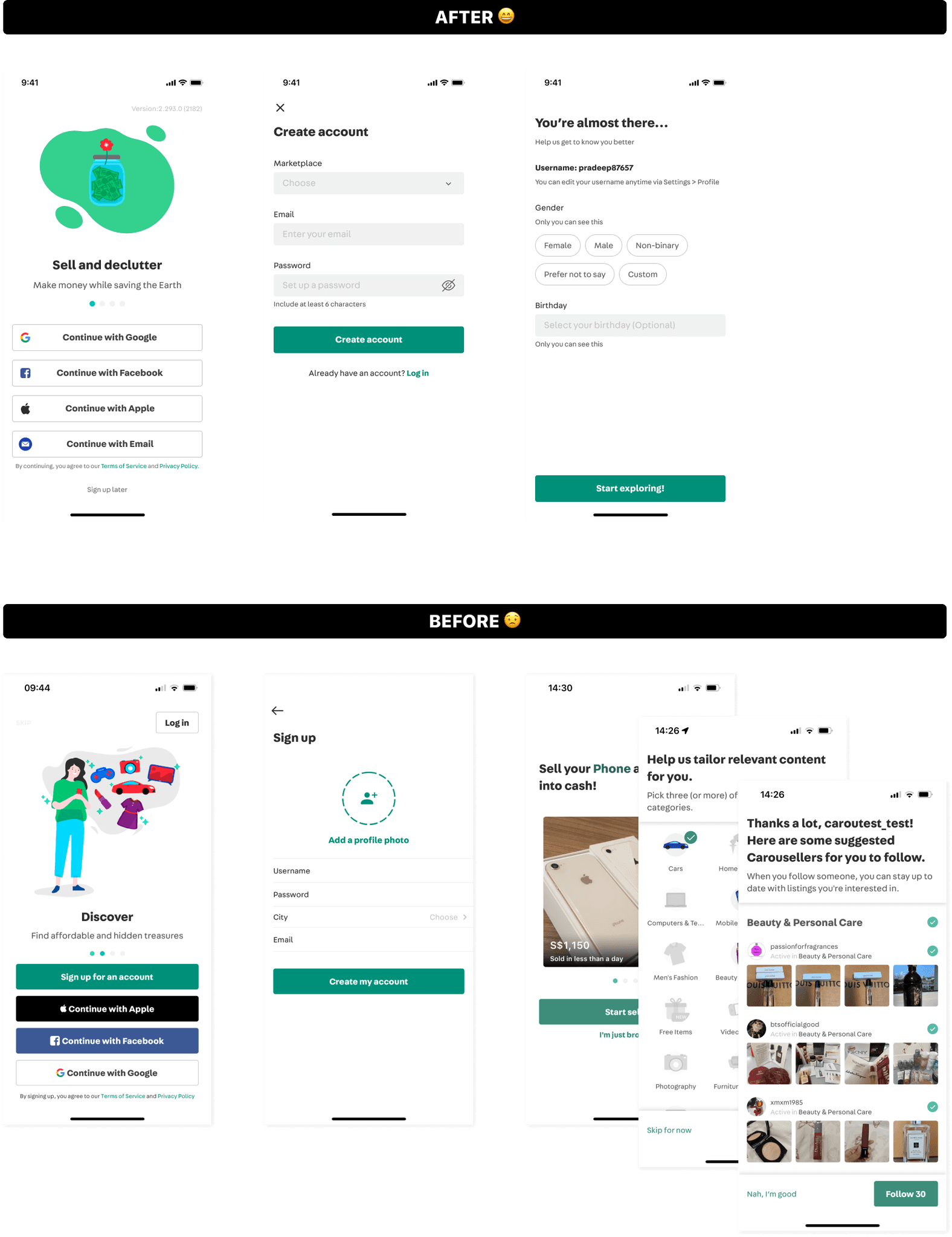
Simplified the flow from 6 steps to 3
Simplified the flow from 6 steps to 3
Simplified the flow from 6 steps to 3
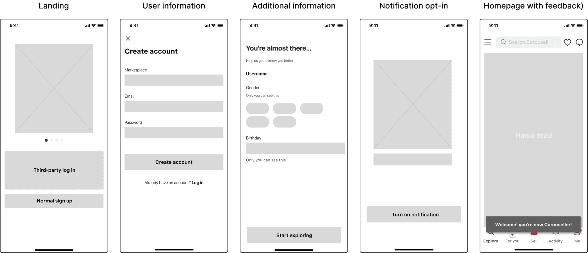


Final design
Final design
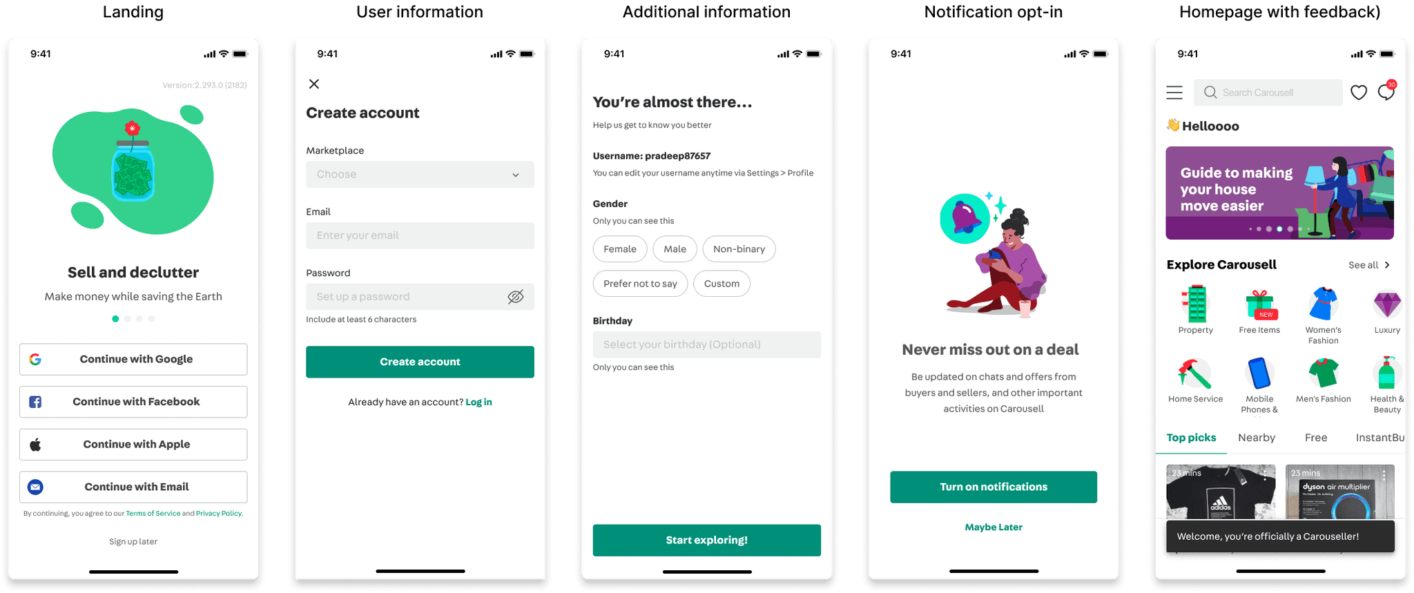
Finally, we delivered the final design and handed it over for development. Our focus was ensuring that users only need to input necessary information and experience product first.
Finally, we delivered the final design and handed it over for development. Our focus was ensuring that users only need to input necessary information and experience product first.
Finally, we delivered the final design and handed it over for development. Our focus was ensuring that users only need to input necessary information and experience product first.


Removed confusing screens to simplify the sign-up flow
① Updated UI elements using components from the new design system
② Simplified personalization by only asking for gender and age, Recommendations are automatically tailored—no manual selection needed
③Focused on helping users quickly create an account and start exploring the app


Web design
Web design
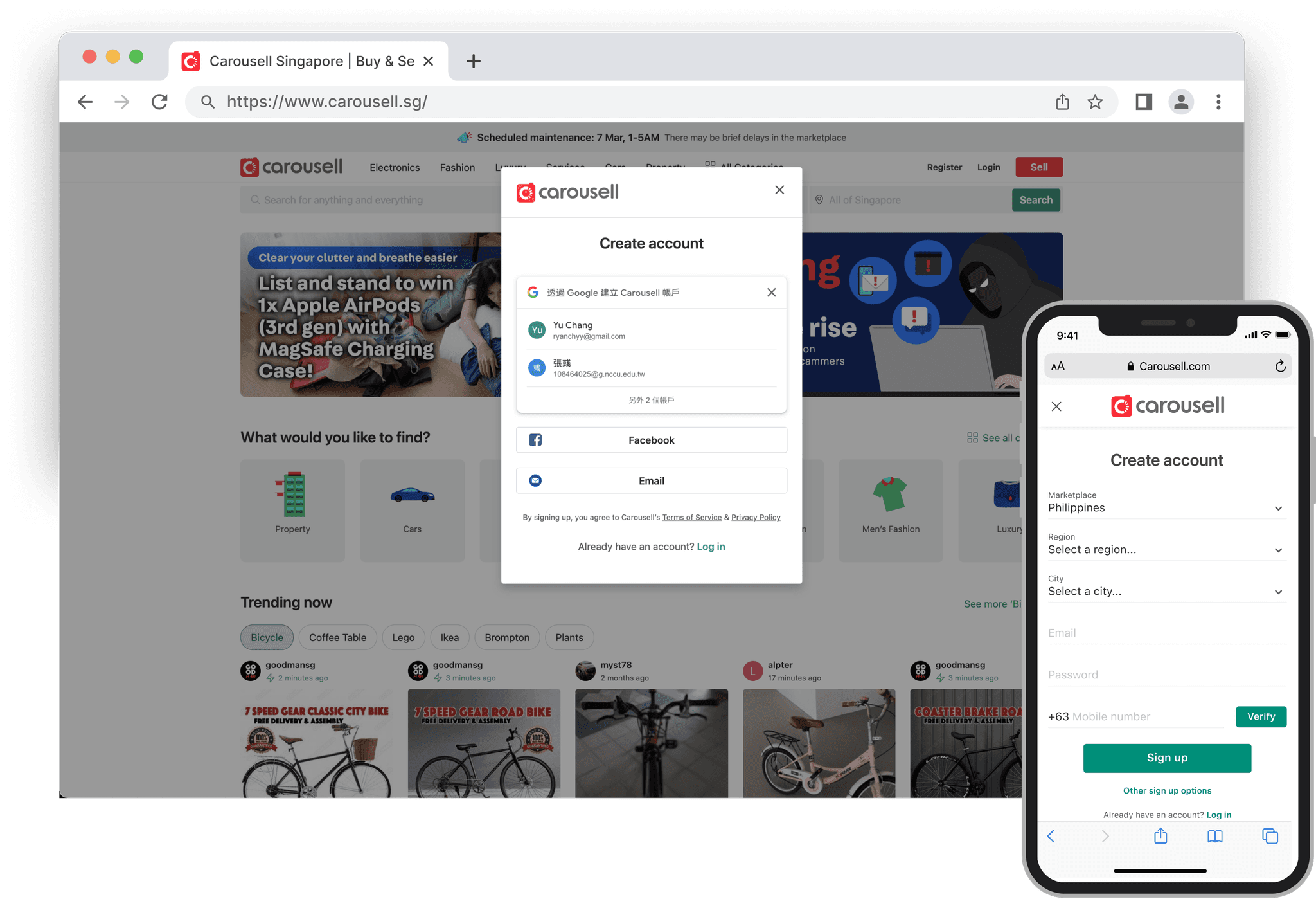
In addition to the app design, we have extended the new sign-up flow to the website as well, so as to ensure a consistent experience across all platforms.
In addition to the app design, we have extended the new sign-up flow to the website as well, so as to ensure a consistent experience across all platforms.
In addition to the app design, we have extended the new sign-up flow to the website as well, so as to ensure a consistent experience across all platforms.


Results
Results
After releasing the new sign-up flow, we measured its success metrics and found that it had successfully improved the user experience.
After releasing the new sign-up flow, we measured its success metrics and found that it had successfully improved the user experience.
After releasing the new sign-up flow, we measured its success metrics and found that it had successfully improved the user experience.
22%
22%
22%
Increase completion of sign-up flow
Increase completion of sign-up flow
Increase completion of sign-up flow
13%
13%
13%
Increase in the growth of new users
Increase in the growth of new users
Increase in the growth of new users
🔅
The journey never ends, there are more to come. We are ensuring that users who choose to embark on this journey with us will have a truly delightful experience.
🔅
The journey never ends, there are more to come. We are ensuring that users who choose to embark on this journey with us will have a truly delightful experience.
🔅
The journey never ends, there are more to come. We are ensuring that users who choose to embark on this journey with us will have a truly delightful experience.
Reflection
Reflection
I learned that sometimes it's necessary to prioritize and make trade-offs between project timelines and available resources when designing features. There's no such thing as a perfect or one-size-fits-all design. For example, we originally intended to provide different registration flows for different user groups. However, this would have required too many resources and would have competed with other ongoing projects. Therefore, we decided to phase it out.
Moreover, effective communication is crucial in design. It's important to understand the reasoning behind the design decisions and to communicate with the product manager and engineers to come up with the most feasible solution.
In addition, understanding the users' voices is critical. When necessary, we should conduct user interviews because the users are the ones who actually use the product, not the designers, engineers, or product managers. Our job is to advocate for the users while also considering the company's business needs.
Sign-up flow revamping
Sign-up flow revamping
Timeline
Jul 2022 - Oct 2022
Jul 2022 - Oct 2022
Responsibility
Responsibility
End-to-end design process
End-to-end design process
Company
Company
Carousell
Carousell
Overview
Overview
Last year, only about 20% of users were able to complete the whole sign-up process. To improve new user acquisition, we plan to redesign the sign-up experience for our product.
Impact
Impact
↗22% Increase completion of sign-up flow
↗13% Increase in the growth of new users
↗22% Increase completion of sign-up flow
↗13% Increase in the growth of new users
Sign-up flow revamping
Sign-up flow revamping
Top ↑
