End-to-end design process, User testing
About 80% of users add money to PayPay through ATMs. This year, we're expanding ATM features like cardless deposits and withdrawals with PayPay Bank. Our goal is to create an all-in-one platform where users can access all atm-related feature they need with just their phones.
*PayPay is the digital payment tool; PayPay Bank is a traditional bank that we merged into our group recently.
Feedback from users
Impact
↗ 18% increase in atm services adaption rate
↘ 13% decrease in customer service inquiries
Outcome Showcase
Users can now access all ATM features with just their smartphone—no need to carry or worry about forgetting a bank card.
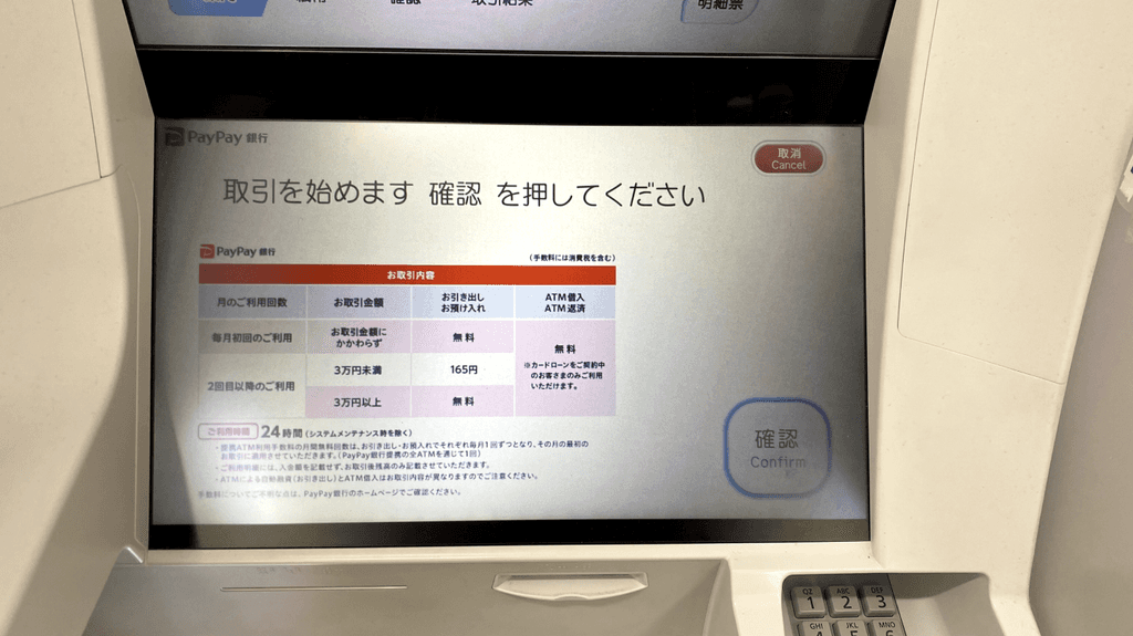
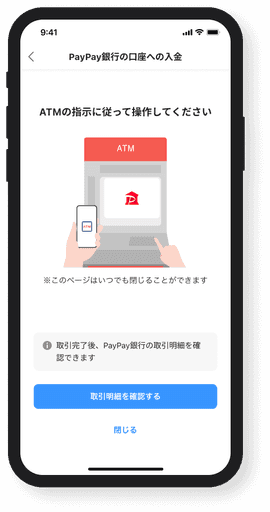
As demonstrated in the video, simply scan a QR code and enter a PIN to withdraw cash.
Understanding the needs
We recently merged PayPay Bank and plan to integrate some of its features into our app to improve adoption and make services more accessible.
We've also received frequent requests for an ATM cash-out feature, giving users more flexibility in managing their money.
+ PayPay Bank Cardless deposit/withdrawal
+ PayPay E-money cash-out
Therefore, I’m thinking of a single screen that brings all ATM-related features together, so users can easily find what they need without jumping between different services or screens. And it also let users see what other features we offer.
But at the begining of the project
We were facing a tight timeline and limited engineering resources, which made it necessary to prioritize among all the features we want to build. I collaborated with PM and business teams for a brainstorming workshop, where we applied the Impact/Difficulty Matrix to evaluate two features: Bank cardless deposit/withdrawal and E-money cash-out. I contributed insights during the session to highlight which feature would generate more user value.
As a results, Bank contactless deposit/withdrawal stood out as a high-impact, low-difficulty option—it addressed a clear user need and could be implemented quickly with minimal technical dependencies. and aligned with our 2025 business roadmap to integrate services across entities into an all-in-one platform. On the other hand, E-money cash-out involved more regulatory complexity—particularly around anti-money laundering laws—which introduced higher risk and uncertainty.
Understanding users of the cardless deposit and withdrawal
Identify the user flow
I visited an ATM and tested the process using competitor apps and benchmark common design and flows.
⊕

Gather insights from customer support team
I collaborated with the customer support team to gather user inquires regarding cardless ATM. We then grouped them into key categories for further synthesization.
Review the data
I looked at the data to find where most users were dropping off or having issues, and dug into what was causing it.
Digging deeper — mapping out both traditional and cardless flows.
Traditional flow vs. Contactless flow

Pain Point ①:
The initial setup takes time and has a high failure rate
→ We need to verify users' identities to prevent fraud. Each verification method has a different process, making it difficult for users to understand what to do and which one to choose.
Pain Point ②:
Lack of clear instructions after scanning QR codes
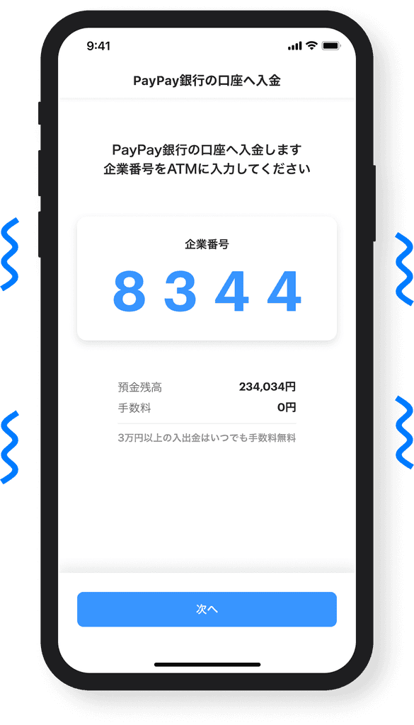
→ After scanning the QR code on the ATM screen, users see a corporate number on their phone, which they need to enter on the ATM. However, there are no proper instructions guiding them to switch to the ATM, leaving them confused and unsure of what to do next.
Pain Point ③:
After completing a withdrawal/deposit, there’s no clear confirmation message
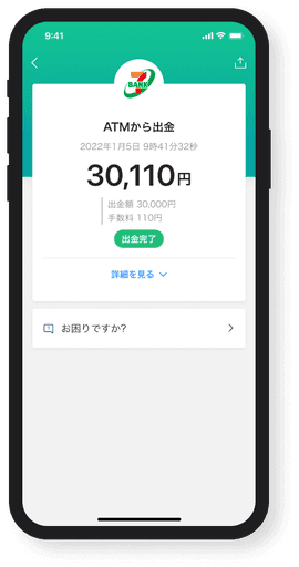
→ Due to technical constraints, it's challenging to display the withdrawal/deposit amount and total balance during the cardless flow, leaving users uncertain if the transaction was successful.
Draft design
I created wireframes and flows mapping the interaction between mobile and ATM screens.


Some key points about the design solution:
Simplify the initial setup by reducing steps and pre-filling user data with consent.
Use clear instruction to guide users on what to do next after scanning qr code.
Provide clear confirmation and feedback when the transaction is completed.
After sharing the draft design, I received a variety of feedback from the team, especially about the entry screen for services selection, which is one of the most improtant screens of the flow

Since the feedback was mixed and lacked a clear direction, I saw it as a good opportunity to run a user testing.
User testing
I created 4 mockups based on the feedback and tested them with 8 participants. We asked about their first impressions, what caught their attention, and where they would interact to complete the task.
Mockup 1

Using outlined buttons and separate sections to clearly distinguish between PayPay and PayPay Bank
Mockup 2

Adding icons to make the buttons stand out more and better highlight the differences between options
Mockup 3

Tring vertical button layout to improve scanability.
Mockup 4

Adding illustration to draw attention to the call to action.
Some quick insights:
Adding icons helped users recognize the options more easily.
The illustration didn’t add much value and just made the screen feel cluttered.
Users preferred the horizontal button layout, as it better matched the overall page structure.
After user testing, I moved on to finalizing the design!
Final design

Choose withdraw/deposit


Second Iteration
After launching the feature, we found that customer service inquiries increased. We immediately analyzed the details by checkiing the inquiries and data points of the flow.
We identified 3 major issues:
😖
Users found the initial setup got lost easily
🤔
PayPay and PayPay Bank mistaken for each other
🫨
Balance Top-up users were confused by the new screen
Before

After

😖 Users found the setup process challenging and got lost easily
🤔 PayPay and PayPay Bank features mistaken for each other
→ Adding a half-sheet before the next screen to clarify the action.


🫨 Top-up users were confused by the new screen
→ Adding a tutorial dialog to introduce the new screen and guide users on the updated behavior.
Results
Some reviews from users↓
Super convenient! I love how I can withdraw and deposit cash without needing my card.
The process is smooth, and the instructions are clear!
Really useful feature! The interface is intuitive, and I can set up easily!
Future Ideas
During the iteration, I also came up with some ideas for future improvements, such as:
Adding haptic feedback to provide users with a strong feedback, helping them feel more confident in their actions.
Before
After
Instead of ending on a static page, once completed, the data will be retrieved through an API from the ATM, displaying the transaction success and amount. Making the experience better.
Learning
Throughout this project, I gained several important insights:
When faced with unclear or ambiguous requirements, it's crucial to raise questions early. Doing so not only saves time and resources but also ensures the team is aligned with the company’s goals from the start.
Bringing features together across multiple devices and services takes careful effort. Hands-on testing and observing in real-world scenarios are crucial for spotting issues that might not appear in theory or isolated development.
No matter how thorough the initial research is, user behavior in real-world scenarios often diverges from expectations. Continuous follow-up and iterative improvements based on actual usage data are essential to refine the product and truly meet user needs.