Activity Screen Revamping
Activity Screen Revamping
Top ↑
Activity Screen Revamping
Activity Screen Revamping
Timeline
Timeline
Dec 2022 - July 2023
Dec 2022 - July 2023
Responsibility
Responsibility
End-to-end design process, User research
End-to-end design process, User research
Company
Company
Carousell
Carousell
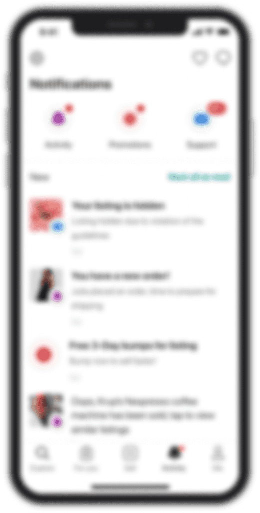
The Activity tab is a key screen visited by 80% of users daily, where they track account and order activities. We also use it for sharing platform updates, gather feedback, and promote marketing campaigns.
However, there isn’t a clear way for users to take the next steps, so we aim to drive more engagement, boost conversions, and increase revenue by improving order notification management.
Impact
↗ 15% increase in CTR for order-related updates
↗ 7% increase in notification screen time
↗ 15% increase in CTR for order-related updates
↗ 7% increase in notification screen time
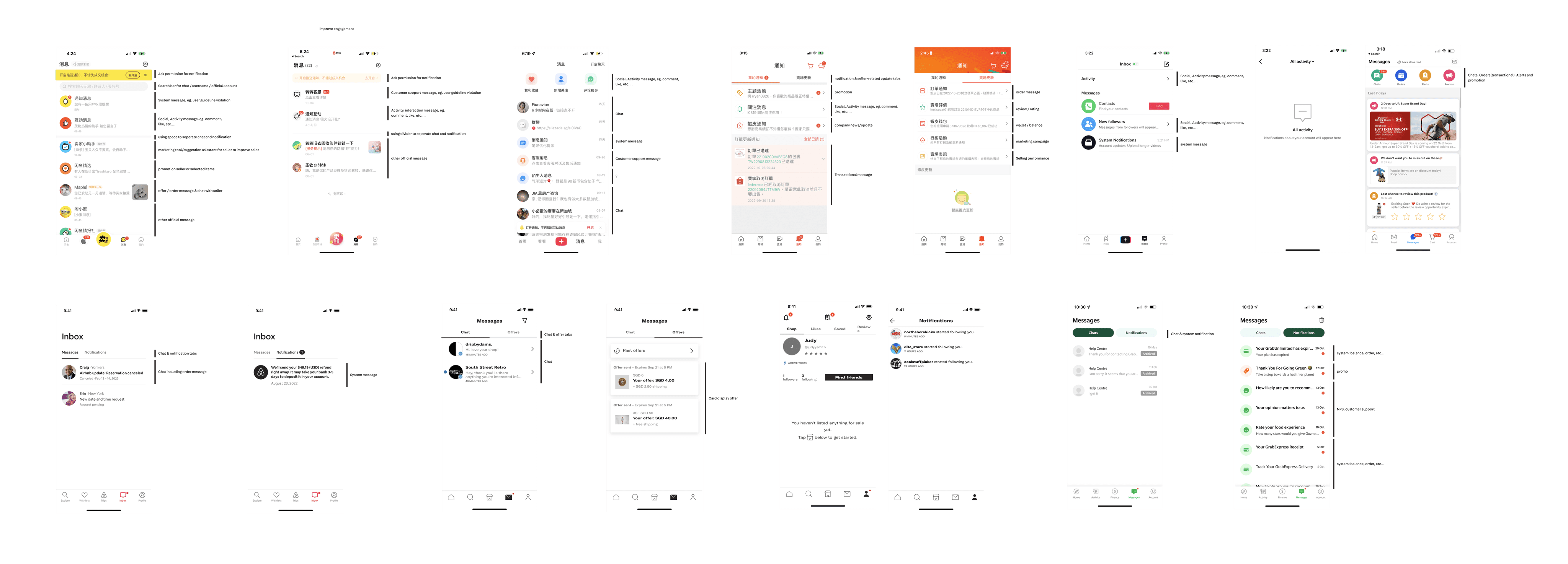
📈 Let's begin with data to have a understanding of the current situation.
📈 Let's begin with data to have a understanding of the current situation.
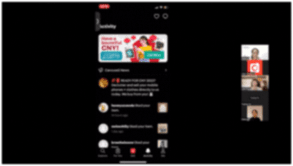
Audit
Audit
At the beginning of this project, I sample the CTRs of each section in the current activity tab over a period of 6 months.
At the beginning of this project, I sample the CTRs of each section in the current activity tab over a period of 6 months.
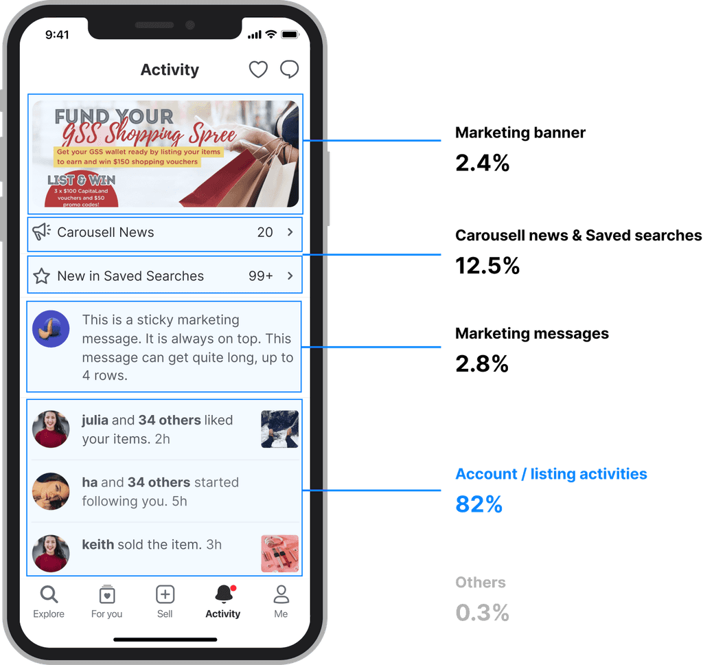
We've found that some content, like marketing banner, Carousell news, and marketing messages has a low CTR but takes up a lot of space. This reduces the visibility of account/listing activities, which have a higher CTR and more relate to users.
We've found that some content, like marketing banner, Carousell news, and marketing messages has a low CTR but takes up a lot of space. This reduces the visibility of account/listing activities, which have a higher CTR and more relate to users.
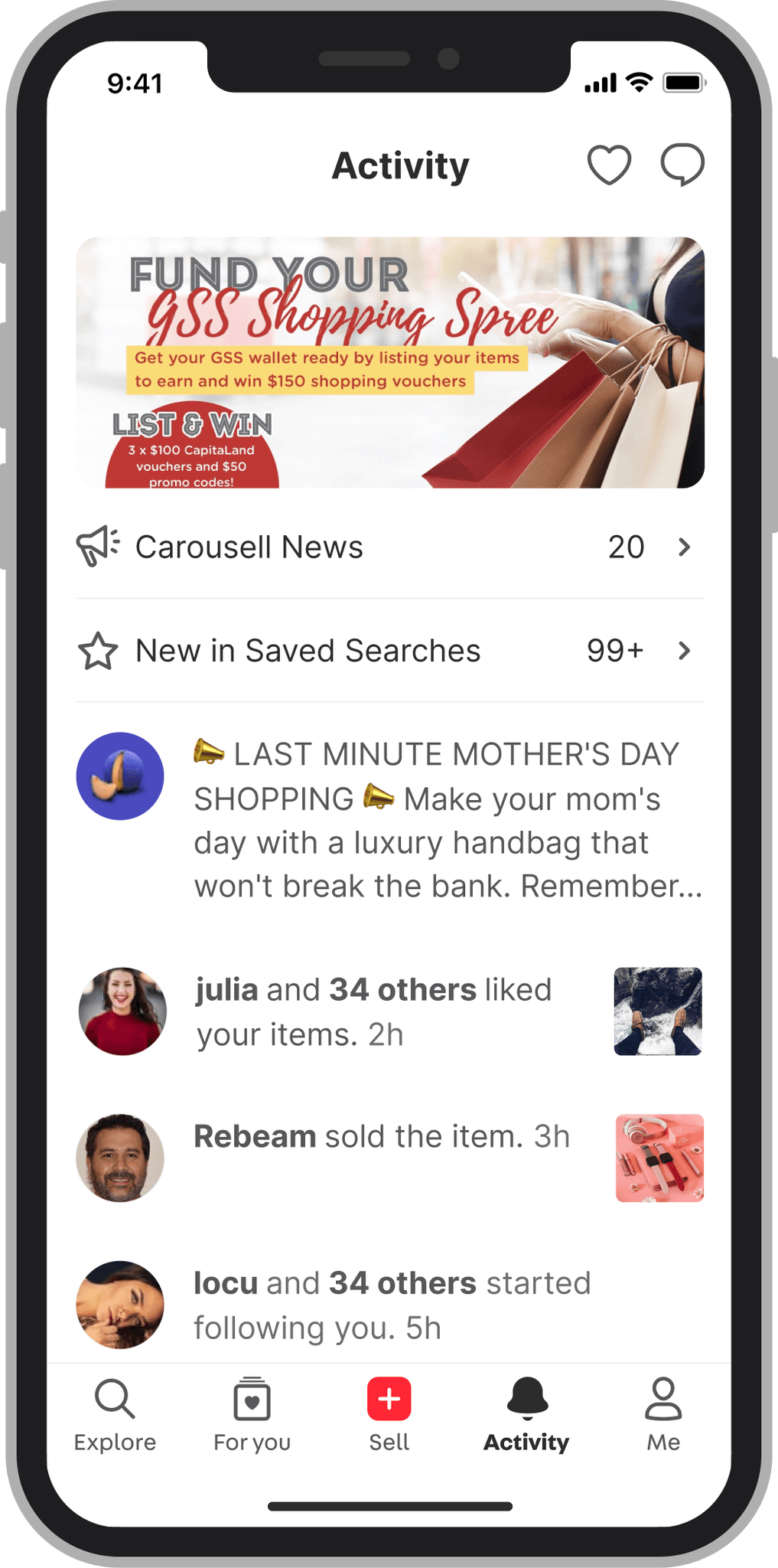
Additionally, when reviewing the information architecture of this page, it seems the content lacks a clear hierarchy, making it easy for users to miss important notifications.
Additionally, when reviewing the information architecture of this page, it seems the content lacks a clear hierarchy, making users more likely to miss important notifications.
Additionally, when reviewing the information architecture of this page, it seems the content lacks a clear hierarchy, making it easy for users to miss important notifications.
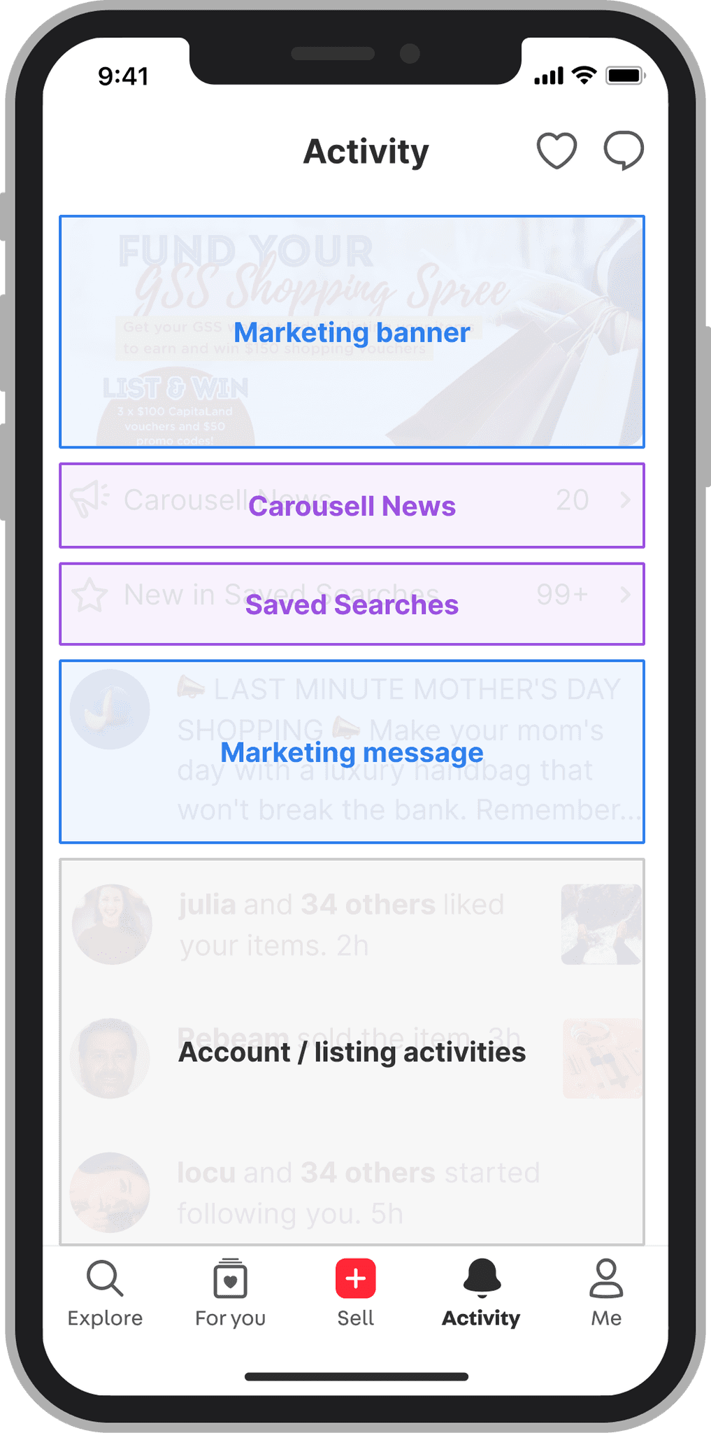
Issues with current activity page
Issues with current activity page
Issues with current activity page
😖
Marketing-related sections have low CTRs but occupying significant space
🤔
The layout lacks a clear hierarchy
🫨
Important notifications are difficult to find
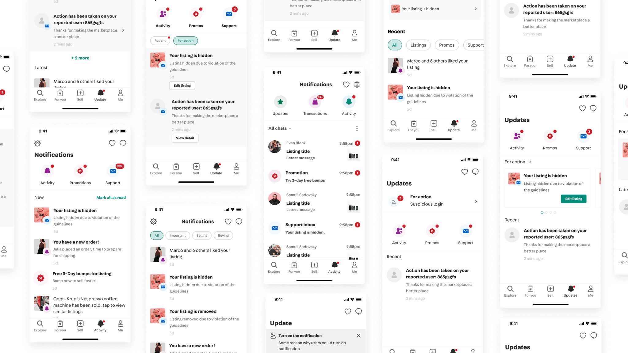
I also want to explore how notification pages work on other products.
I also want to explore how notification pages work on other products.
I also want to explore how notification pages work on other products.
Patterns we've identified:
Patterns we've identified:
Categorization
Visual layouts for hierarchy
Read/unread indicators
Then I begin exploring design concepts
Then I begin exploring design concepts
Based on competitive analysis, I created several design concepts. At this stage, I concentrated on information architecture and high-level layouts.
Key considerations include:
Based on competitive analysis, I created several design concepts. At this stage, I concentrated on information architecture and high-level layouts.
Key considerations include:
01
Categorizing notifications
Categorizing notifications
02
Highlighting important notifications
Highlighting important notifications
03
Indicating unread notifications
Indicating unread notifications
🤯
As the number of concepts grew and discussions went back and forth without clear direction.
We decide to conduct user interviews. To make well-informed design decisions and gain an understanding of the user.
🤯
As the number of concepts grew and discussions went back and forth without clear direction.
We decide to conduct user interviews. To make well-informed design decisions and gain an understanding of the user.
User interview
User interview
I used internal tool to sample various user segments, including sellers, buyers, who are both sellers and buyers, and pro sellers to interview with.
I used internal tool to sample various user segments, including sellers, buyers, who are both sellers and buyers, and pro sellers to interview with.

During the interview phase, we divided the process into two parts.
During the interview phase, we divided the process into two parts.
➊ Card Sorting
➊ Card Sorting
We give users different examples of notifications on separate cards and ask them to organize them while verbalizing their thoughts.
We give users different examples of notifications on separate cards and ask them to organize them while verbalizing their thoughts.
➋ Concept Testing
➋ Concept Testing
For the second part, we present 3 different concepts to the users and ask them to interact with them while verbalizing their thoughts.
For the second part, we present 3 different concepts to the users and ask them to interact with them while verbalizing their thoughts.
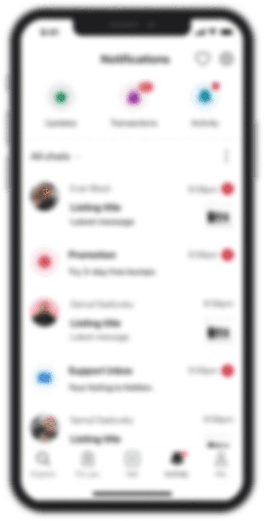
Concept A
Concept A
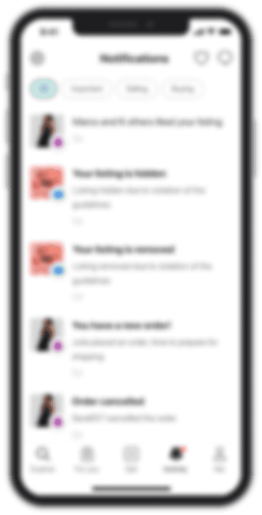
Concept B
Concept B
Concept C
Concept C
The goal is to determine which concept is worth exploring further and also understand the reasons behind users' preferences.
The goal is to determine which concept is worth exploring further and also understand the reasons behind users' preferences.
Based on the research findings, we’ve come up with some principles around the user’s mental model
Based on the research findings, we’ve come up with some principles around the user’s mental model
Things like how users group notifications, their views on each one, and which notifications they tend to ignore. And apply the insights to the design.
Things like how users group notifications, their views on each one, and which notifications they tend to ignore. And apply the insights to the design.
More details
More details
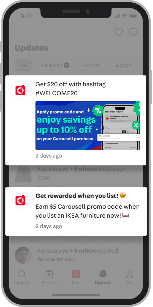
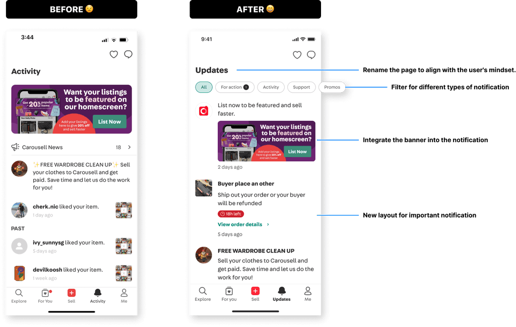
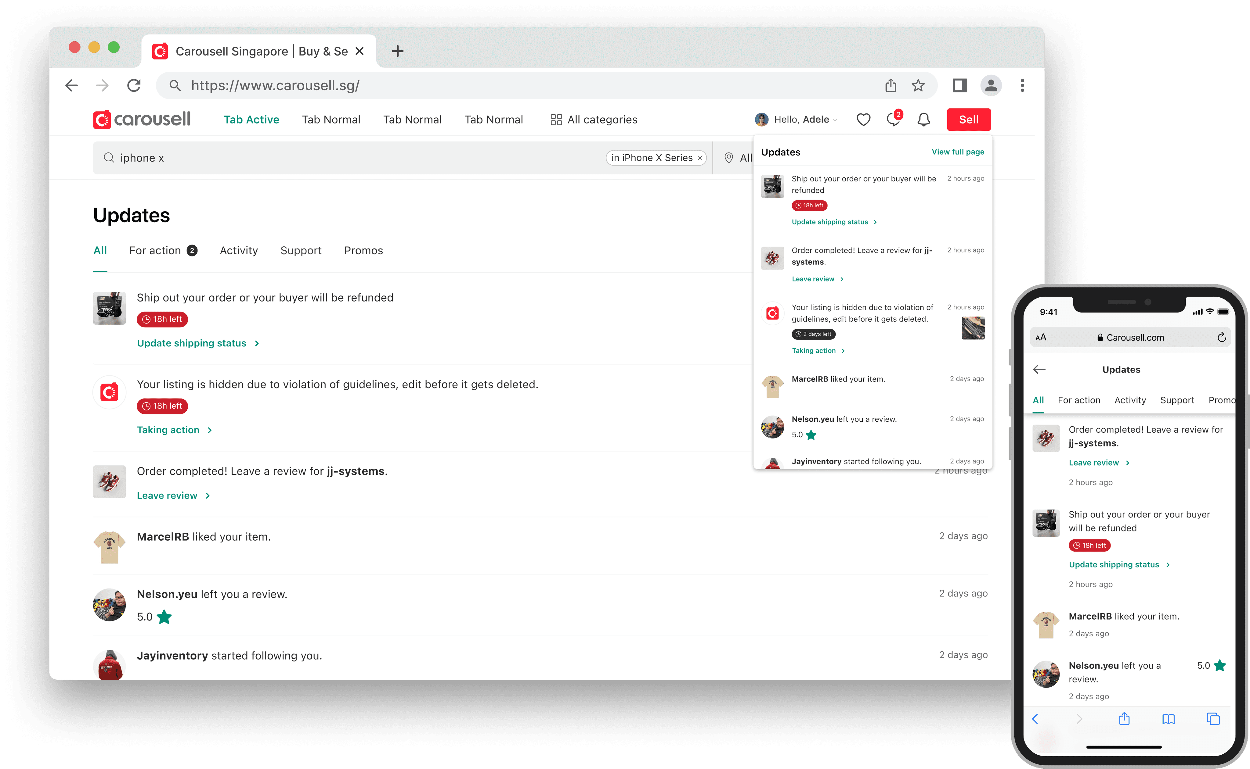
By integrating marketing banners and messages into the notification format, we can establish a clearer structure that’s easy to scan while still utilizing valuable screen space for marketing.
By integrating marketing banners and messages into the notification format, we can establish a clearer structure that’s easy to scan while still utilizing valuable screen space for marketing.
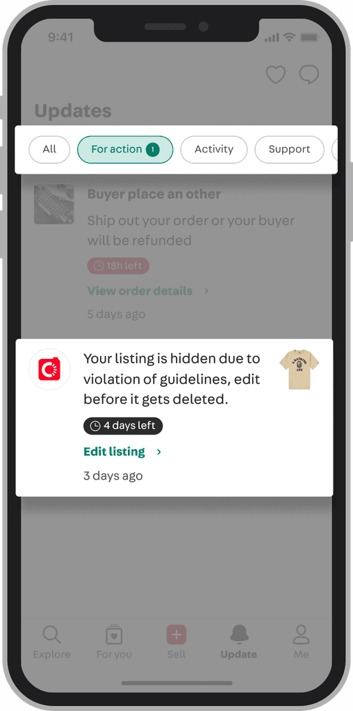
Based on user feedback, notifications are grouped by two criteria:
- by topic (e.g., buying, selling, promotions, etc.)
- by urgency
To address urgency, we introduce a new layout that includes a countdown timer and CTA.
This enables users to easily track important notifications and promptly take action.
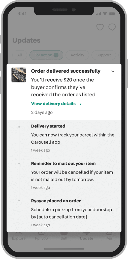
To address users' concerns about losing track of order notifications, we created an expandable layout.
This design includes a chevron on the right side that lets users expand or collapse the timeline. We also grouped notifications from the same order together to save space.
To address users' concerns about losing track of order notifications, we created an expandable layout.
This design includes a chevron on the right side that lets users expand or collapse the timeline. We also grouped notifications from the same order together to save space.
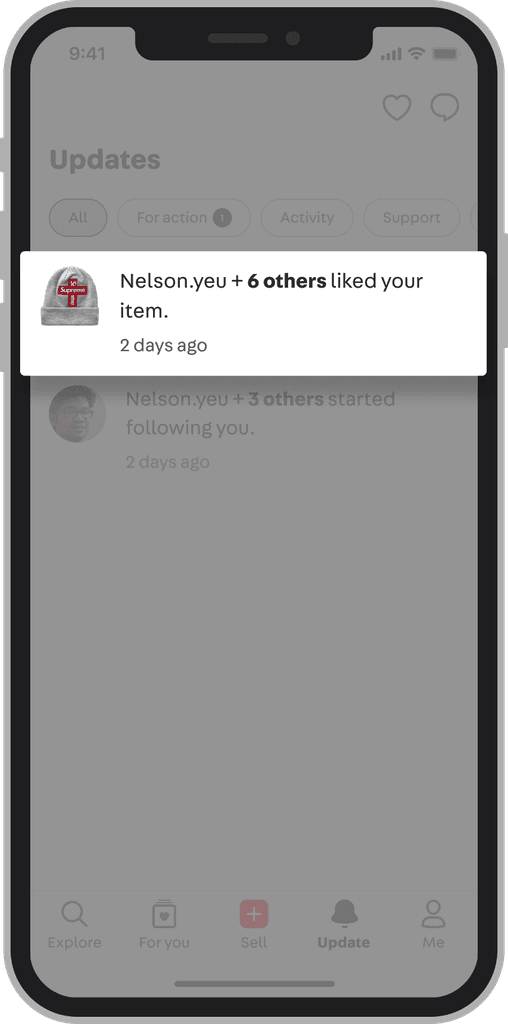
We further group similar types of notifications, such as likes on items. This enhancement aims to present users with a more organized and tidy activity tab.
We further group similar types of notifications, such as likes on items. This enhancement aims to present users with a more organized and tidy activity tab.
And here comes the Web design
And here comes the web design
And here comes the Web design
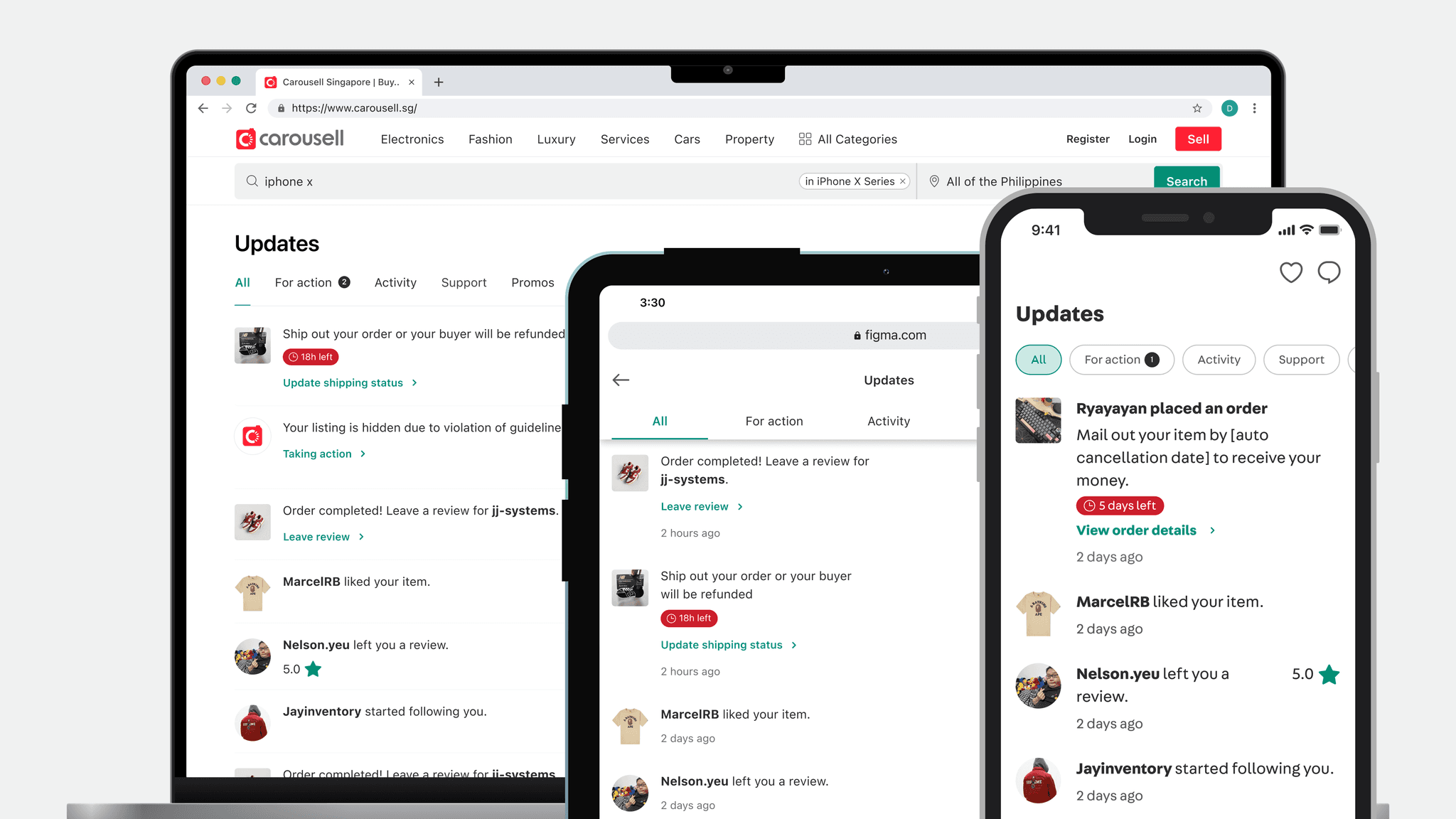
We’ve added an activity tab to our web platform, which wasn’t available before. This is designed to provide a consistent user experience across all platforms.
We’ve added an activity tab to our web platform, which wasn’t available before. This is designed to provide a consistent user experience across all platforms.
Get everyone onboard
Get everyone onboard
Given the project's scope and its effect on various functional teams, we present it at the tech townhall. This meeting will include all tech team members including c-level executive, where we’ll introduce the new design and answer any questions.
Given the project's scope and its effect on various functional teams, we present it at the tech townhall. This meeting will include all tech team members including c-level executive, where we’ll introduce the new design and answer any questions.
Additionally, we plan to hold a workshop with the marketing team as they also use the activity tab to send out ad and campaign notifications.
Additionally, we plan to hold a workshop with the marketing team as they also use the activity tab to send out ad and campaign notifications.
Reflection
Reflection
During this project, I deeply explored how to conduct user interviews and apply the insights to our design, from recruiting participants to conducting face-to-face sessions. I also maintained active communication with stakeholders and organized regular check-in meetings, which helped keep us on the right track.
On the other side, I spent too much time brainstorming design ideas without fully grasping users' needs and preferences initially. While competitive analysis can provide inspiration, it isn’t always directly applicable to our products. To enhance my design strategy with solid evidence, I decided to incorporate user interviews.
I also learned the importance of considering different user personas, as a feature that benefits one user may not be useful and could even be detrimental to another. Moving forward, we should review previous research to understand how past decisions have influenced the current design. It’s essential to focus on the problems we're trying to solve and make informed decisions based on user insights.
Next
Design system revamping →

Copied!
Copyright © 2025 by Chang Yu
Copied!
Copyright © 2025 by Chang Yu
Copied!
Copyright © 2025 by Chang Yu