


Design system revamping
Design system revamping
Timeline
April 2023 - ongoing
Responsibility
Design system
Company
Carousell
Overview
This project aims to enhance the consistency of our design system across all platforms, improving efficiency for designers and engineers.
During the project, we have established a process that includes component assessment, updates, reviews, implementation, and sharing, ensuring alignment across platforms.
With a clear process and improved collaboration between designers and developers, we are boosting productivity and consistency. The team will continue refining the system.
Impact
56% increase components insertion rate in the design file
18% decrease of component detachment rate
Understanding the current situation
Understanding the current situation
At the start of this project, we surveyed developers about their concerns. They highlighted that design components often didn’t match those in actual implementation.
We also observed that some similar-looking components served different functions, and this wasn’t clearly documented.
We further held a workshop with designers to gather feedback. Many designers modified components due to a lack of flexibility in existing components, and even experienced designers struggled to find what they needed, wasting time.
Pain Points from Initial Research

Lack of consistency
Lack of clear guidelines and documentation.
Components are difficult to reuse due to outdated Figma features.
No defined process for updating and maintaining the design system, leading to misalignment between design and development.

Poor discoverability
No links between design and codebase making it difficult for engineers to find reusable code.
Difficulty in searching for components by name.
Limited visibility for designers to track changes in components.

Poor Communication
Inconsistent terminology leads to confusion over component names.
Fragmented communication channels result in missed messages and reduced team cohesion.
Lack of structured feedback mechanisms and unclear scope can hinder improvements and cause delays.
We decide to test button component to try out the process and note any issues since it's commonly used on all platforms.
We decide to test button component to try out the process and note any issues since it's commonly used on all platforms.
Try and error
Try and error
First, we invited one of the developers to join our trail run, we did an assessment for current production. So as to identify the gap between implementation and design system.
We discovered that the components were not updated with the latest features of Figma, such as auto layout and properties. As a result, they lacked the flexibility to meet designer's need.
Additionally, we found that the documentation, which was meant to guide us on how to use certain components, was outdated and incomplete.
As a result, designers often create UIs that are slightly different and hand them off to developers. This lack of a clear single source of truth results in an increasing gap between implementation and design.
To address these issues, we took action by updating the button component with new Figma features.
We also made the decision to include the documentation directly in the Figma file, as it proved to be more convenient and efficient to have all the resources in one place.
To address these issues, we took action by updating the button component with new Figma features.
We also made the decision to include the documentation directly in the Figma file, as it proved to be more convenient and efficient to have all the resources in one place.
To address these issues, we took action by updating the button component with new Figma features.
We also made the decision to include the documentation directly in the Figma file, as it proved to be more convenient and efficient to have all the resources in one place.
How others are doing
How others are doing
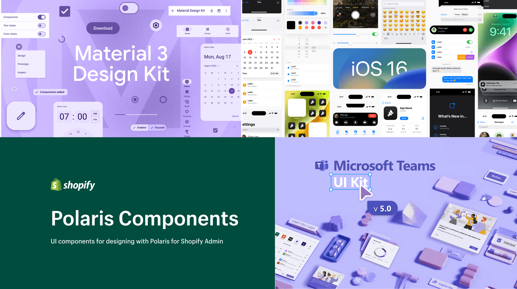
We conducted research on how other companies approached their design systems, and also reading some articles that addressing this topic.
We conducted research on how other companies approached their design systems, and also reading some articles that addressing this topic.
We conducted research on how other companies approached their design systems, and also reading some articles that addressing this topic.


Let's do this
Let's do this
As a result, we made the decision to distribute the responsibility for component updates among different teams based on the insertion rate data from the Figma analytic tool.
Additionally, we developed a handbook and process for component updates, which we shared with other product designers to gather feedback. Through several iterations and adjustments, we ensured that the process became clear and well-defined.
With the refined process in place, we were able to proceed with our work.
Things I did
Things I did
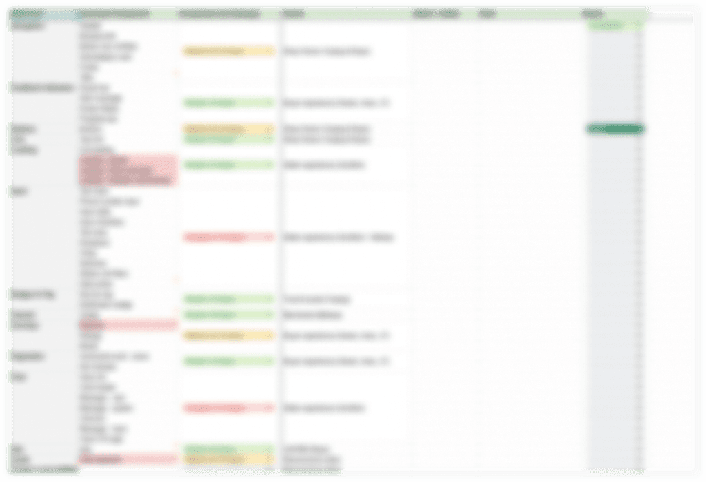


Create a spreadsheet to allocate ownership and track the progress
Create a spreadsheet to allocate ownership and track the progress
Create a spreadsheet to allocate ownership and track the progress
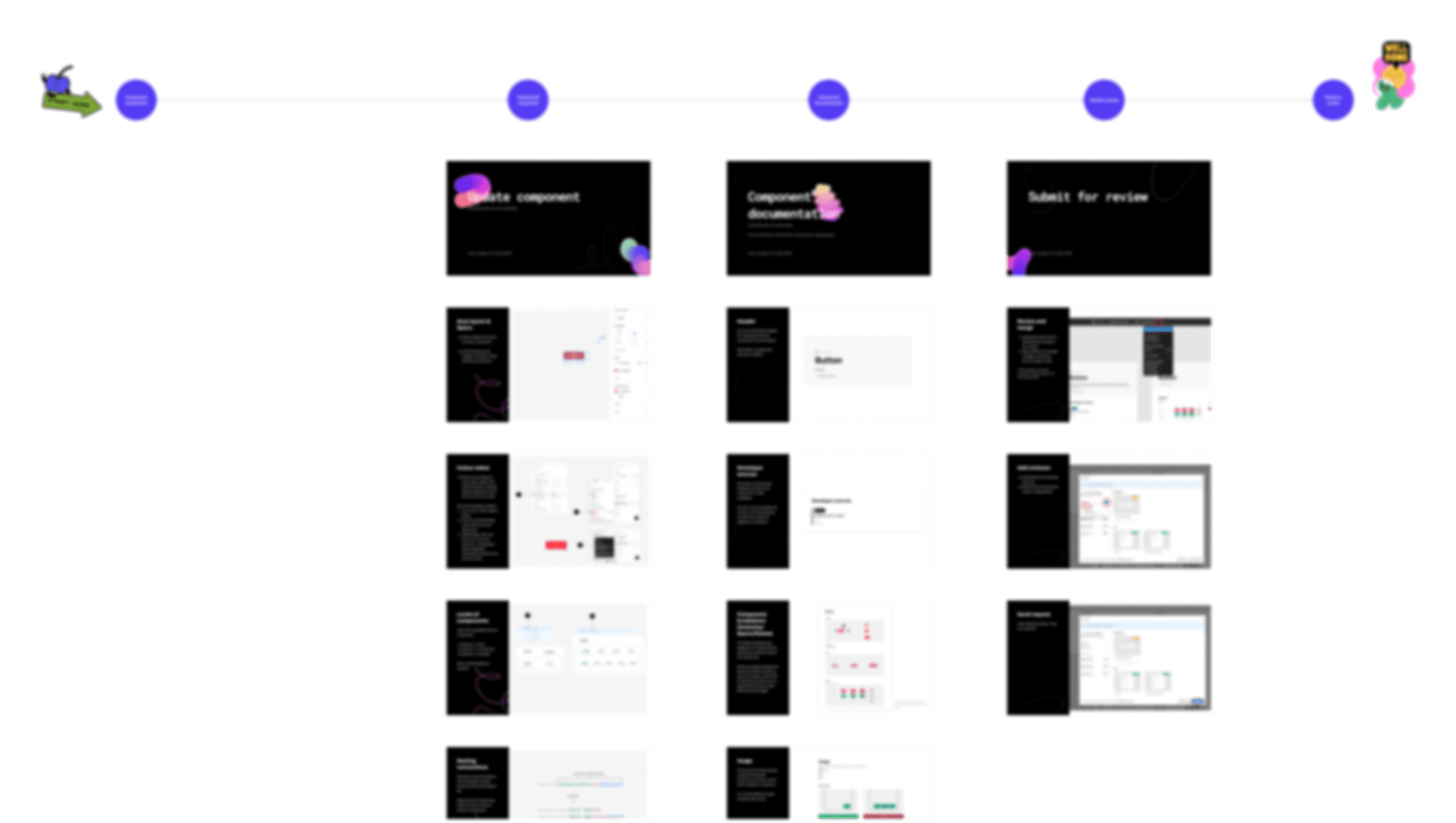


Further create a detailed handbook and defined process to ensure everyone is aligned of how to update the design system
Further create a detailed handbook and defined process to ensure everyone is aligned of how to update the design system
Further create a detailed handbook and defined process to ensure everyone is aligned of how to update the design system
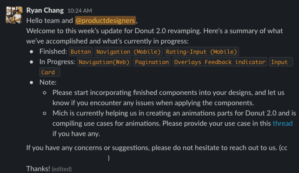


We have established a weekly announcement in Slack to keep the team and all stakeholders aligned and informed with the update
We have established a weekly announcement in Slack to keep the team and all stakeholders aligned and informed with the update
We have established a weekly announcement in Slack to keep the team and all stakeholders aligned and informed with the update
During the process, we also seized the opportunity to tidy up the design file. This involved restructuring the components page and ensuring that the variants covered all possible use cases.
During the process, we also seized the opportunity to tidy up the design file. This involved restructuring the components page and ensuring that the variants covered all possible use cases.
Details and results
Details and results


Inside the Figma file, we maximized the benefits of features like properties and variants, enhancing the flexibility and usability of the design components.
Inside the Figma file, we maximized the benefits of features like properties and variants, enhancing the flexibility and usability of the design components.
Inside the Figma file, we maximized the benefits of features like properties and variants, enhancing the flexibility and usability of the design components.
We annotate codebase information directly within the Figma file, making it easy for engineers to locate and reuse the relevant code.
We annotate codebase information directly within the Figma file, making it easy for engineers to locate and reuse the relevant code.
We annotate codebase information directly within the Figma file, making it easy for engineers to locate and reuse the relevant code.


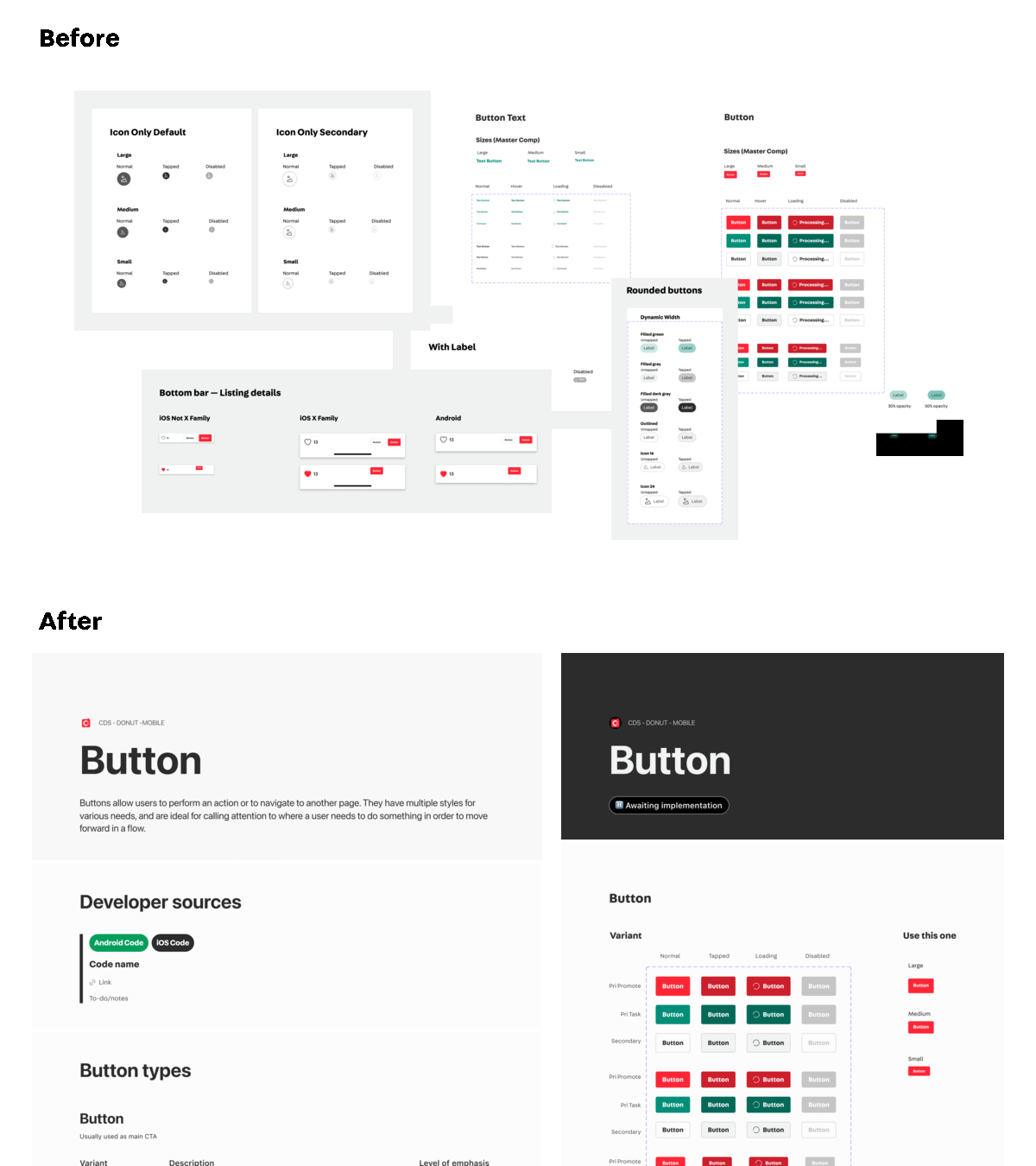


We have organized the structure of the design file and incorporated documentation alongside the components. In the updated version (After), the documentation is displayed on the left side, while the variants are presented on the right side of the image.
We have organized the structure of the design file and incorporated documentation alongside the components. In the updated version (After), the documentation is displayed on the left side, while the variants are presented on the right side of the image.
We have organized the structure of the design file and incorporated documentation alongside the components. In the updated version (After), the documentation is displayed on the left side, while the variants are presented on the right side of the image.
Impact
Impact
18%
18%
Decrease of component detachment rate
Decrease of component detachment rate
56%
56%
Components insertion rate in the design
Components insertion rate in the design
Although it's WIP, we continue to make improvements and have exciting updates planned for the future!
Although it's WIP, we continue to make improvements and have exciting updates planned for the future!
Although it's WIP, we continue to make improvements and have exciting updates planned for the future!
Rolling out color tokens with semantic naming
Extending the revamping efforts to font styles, spacing and shadows.
Working to bridge the gaps between code implementation and components in Figma
Rolling out color tokens with semantic naming
Extending the revamping efforts to font styles, spacing and shadows.
Working to bridge the gaps between code implementation and components in Figma
Reflection
Reflection
Reflection
Throughout the project, I gained a valuable understanding of the importance of communication and collaboration. It is essential not to work in isolation but rather engage with other team members. In particular, since our users are product designers, it is crucial to understand their thoughts and expectations.
Revamping a design system cannot be achieved single-handedly; it requires a collaborative effort. Trusting team members and assigning ownership are vital aspects of this process. We learn and improve through iterations, establishing a healthy design system that is sustainable, comprehensive, optimized, and capable of handling future requirements.
It is important to recognize that there is no one-size-fits-all design system. We must consider our unique circumstances and leverage existing implementations to develop solutions that truly address our specific case.
Next
Sign-up flow revamping →
Top ↑
