Credit Card Voucher
Credit Card Voucher
Overview
Designed a new payment method that shifted external credit card usage to voucher-based payments in PayPay
Timeline
2024 Q4 - 2025 Q1
My Role
End-to-end design, user research, usability testing
Team
Designer (me), PM, Engineering, Legal, Business
Background
PayPay is Japan's largest mobile payment platform with over 65 million users. At that scale, even small inefficiencies become expensive problems. One of them: users could link their external credit cards to pay through PayPay. Convenient for users, but every transaction came with a processing fee to the card networks. At 65M users, that adds up fast.
So leadership decided to phase it out. My job was to figure out how.
Business goal vs. user motivation
Before jumping into design, I wanted to understand why users were linking their credit cards in the first place.
The answer reframed everything. Most of them weren't loyal PayPay users, they were using PayPay as a payment interface to rack up airline miles and credit card rewards. PayPay just happened to be accepted everywhere in Japan.
That meant we weren't removing a feature. We were about to eliminate the main reason these users opened the app.
The real question wasn't "how do we remove credit card support?" It was "how do we let users keep earning rewards without routing through the card network?"
Finding a solution that actually worked
Once we had the right problem, the most obvious answer was a top-up flow. Users charge their credit card to load balance, then pay from that. Clean, familiar, and it would've solved the cost problem too, top-up transactions don't route through card networks the same way purchases do.
The blocker was regulatory. Adding a new stored-value type would classify it as e-money under Japan's Payment Services Act, requiring a separate license and AML compliance overhead we couldn't absorb on our timeline.
So we looked at what we already had. PayPay's existing voucher system sat outside those regulations, vouchers are non-transferable, which keeps them clear of Japan's AML rules. We proposed a new type: Credit Card Vouchers. Users buy the voucher with their credit card, keep all their miles and rewards, then pay through PayPay as usual.


Credit card charges convert into vouchers, same purchase, different route.
Fast cutoff vs. user transition
The easiest path was a hard cutoff: set a date, kill the feature, send a notification. Engineering preferred it. Minimal conditional logic, clean implementation.
But before locking in the approach, I reviewed CS data to understand where payment failures actually hurt users. One pattern kept showing up: unexpected errors at checkout, they'd try again and again, led to frustration and eroded trust in the app.
So I pushed for a phased rollout. Rather than a straight deprecation, I proposed a transitional phase between the current state and full termination. Users would receive advance notice of the cutoff date and be guided through purchasing a Credit Card Voucher before direct card payment was removed entirely.

In Japan, an unexpected error at checkout is more than friction. It's embarrassing.
Translating decisions into screens
With the problem defined, the solution validated, and the scope locked, it was time to design. The experience came down to three things
#1 Identifying entry points and timing for the sunset notification
Rather than placing the notification everywhere, I used CTR data to find where users were most likely to see it. The payment flow and post-payment receipt screen came out on top, so those became my primary placements.

Then I caught a gap. Users who were adding a credit card for the first time would skip both of those entirely and land straight on a feature that was about to disappear. We added the notification to that flow too, before it became a problem in production.

#2 Onboarding users to the new voucher concept and guiding the first purchase
These users had been paying with their credit card through PayPay for months, maybe years. Now we were asking them to stop and learn something new.
The risk wasn't confusion, it was abandonment. If onboarding felt like too much work, they'd switch to a different payment method and we'd lose them anyway. The onboarding had one job: make this feel smaller than it actually was. Clear explanation, one-time setup framing, no dead ends.
That meant we couldn't just send users straight to the purchase screen. That would've felt pushy. Japanese users in particular tend to want more context before taking action, so we added a buffer page to explain what was changing and why before asking them to do anything.

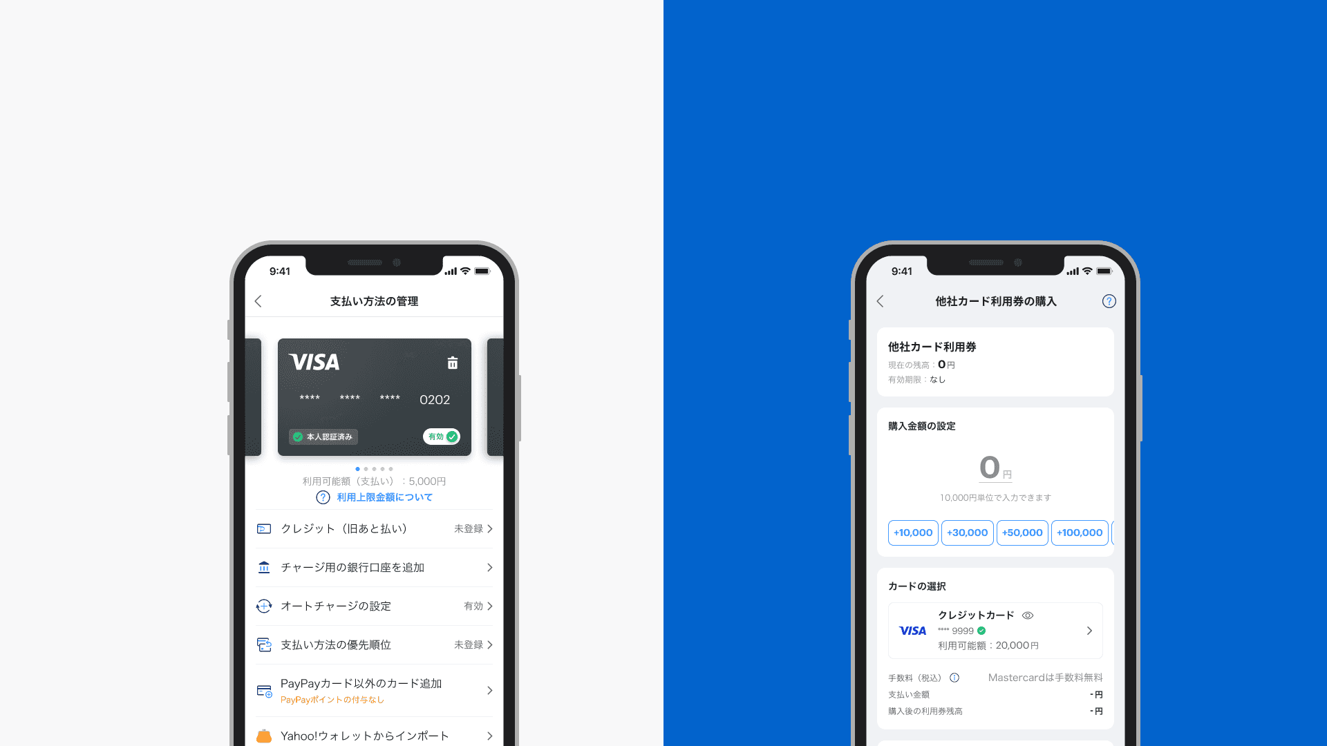
The biggest unknown was the purchase screen. Should it feel like buying a product where you pick a fixed amount, or like topping up where you just type in a number?
It sounds like a small detail, but it wasn't. Get the mental model wrong and users would hesitate, or drop off entirely, right at the step we most needed them to complete.
I then explored three purchase screen directions: adapting the existing Gift Voucher pattern, a top-up style input, and a scroll-based amount selector.


I also looked at how other apps handle amount input experience.

Each pattern had its own rationale and precedent. I decided to run research to understand which mental model actually matched how our users thought about the purchase.
Survey
I created surveys in both English and Japanese to understand how users perceive the Credit Card Voucher concept and interpret the purchase layout.

Concept testing
I created prototypes and tested them with 8 users.

I prefer the top-up–style screen since I already know how to use it.
I don't like having fixed amounts. I want to decide how much I put in myself.
I like the preset amount buttons, they save time.
The research pointed clearly to the top-up pattern. Users already knew how it worked, and that familiarity mattered more than conceptual accuracy. No new mental model to learn, no extra friction at the point of purchase.

One constraint remained: legal requirements mandated amounts in ¥10,000 increments. A random entry would trigger an error, so instead of a hard error state, I added a floating quick-fix button that auto-corrects the amount in one tap.
When an invalid amount is entered, a floating quick-fix button appears, auto-correcting to the nearest valid increment without interrupting the flow.
#3 Integrating voucher payment into the existing checkout flow without friction
Purchase done, but I didn't want to just leave users there. The confirmation screen shows the voucher status and has a single CTA that takes them straight to payment with the voucher pre-applied.
The idea was simple: no matter when someone found out their card was being cut off, they could recover and complete their payment without hitting a dead end. Start to finish, the whole thing takes about 10 seconds.
Once the purchase is done, users see a status screen confirming their voucher. One tap at the bottom CTA and they're at the payment screen, voucher applied, ready to go.
I also went through every possible granting scenario with the backend logic, making sure nothing unexpected would slip through once it shipped.

Granted

Pending

Error
Beyond the handoff
We established a formal design QA process and to improve implementation quality, benefiting other projects as well.

Annotation tool I built
Now the feature is on beta test
The design is currently in beta testing with a limited group of users. I'm monitoring voucher purchase success rate and payment success rate as the primary signals, with support inquiry volume as a secondary indicator of friction. Findings from this phase will inform any adjustments before the full rollout.
Learning
The biggest thing I took away was how much late misalignment costs in a compliance-heavy environment. When legal requirements shift after you've already designed something, you're the one who has to absorb it. I got a lot better at pulling people into the conversation earlier.
The other thing: research under pressure is still worth doing. Five users and a survey isn't rigorous, but it moved a major decision from opinion to evidence. I'd make that call again.

Next
Top-Up Screen A/B Testing
Optimized through A/B testing, achieving a 7% increase in top-up amounts
Credit Card Voucher
