Top ↑

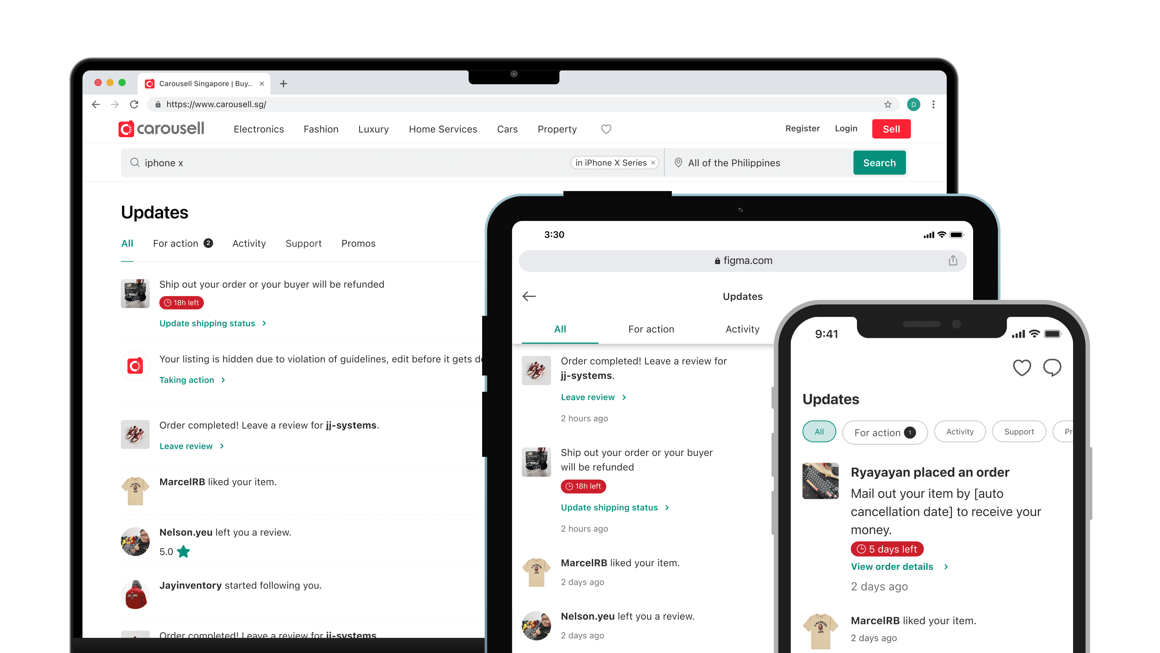
Brand New Notification Center
Brand New Notification Center

Brand New Notification Center

Brand New Notification Center

Brand New Notification Center

Improved user engagement led to an 11% increase in order completion

Improved user engagement led to an 11% increase in order completion

Timeline

Timeline

Timeline

Dec 2022 - July 2023

Dec 2022 - July 2023

Dec 2022 - July 2023

Responsibility

Responsibility

Responsibility

End-to-end design process, User research

End-to-end design process, User research

End-to-end design process, User research

Company

Company

Company

Carousell

Carousell

Carousell

Overview

The Activity tab is one of Carousell's most visited screens: 80% of users open it daily to track their account and order activity. It's also where the platform shares updates, gathers feedback, and runs marketing campaigns.


The problem: the tab gave users no clear next step. Important order notifications were buried under marketing content. We set out to redesign it to drive engagement, order completion, and revenue.

Results

  • +20% CTR for order-related updates

  • +11% order completion rate

📈 Let's begin with data to have a understanding of the current situation.

📈 Let's begin with data to have a understanding of the current situation.

Audit

Audit

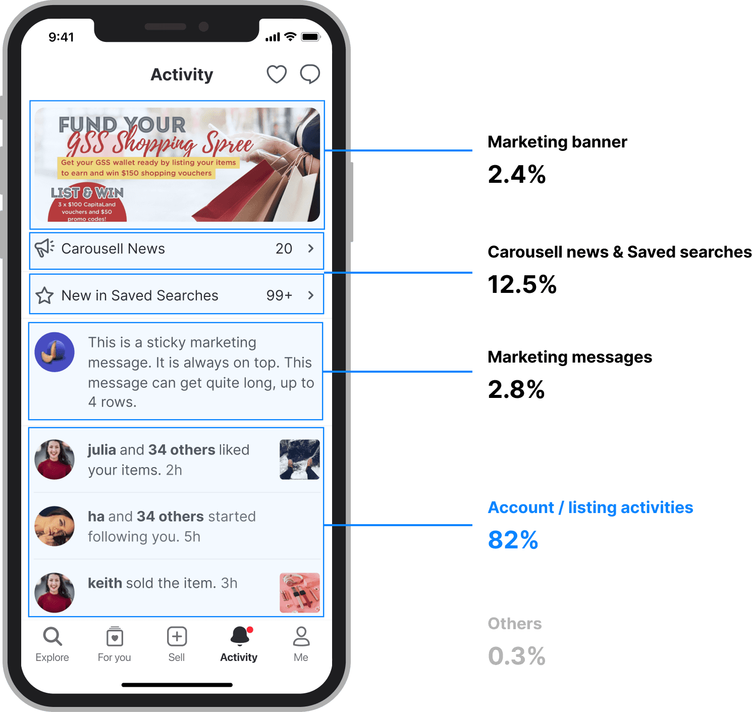
I started by sampling the CTR of each section in the Activity tab over a six-month period.

I started by sampling the CTR of each section in the Activity tab over a six-month period.

The pattern was clear: marketing banners, Carousell news, and marketing messages had low CTRs but took up most of the screen. That pushed down account and listing activity, the content users actually clicked on and cared about.

Reviewing the information architecture showed the same story from another angle: the page had no clear hierarchy, so important notifications were easy to miss.
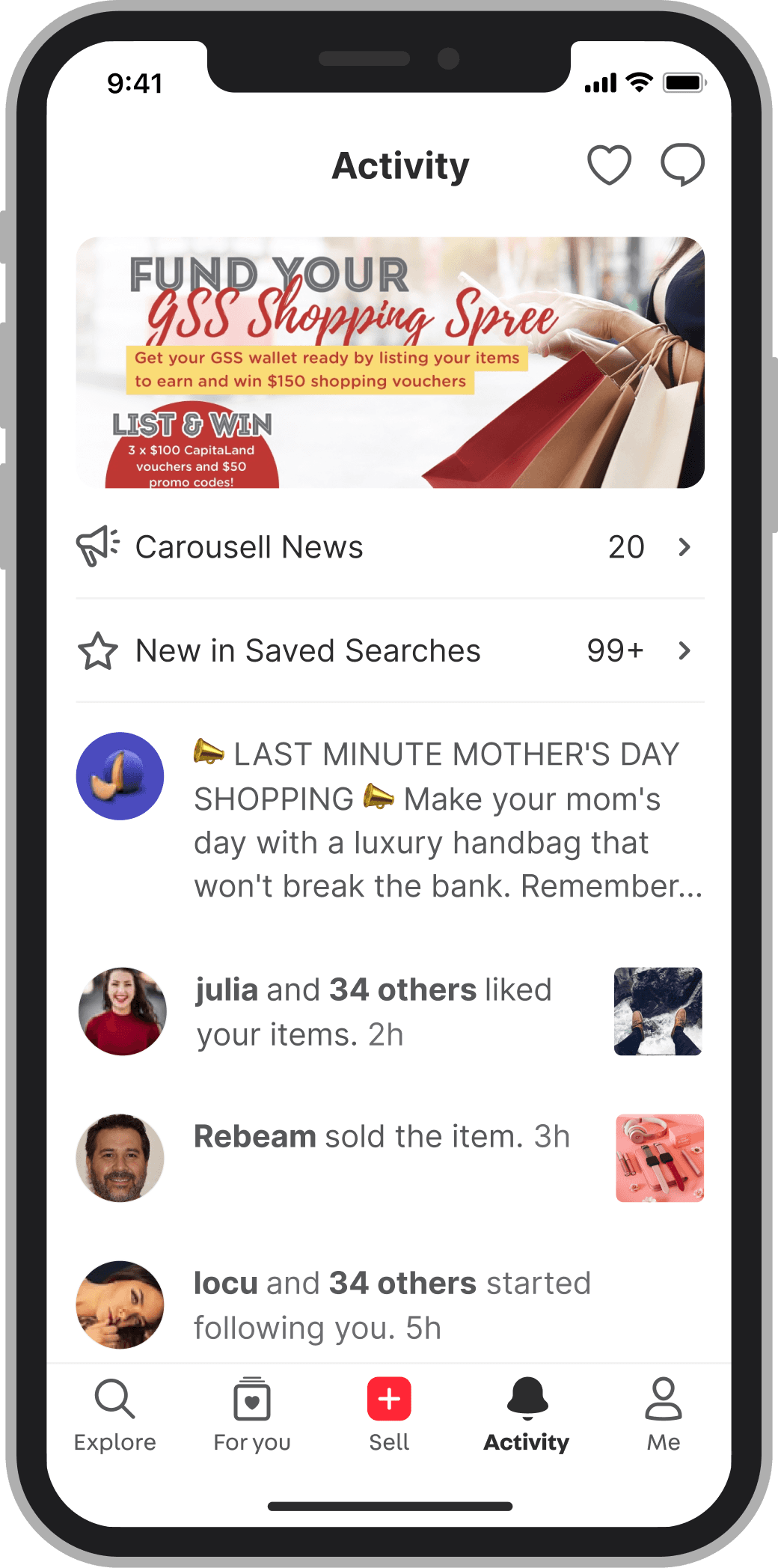
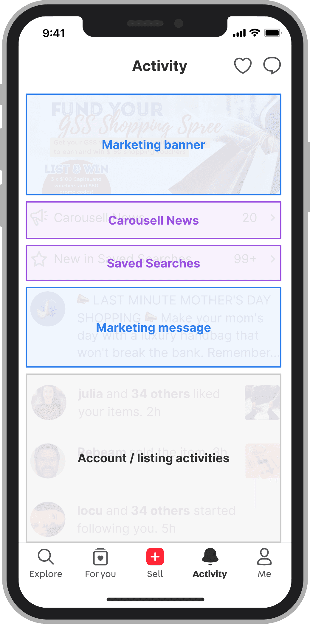
Issues with the current Activity tab

Issues with the current Activity tab

😖

Marketing sections had low CTRs but occupied significant space

🤔

The layout lacked a clear hierarchy

🫨

Important notifications were hard to find
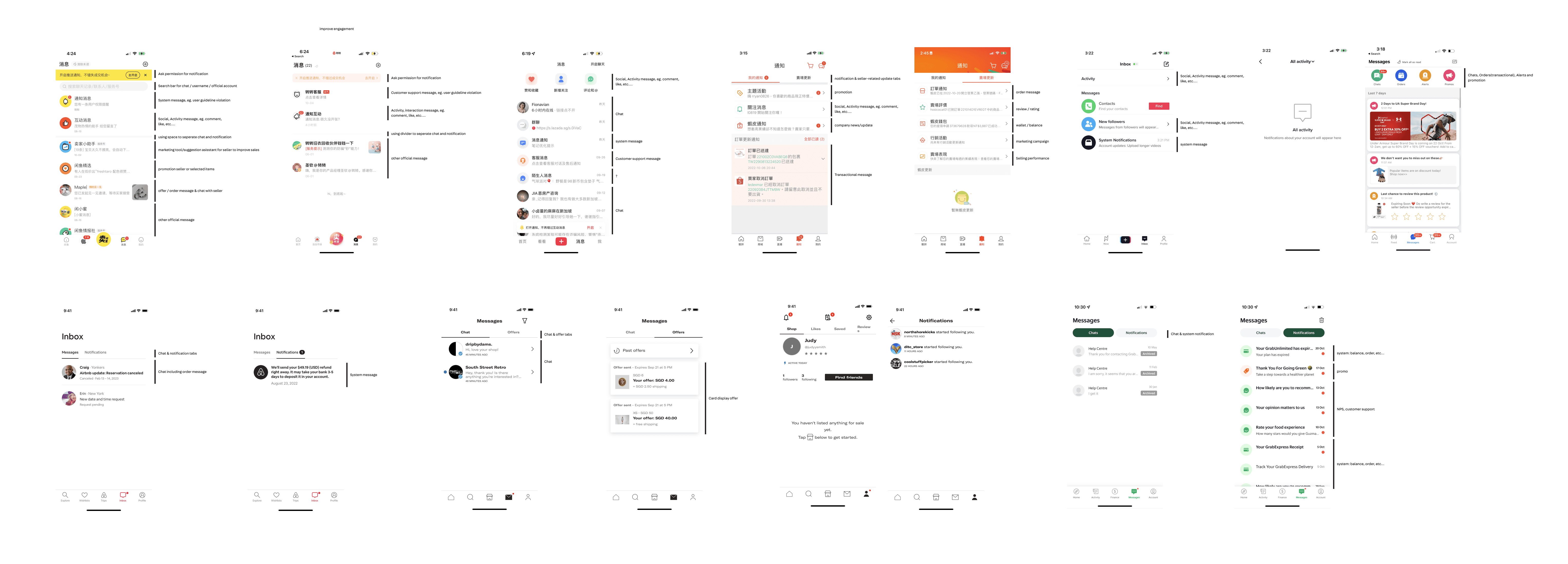
Learning from other products

Learning from other products

Learning from other products

I also looked at how notification pages work in other products. Three patterns kept showing up:

I also looked at how notification pages work in other products. Three patterns kept showing up:

  1. Categorization

  1. Visual layouts for hierarchy

  1. Read/unread indicators

First concepts, and a turning point

First concepts, and a turning point

Based on those patterns, I explored several design concepts, focusing on information architecture and high-level layouts.

Key considerations:

Based on those patterns, I explored several design concepts, focusing on information architecture and high-level layouts.

Key considerations:

01

Categorizing notifications

Categorizing notifications

02

Highlighting important notifications

Highlighting important notifications

03

Indicating unread notifications

Indicating unread notifications

🤯
But the number of concepts kept growing, and team discussions went back and forth without a clear direction. Competitive patterns could tell us what other products did, not what our users needed.

So I stopped generating concepts and proposed user interviews, so we could settle the direction with evidence instead of opinions.
User interview

User interview

Using an internal sampling tool, I recruited 5 participants across our key segments: buyers, sellers, users who both buy and sell, and pro sellers.

Using an internal sampling tool, I recruited 5 participants across our key segments: buyers, sellers, users who both buy and sell, and pro sellers.

Each session had two parts

Each session had two parts

➊ Card Sorting

➊ Card Sorting

We gave participants example notifications on separate cards and asked them to organize them while thinking aloud. This showed us how users naturally group notifications.

We gave participants example notifications on separate cards and asked them to organize them while thinking aloud. This showed us how users naturally group notifications.

➋ Concept Testing

➋ Concept Testing

We then had participants interact with three concepts (A, B, and C) while thinking aloud, to see which direction was worth pursuing and why.

We then had participants interact with three concepts (A, B, and C) while thinking aloud, to see which direction was worth pursuing and why.

Concept A

Concept A

Concept B

Concept B

Concept C

Concept C

What we learned

What we learned

Concept B won, for two reasons. Its grouping matched the way users naturally organized notifications in card sorting, and it was the smoothest to interact with: participants moved through it with the least hesitation.

Card sorting also gave us the mental model to build on. Users group notifications by two criteria: by topic (buying, selling, promotions) and by urgency.
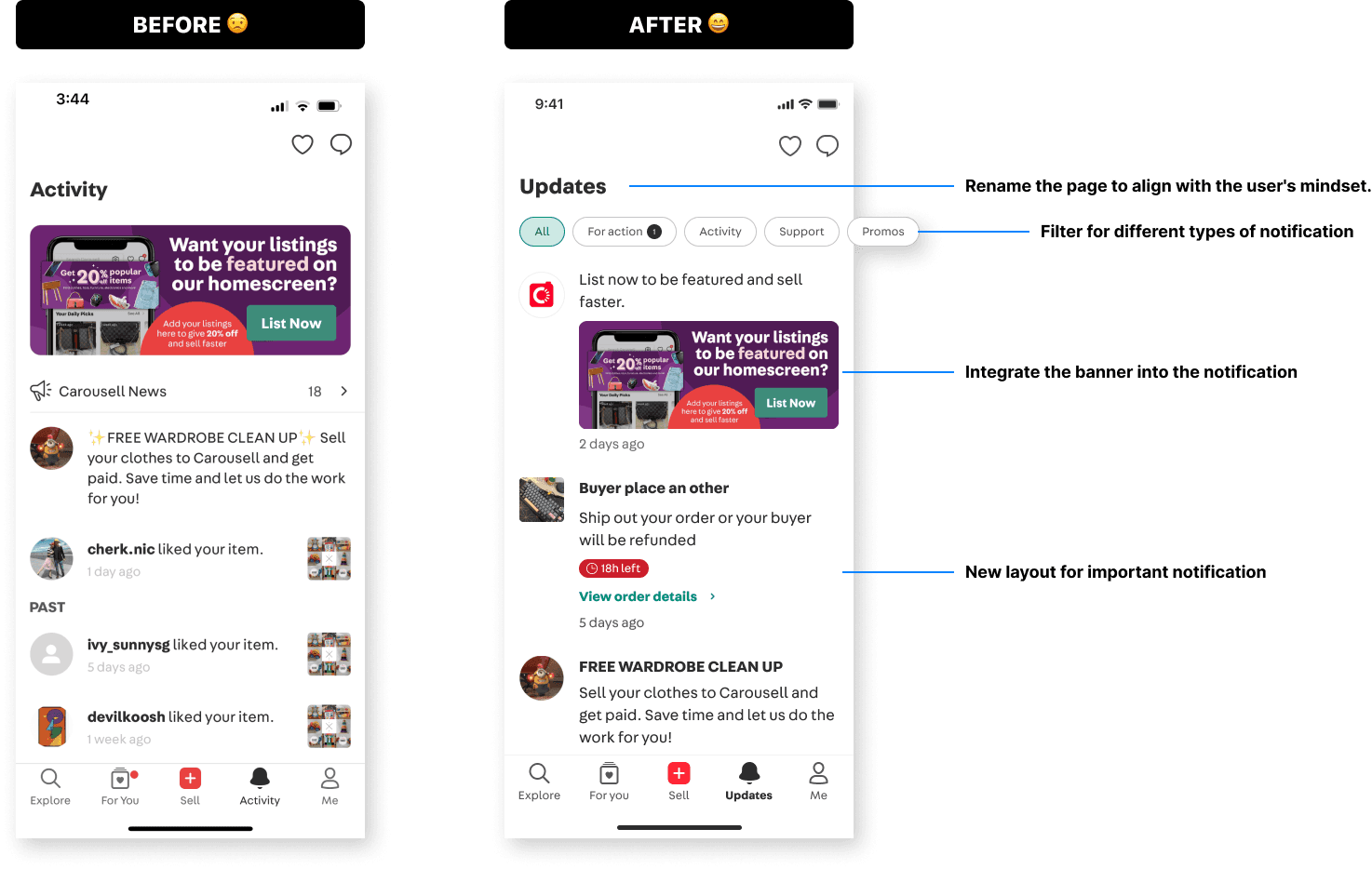
Based on the research findings, we’ve come up with some principles around the user’s mental model

Based on the research findings, we’ve come up with some principles around the user’s mental model

Things like how users group notifications, their views on each one, and which notifications they tend to ignore. And apply the insights to the design.

Things like how users group notifications, their views on each one, and which notifications they tend to ignore. And apply the insights to the design.

More details

More details

Marketing content, integrated instead of stacked. By converting marketing banners and messages into the notification format, the page gained a clearer structure that's easy to scan, while marketing kept valuable screen space.

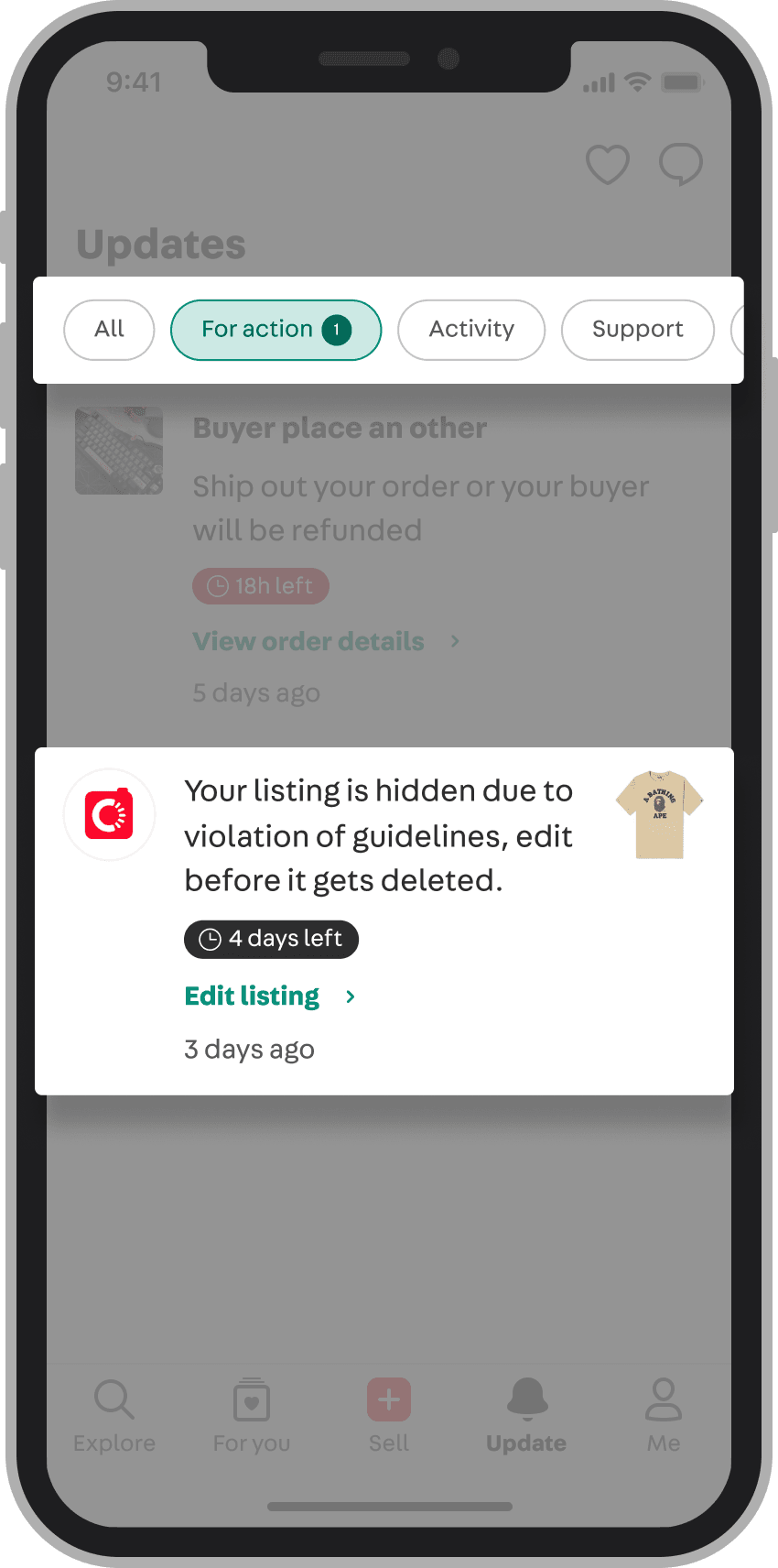
A layout for urgency. Based on user feedback, notifications are grouped by topic and by urgency. For urgent items, we introduced a new layout with a countdown timer and a CTA, so users can spot important notifications and act on them right away.
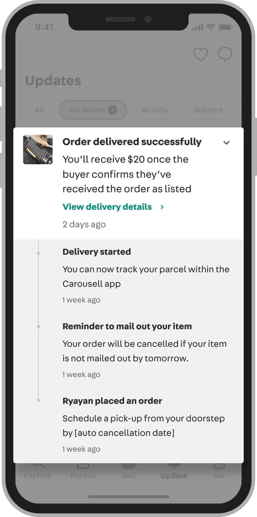
An expandable order timeline. To address users' concern about losing track of order notifications, we created an expandable layout: a chevron lets users expand or collapse the timeline, and notifications from the same order are grouped together to save space.

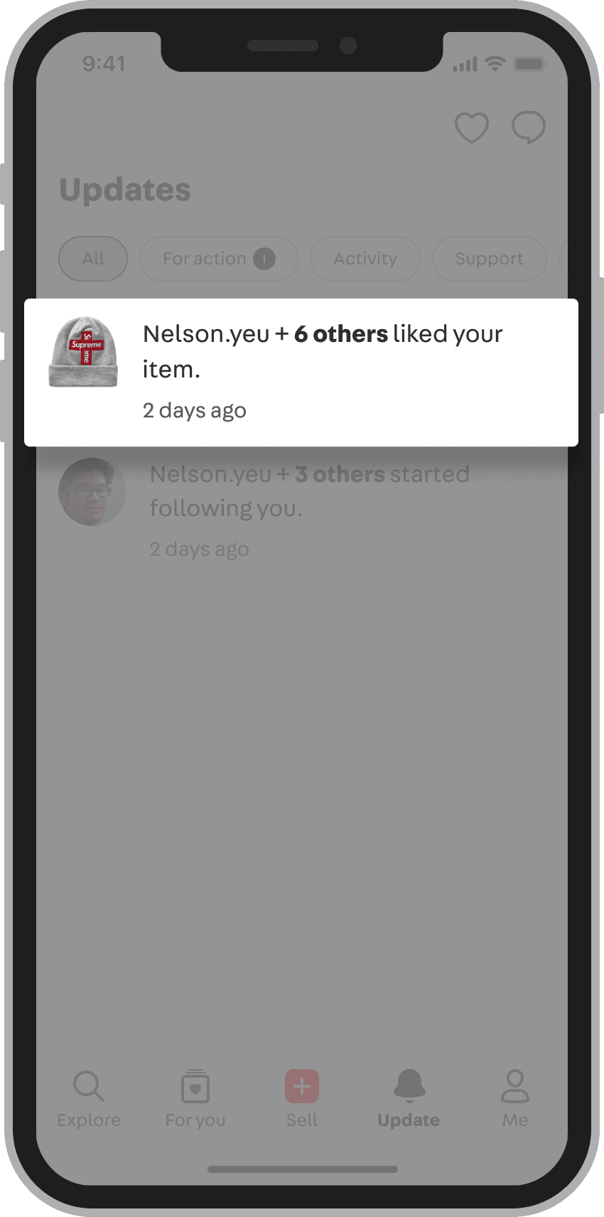
Grouping similar notifications. Low-stakes notifications of the same type, like likes on items, are bundled to keep the tab tidy.
Bringing marketing along

Bringing marketing along

The riskiest part of this redesign wasn't the interface. We were shrinking the most visible placements on a high-traffic page, and those placements belonged to the marketing team.

Instead of debating opinions, I brought the data: six months of CTRs showing their banners weren't performing in the current format. Then I made sure the new format wasn't a downgrade for them. The notification-style placement supports flexible content (image, text, or video), so campaigns kept their expressive range while fitting into the page's hierarchy.

Marketing accepted the change, and we held a workshop together to align on how campaign notifications would work in the new structure.

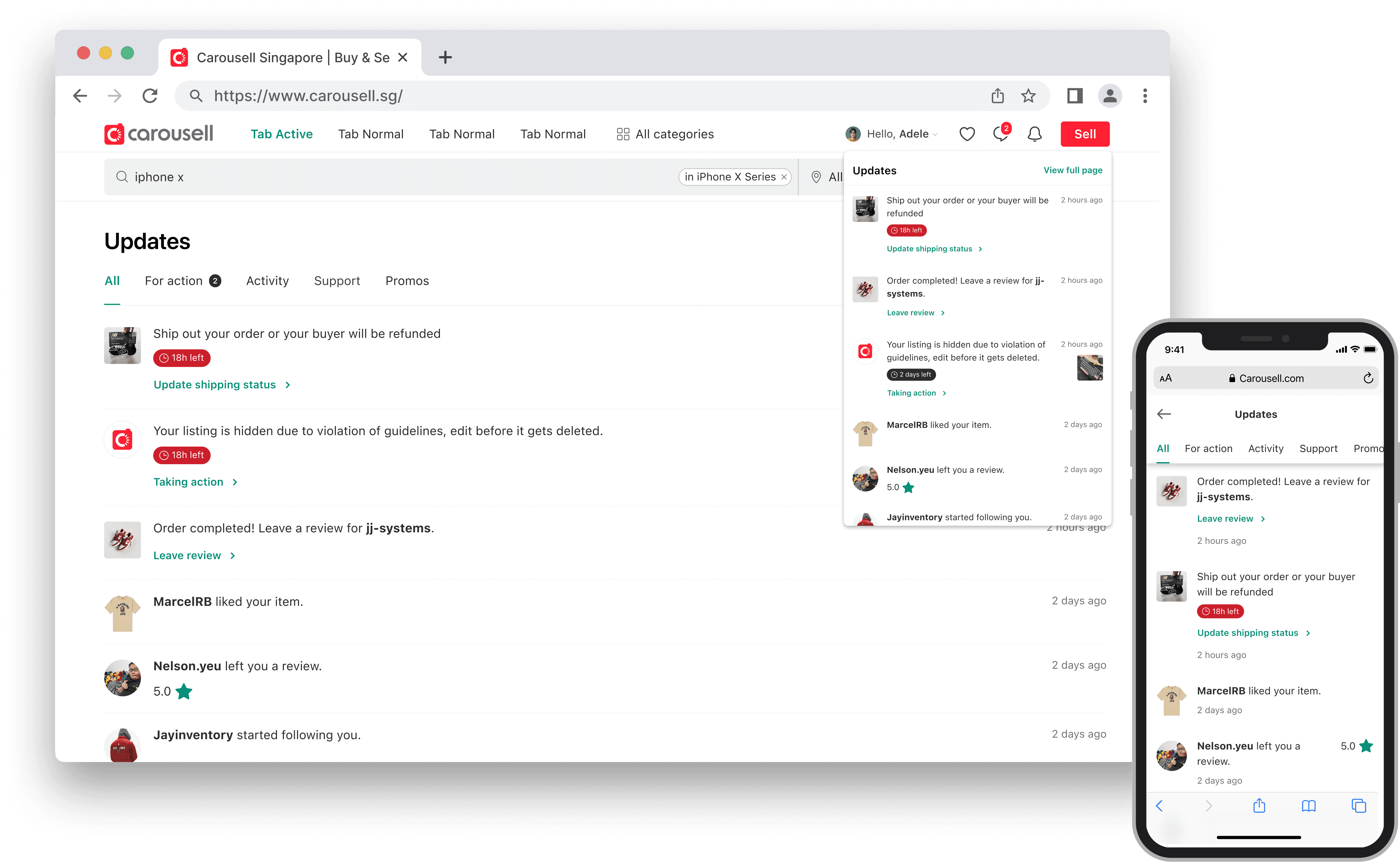
Responsive web design

Responsive web design

We’ve added an activity tab to our web platform, which wasn’t available before. This is designed to provide a consistent user experience across all platforms.

Results

Results

20%

20%

20%

Increase in CTR for order-related updates

Increase in CTR for order-related updates

Increase in CTR for order-related updates

11%

11%

11%

Increase in order completion rate

Increase in order completion rate

Increase in order completion rate

Getting everyone on board

Getting everyone on board

Given the project's scope and the number of teams it touched, we presented the new design at the tech townhall, in front of the whole tech org including C-level executives, walking through the rationale and taking questions.

Given the project's scope and the number of teams it touched, we presented the new design at the tech townhall, in front of the whole tech org including C-level executives, walking through the rationale and taking questions.

Reflection

Reflection

Two lessons stuck with me.

  1. Evidence before exploration. I spent too long generating concepts from competitive analysis before really understanding what our users needed. Competitive patterns are inspiration, not validation. Five interviews settled in days what weeks of internal debate couldn't, and that changed how I sequence research in every project since.

  2. One screen, many personas. A layout that helps a casual buyer can get in the way of a pro seller managing dozens of orders. Designing the Activity tab meant naming those tensions explicitly, and reviewing past research so we didn't rebuild decisions that had already been tried.
Next

Sign-Up Flow OverhauI

Shifting from confusion to clarity drove a 13% increase in new user acquisition

Email

Copied!

Let’s build something together · © 2026 Ryan Chang

Email

Copied!

Let’s build something together · © 2026 Ryan Chang