Background
PayPay's illustration library comes with a long list of rules: approved palette and variable binding, flat shapes only, no strokes or gradients, proportional scaling, strict logo usage. None of it is hard to follow on its own, but in practice designers were just trying to remember the list while they worked. So the bar moved depending on who was reviewing that day and how close the deadline was.
Our H2 retrospective made it clear this wasn't just one or two people complaining. We surveyed all the designers on the team, and the demand was obviously there: everyone used illustrations at least quarterly, and 83% had ended up commissioning custom work simply because nothing in the library fit. H1 planning had already flagged this as a place to try AI. I took that as something worth actually building, not just a nice idea on a slide, so I built it.
Solution
Illustration Inspector turns the guideline doc into something designers can run against their own work. Select a frame, hit inspect, and the plugin checks it across six dimensions: colors, strokes, gradients, deformation, flat shapes, and logo usage. Failures link straight to the layers causing them, so fixing a problem doesn't mean re-reading the guideline doc, it means clicking the layer the plugin already flagged.
I'm not a trained engineer. Throughout the build, I directed AI to write code and implementation, while I owned the product decisions: what counts as a failure, how that failure should look on screen, and when a heuristic was wrong and needed tightening.
From re-checking the guideline docs to having issues flagged automatically.

Years ago, I wouldn't have believed I could build a Figma plugin without knowing how to code.
Build process
Starting from the need, not the platform. I didn't set out to build a Figma plugin. I started by writing out what designers actually needed: a way to check a frame against the guideline list without opening a separate doc, and to fix what failed without leaving their canvas. I talked that through with AI before deciding on the build target, going back and forth on where this should live, a separate web tool, a Figma widget, a plugin. The plugin was the only option that actually meant working inside the file someone already had open.
Features before visuals. Before I touched any UI, I locked the full feature set: all six inspection dimensions, what each one needed to catch, and roughly what a fix should look like for each. I did this on purpose, since designing the panel while the scope was still moving would have meant redesigning every time a check got added or cut. By the time I started on visuals, the list wasn't going to change, so the UI work was about how to present six fixed checks well, not about guessing how many checks there might eventually be.
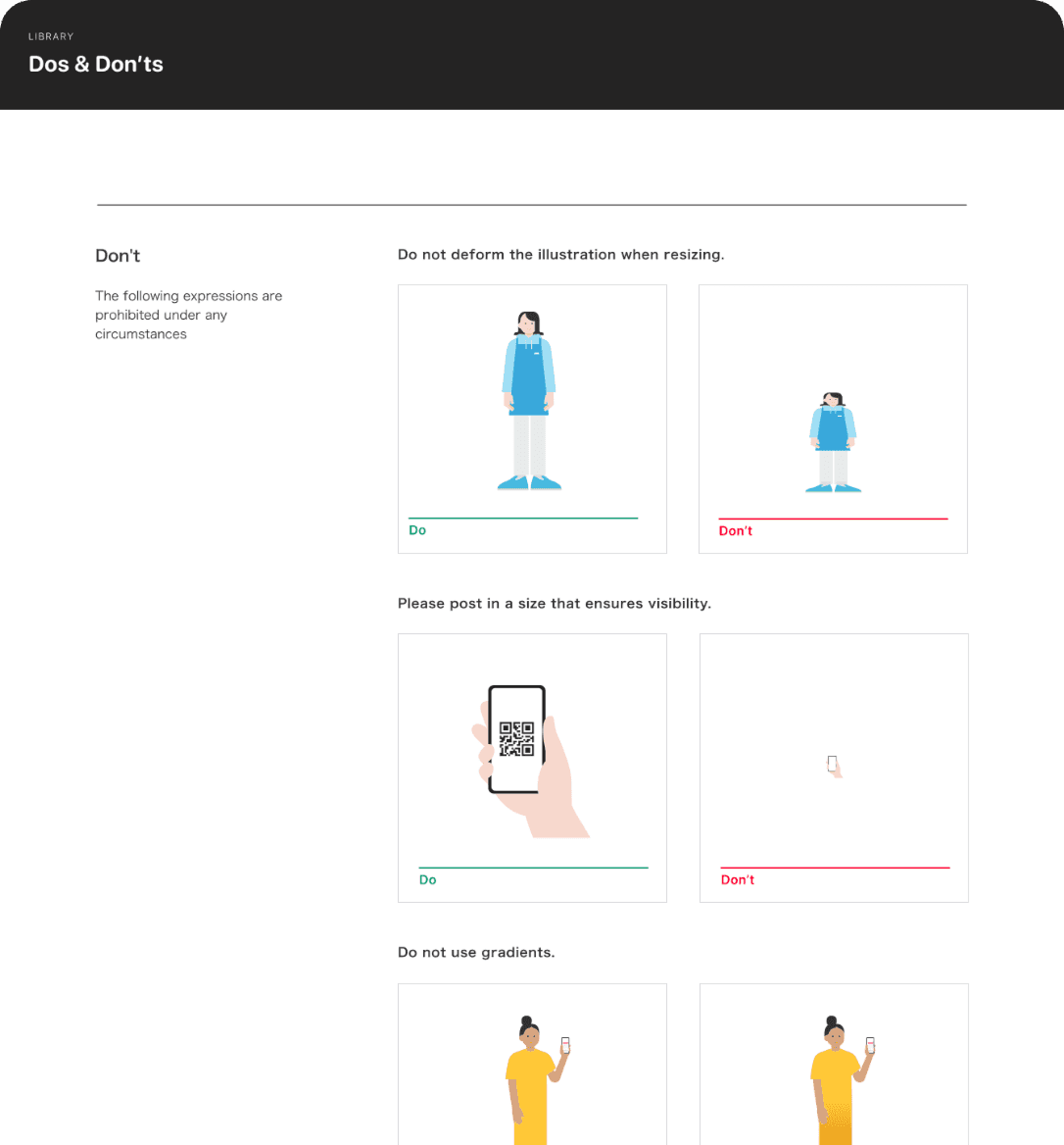
Turning guidelines into math. The hardest part wasn't color or stroke, it was deformation and flatness. The guideline doc just says "keep proportions," it doesn't say how to detect that in a transform matrix. I went frame by frame with AI, turning design intent into geometry: comparing singular values to catch stretching, checking grey shading plus diagonal edges to catch fake 3D. One frame exposed the gap early. A head had visibly stretched sub-layers but passed, because the rule let anything rotated off the hook. I had AI fix it so rotated layers still fail past a noise threshold. One bad frame did more than any theory could.

Example for deformation case.
Five directions before one. Before locking the visual design, I had AI generate five different directions for the plugin UI. Two stayed close to PayPay's existing product language, three pushed into bolder territory. I didn't pick one outright. I went through all five against the actual empty state and results flow, then combined pieces across them, which is how the final near-black CTA and the mascot-driven empty state both ended up surviving over the safer default option.

Knowing what not to build. Early prototypes covered more ground than the final plugin: halation, all-black or all-white frames, exact size presets, even whether the right library component was used. I cut all of it. Those checks depend on context the plugin can't see, like the actual screen background or surrounding UI, and a tool that flags false problems loses trust faster than a shorter tool that's always right. Six reliable checks beat ten noisy ones.
Outcome (with demo)
When a color is off-palette, the plugin suggests the closest on-palette match, and users can pick manually instead if they want.When a color is off-palette, the plugin suggests the closest on-palette match, and users can pick manually instead if they want. If everything looks right, they can apply every fix at once with Apply All.
For the company logo, we have a brand guideline covering things like color and shape, so the tool also flags whether a logo instance matches it.
Switch language or theme with one tap.
No formal metrics yet, it's too soon. But it's used by the whole design team now, not just me. It swapped an inconsistent manual check for one shared standard, and designers get layer-level feedback instead of vague "off-brand" comments. Dark mode and the language toggle mean it actually works for everyone on the team, not just whoever's demoing it.
It's also freed up the illustration team's own time. They used to run a full compliance pass before they could even talk about whether something said the right thing. Now that's mostly done already, so they get to spend their time on what actually matters: intent, not palette checks.
Planned next: a small time study with a handful of designers to measure prep time saved, confidence labels on the heuristic checks like Flat and Deformation, and an export option for design ops to review trends across the team.
Reflection
Working on this changed how I think about using AI as a designer. It's not about AI making the visuals, it's about AI giving me enough implementation leverage that I can spend my attention on the parts that actually need design judgment, like what counts as a failure, what a fix should feel like, and when a rule is technically correct but practically wrong.
Small tips for working with AI
Plan before writing code
Lock the full feature set before touching any UI.
A image beasts a paragraph
Hand AI a screenshot instead of describing it
Build reusable patterns
Fro anything repeated, make it reusable.
Ask before you build
Don't let AI guess. have it ask clarifying questions first.